We may earn revenue from the products available on this page and participate in affiliate programs. Learn More ›
A Word to the Wise
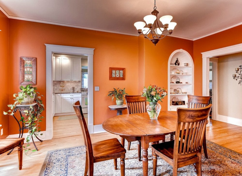
Zillow Digs home in San Francisco, CA
Ever visited a home where color is used in abundance and then think to yourself, “I want to do the same thing in my house”? Fast forward to the paint store, where you stand frozen in front of a sea of paint chips. The hesitation is understandable. Selecting colors for your home can be daunting. There are simply too many questions—from what shade to choose to how to coordinate the furnishings and fabrics you already own with a new wall color. Because it can be helpful to learn from others’ mistakes, we spoke with experts about the color missteps they’ve seen. Read on to see where fellow homeowners went wrong, and how you can get it right.
Following Trends
Zillow Digs home in Chevy Chase, MD
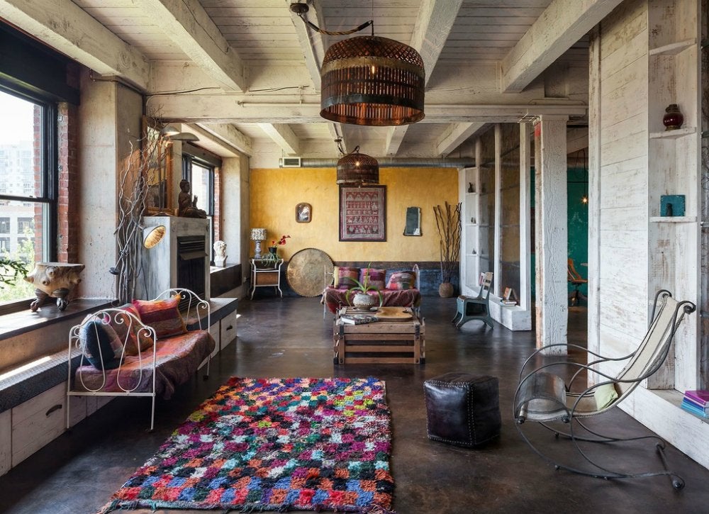
The colors you live with everyday need to be colors you love, not simply whatever happens to be all the rage in fashion and product design. “Even if you absolutely love the current trend colors, they are best used in small doses, like throw pillows or fabric patterns—not for repainting your entire home,” confirms color consultant Barbara Jacobs, of Barbara Jacobs Color and Design.
Matching Furnishings to a Wall Color

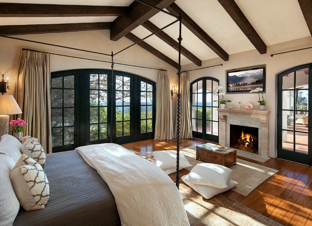
Zillow Digs home in Santa Barbara, CA
“Never paint your walls first and then try to add furnishings and fabrics that coordinate with that color,” advises Carla Aston, principal of Designed with Carla Aston. “You should always start with the items that occupy a room, like a rug or sofa, and then choose a paint color that works with them.”
Overlooking Lighting
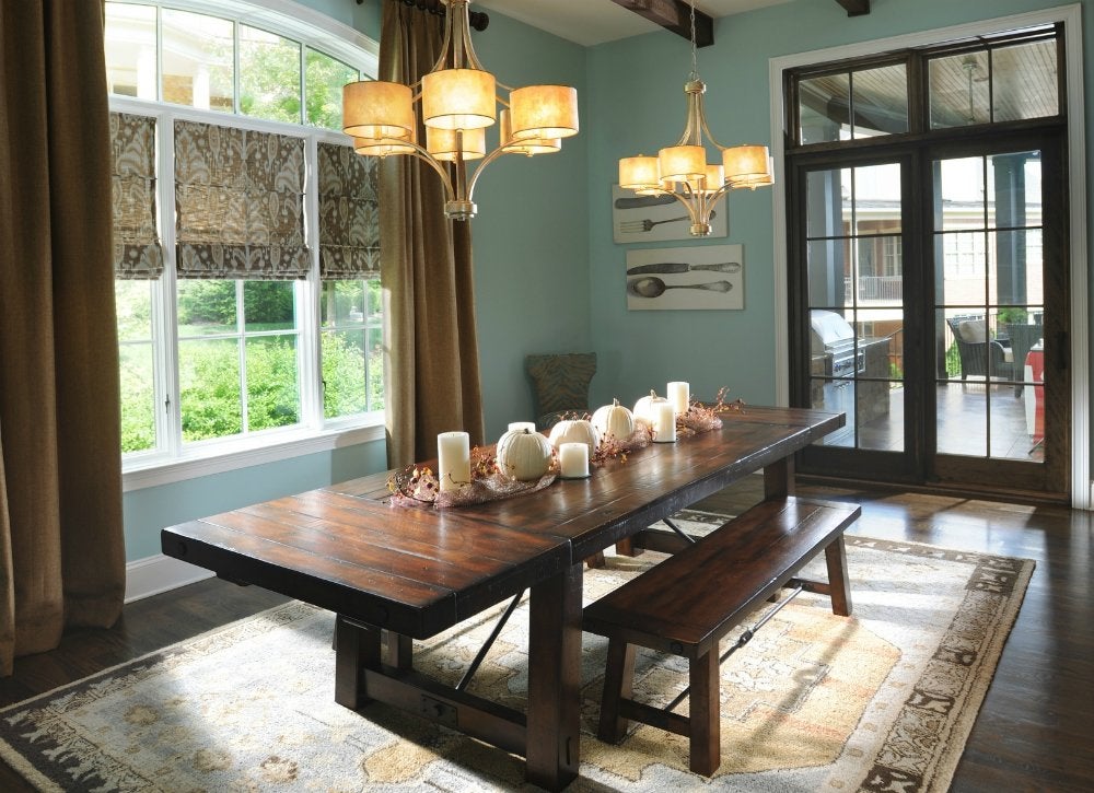
Zillow Digs home in Brentwood, TN
Some colors will look just as you’d imagined when viewed in bright sunlight, but not as expected when lit by a lamp in the evening. Before committing to a color on all four walls, always put up a sample swatch and live with it for some time to check the color in the space, advises Lauren Muse, principal of Muse Interiors. “Leave it up and observe it at different times of day.”
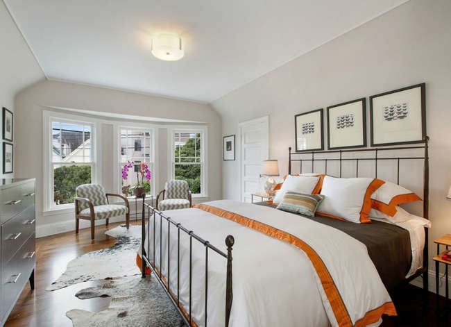
Thinking "White" Means a Lack of Color
Zillow Digs home in San Francisco, CA
Homeowners often pass on white paint when they are looking for color, thinking that their choices will be limited to pure white and creamy ecru. But what we think of as “white” today has grown to include a broad range of shades that incorporate hints of lavender, green, blue, and gray. If a pale hue is intriguing, include this color family in your search.
Related: 11 Reasons to Reconsider Pastels
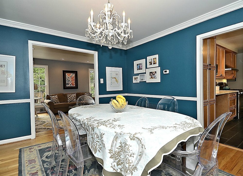
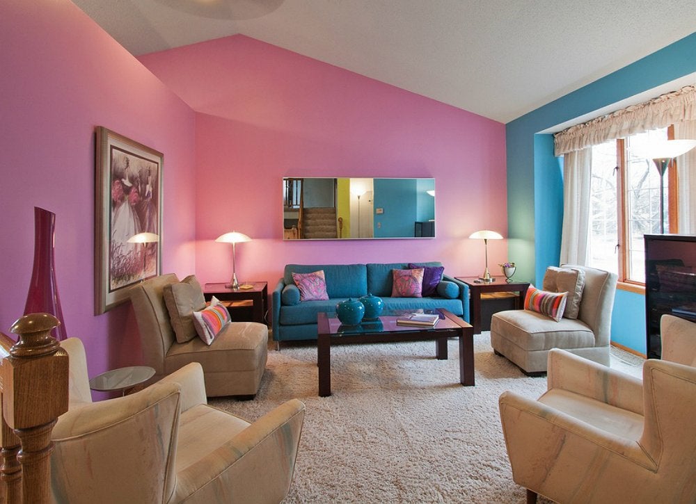
Turning a Color Combination into a Color Competition
Zillow Digs home in Portland, OR
When you’re working with a two-color scheme, don’t try to use an equal amount of both hues in the space. Instead, allow one hue to be the dominant force in the room and the other to be the accent color, says Joni Spear, of Joni Spear Interior Design. “Add yellow tones to a blue space or vice versa,” she explains.
Related: Winning Combinations – 9 “Can’t Miss” Color Schemes
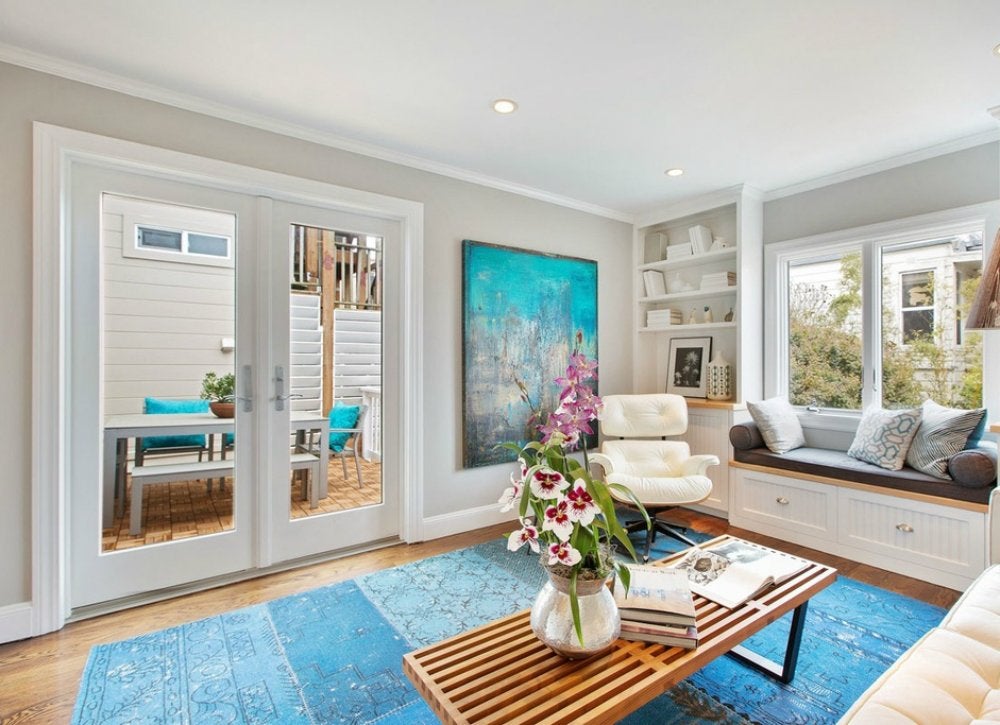
Forgetting the Ceiling
Zillow Digs home in San Francisco, CA
“Ceilings are a large expanse of space that are sometimes overlooked when developing a room’s overall palette,” says Sara McLean, color specialist for Dunn-Edwards Paints. To maximize your ceiling’s impact on a room, you might choose a pale shade that complements the walls, a high-gloss white, or a bold hue that acts as a room’s main source of color.
Related: Look! 11 Painted Ceilings that Wow
Missing the Big Picture
Zillow Digs home in Woodbury, MN
When choosing paint colors for multiple rooms—especially ones that offer a view from one into the next—homeowners sometimes select favorite shades that don’t necessarily work together. For a more cohesive look, plan ahead and pick shades close together on the color spectrum, like yellow, green, and blue.
Related: In Living Color – 7 Tips for Brightening Your Home’s Palette
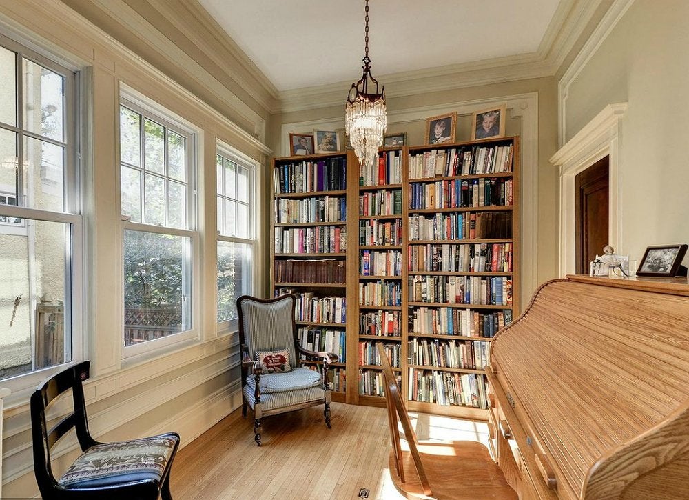
Skipping Comparisons
Zillow Digs home in Colorado Springs, CO
“I like to compare five to seven values of the same tone, eliminating them one by one until we have the best two,” says Sharon Radovich, principal designer at Panache Interior Designs. Compare both for slight differences at all hours of the day, “and typically one trumps the other,” she says. If not, test them both with a sample swatch before proceeding.
Sticking to a Single Color
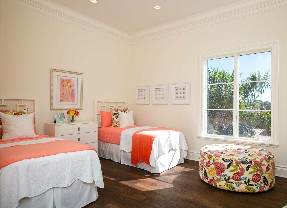
Zillow Digs home in Vero Beach, FL
So you’ve found a favorite color. But simply splashing it up on the walls makes it done. Every hue available at the paint store comes with a family of many shades and tints, so pick up a few extra swatches to identify what those might be for your color of choice. Sharon Radovich of Panache Interior Designs suggests mixing in a few of these on your cabinets, walls, trim, even furniture for a more monochromatic scheme. The extra contrast will make any space more interesting.
Related:
7 Cool Colors for Kids’ Rooms
For more…
Zillow Digs home in Washington, DC