
We may earn revenue from the products available on this page and participate in affiliate programs. Learn More ›
The perfect all-purpose white
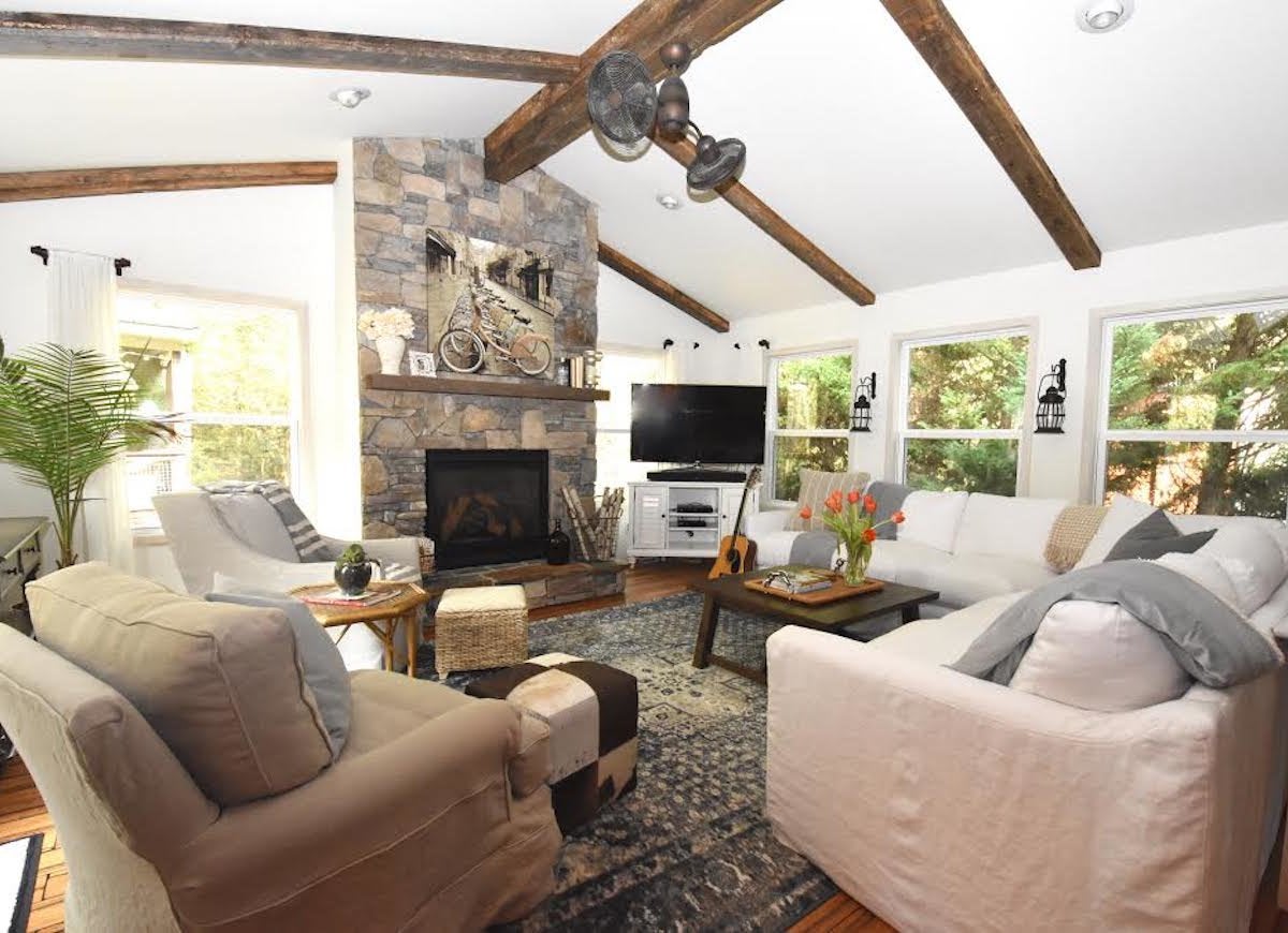
With a world of white to choose from, Charlotte, North Carolina-based interior designer Ally Whalen went with Benjamin Moore White Dove for the walls and ceiling of her home’s family room. “There are authentic rustic beams on the celling, and I wanted a backdrop so the beams remain the focal point,” Whalen says, adding that the soft white is her go-to for many spaces. Designer-to-DIY-er tip: Whalen did the trim around the windows in the same shade but added water and rubbed it on with a cloth. “This allows for a slight contrast from the walls without detracting from the beautiful view of trees in our backyard,” she explains.
Related: 14 White Rooms We Love
What a hint of blue can do!
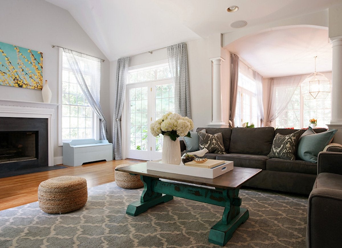
Though Philadelphia-based Larina Kase of the full service boutique firm Larina Kase Interior Design loves white, she sought to make her family room, which has tall tray ceilings, a tad cozier. Her paint solution? Benjamin Moore Alaskan Husky, a pale gray with blue/green undertones. “It’s light, bright, and crisp but with a warmer feel than white,” Kase explains. The shade also brings elegant balance to the toasty wood floors and picks up the aqua accents in the furnishings and artwork.
The stylish versatility of silver
Julia Mack; Photo by Brett Beyer
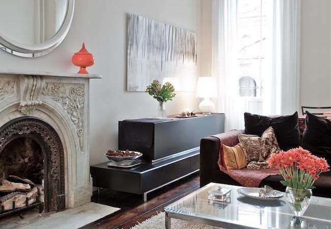
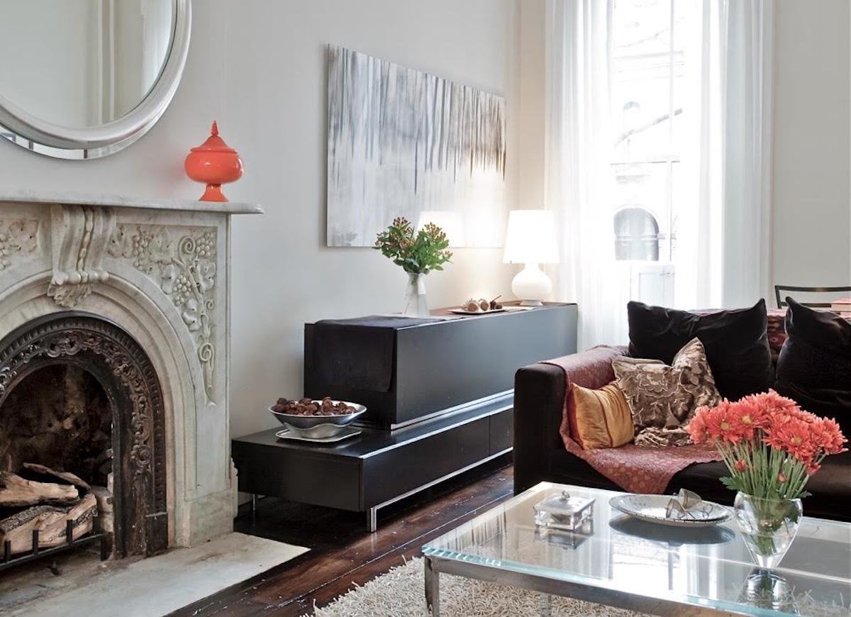
Loyalty can be rare in a field as fickle as home decor, but Julia Mack of the Brooklyn, New York, design firm that bears her name asserts: “Throughout my years of design, I have rarely done a project without Benjamin Moore Silver Satin in an eggshell finish.” Mack calls the sophisticated, flexible hue, which currently adorns her living room and dining room walls, “The perfect chameleon that can move toward an inviting taupe at night to more white during the day with the sun pouring in.”
How to go for the gold
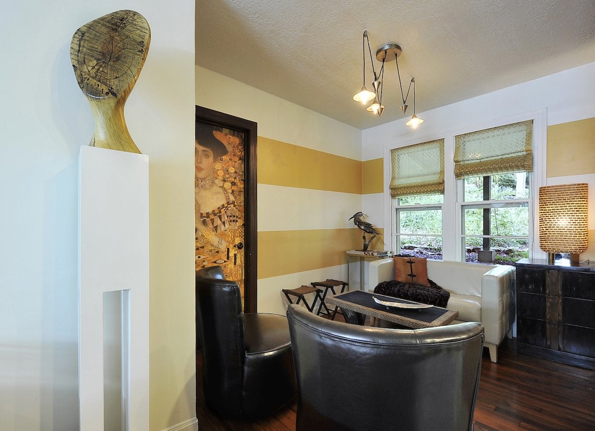
The secret to successfully pulling off strong colors, according to Sharon Radovich, owner of Panache Interiors in Austin, Texas, lies in putting a powerful shade with a softer, neutral one. In the horizontally striped sitting room of her vintage cottage, Radovich paired two shades by Sherwin Williams: Torchlight and Cream. “That shade of gold is simultaneously uplifting and grounding, great for this space, which I often use for socializing,” she says. “And the stripes add a fun, contemporary vibe.”
Related: If This, Then That: Your Guide to Pairing Paint Colors
Don’t forget the finish
Denise Gordon; photography by Chris Mitchell
While color is key, Denise Gordon, creative director of The Organized Home by Denise Gordon and lifestyle editor of CocoaFab.com, believes finish is equally important. The Brooklyn, New York-based interior designer chose two shades of gray for her master bedroom, the cooler tones of Sherwin Williams Essential Gray in an eggshell finish on the walls and darker Grizzle Gray in semi-gloss for the fireplace. “The colors and finishes work together to let the fireplace stand out prominently in the room,” Gordon explains. “It became the feature with that slight touch of attitude we were going for.” For ceiling and trim, Gordon selected in Sherwin Williams Nebulous White, in semi-gloss, to make the space look brighter.
Related: Editors’ Picks: The 9 Greatest Grays for Your Next Paint Job
The delicious drama of coral
“I believe paint should be pleasing to the eye, harmonious with furniture, and appropriate to the lighting conditions in each room,” says Chicago-based interior designer Cynthia Espy, who has a specialty in paint color consulting. To make her dining room a true feast for the senses, she chose Benjamin Moore Coral Rock. “It has a terracotta glow during the day and is gorgeous at night, especially in candlelight—warm but not too sweet,” says Espy, pointing out how it brings out the rich hues in her area rug and contrasts with the coffered ceiling.
Related: 9 Paint Color Rules Worth Breaking
A grown-up shade of gray
“For our new library, we were going for a dark, sexy, menswear vibe with tufted leather and brass hardware,” says Meredith McBride Kipp, a designer, stylist, and decor blogger based in New Jersey. “We did the floor-to-ceiling built-in bookshelves in Benjamin Moore Deep Space. It’s a deep charcoal gray with the subtlest hint of a slate blue that pairs well with the crisp white trim and ceiling.”
Related: 11 Problems You Can Solve with Paint
A creamy new neutral
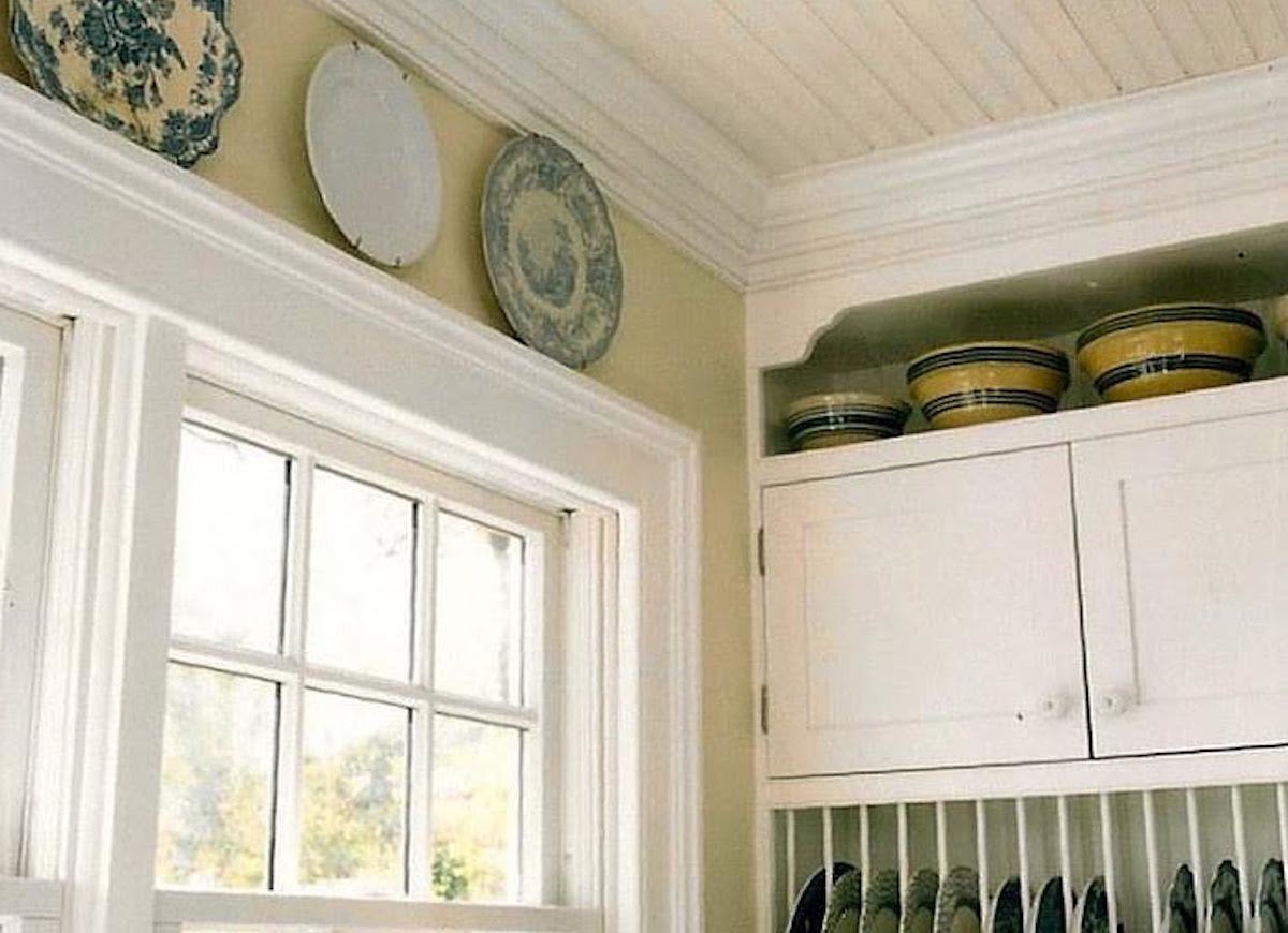
It was a challenge for Jennifer Vreeland McDermott to find the right shade for the walls of her kitchen, which features white cabinets, a slate floor, and white-and-cobalt blue accent tiles. “I wanted a neutral other than white, and nothing in the gray family worked, nor did tan or beige,” says the owner of Englewood Cliffs, New Jersey-based full-service interior design firm JV Design. Ultimately she opted for Farrow & Ball Ringwold Ground. “It’s a rich cream that blends with everything,” she says. Another advantage: “I doubt that this color will ever get dated—it’s the ideal neutral.”
The most flattering pink
“Paint is an imperative part of setting the tone in a room,” says Jennifer Morris of JMorris Design, a bespoke interior design studio in Brooklyn, New York. To assure pleasant dreams—and a beautiful dreamer—Morris picked Benjamin Moore Fondant, a cream with a pale pink cast, for her bedroom. “Pink is generally a great complement for any skin tone,” she explains, saying she prefers this shade’s soft, subtly sexy vibe to more obvious girlie pinks. She likes it so much, in fact, she eschewed the traditional route of contrasting trim and went monochromatic, doing baseboard and ceiling in Fondant as well.
A smart approach to bold
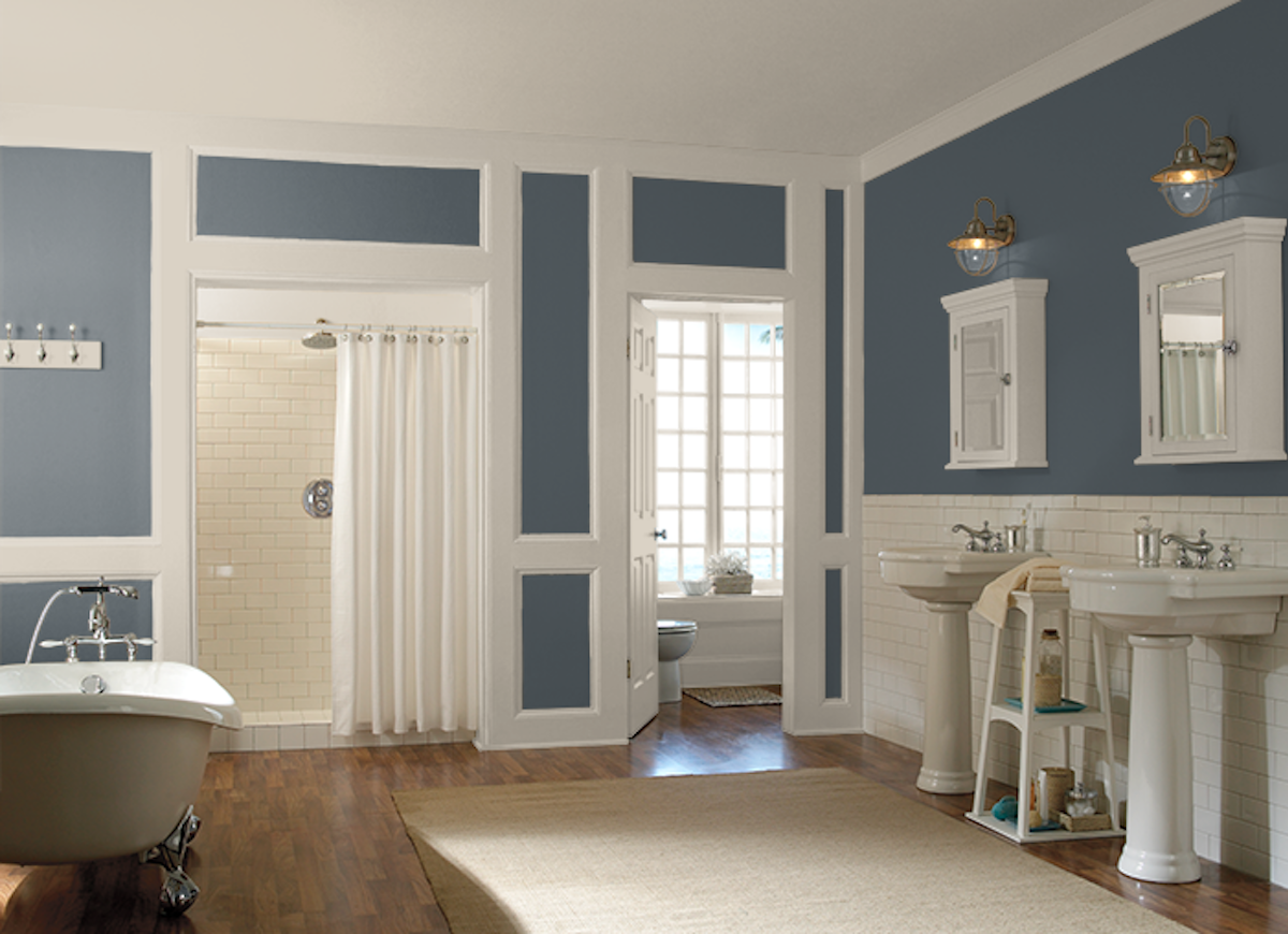
Committing to a bold color choice can be intimidating, so Danielle Coleman, an independent interior designer in Island Park, Illinois, suggests going for it in a small room. “I like more neutral shades in big spaces, but I’ll go bold in smaller rooms—that way it’s easier to repaint if I change my mind,” she explains. Case in point: Coleman used Behr Premium Plus Ultra in Blue Metal, in a semi-gloss sheen, for the walls and vanity of her master bathroom. “The bath has high white wainscoting and white marble tile, so I wanted a dark color to warm things up and provide a stark contrast,” she says. Designer-to- DIYer tip: “Having the walls match the vanity makes the vanity feel that much more custom,” Coleman says.
A lullaby in gray
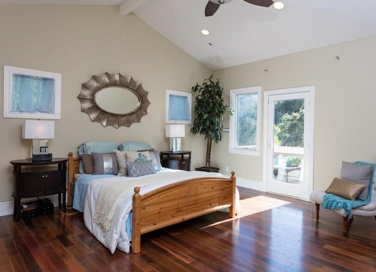
Zillow Digs home in Orinda, CA, painted in a similar color
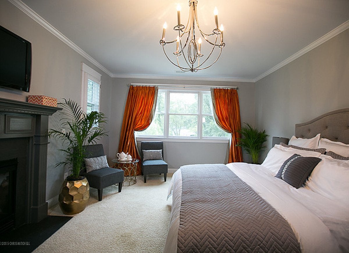
For sleeping serenity, Melissa Warner Rothblum of Massucco Warner Miller, which has offices in Seattle and Los Angeles, chose Benjamin Moore Classic Grey. “This is the perfect soft gray for my master bedroom walls, because it gives just the right amount of color without being overpowering,” she explains. “It’s very soothing and relaxing—just right for a master.”