We may earn revenue from the products available on this page and participate in affiliate programs. Learn More ›
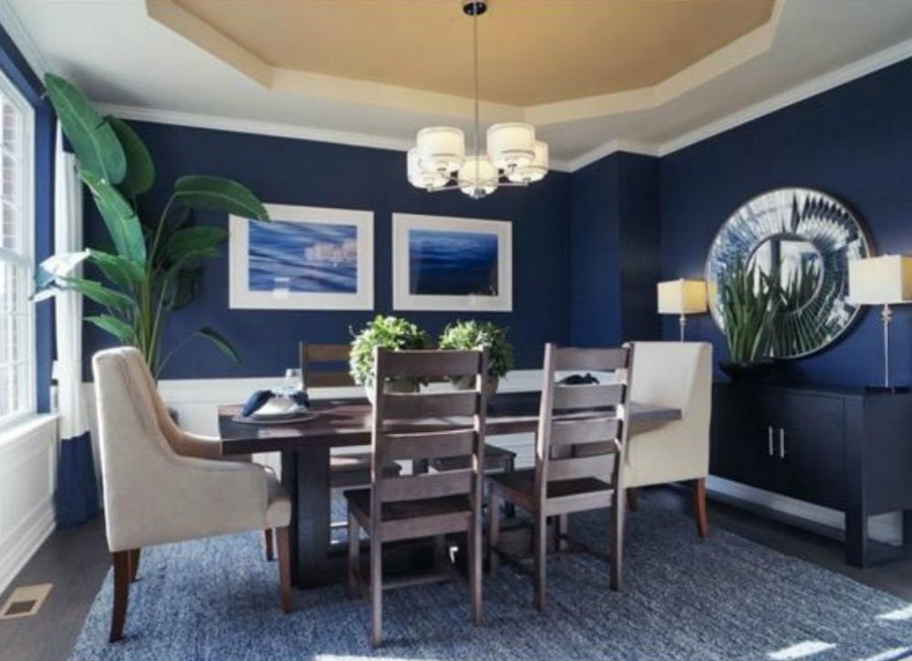
"Never Use Black on Walls"
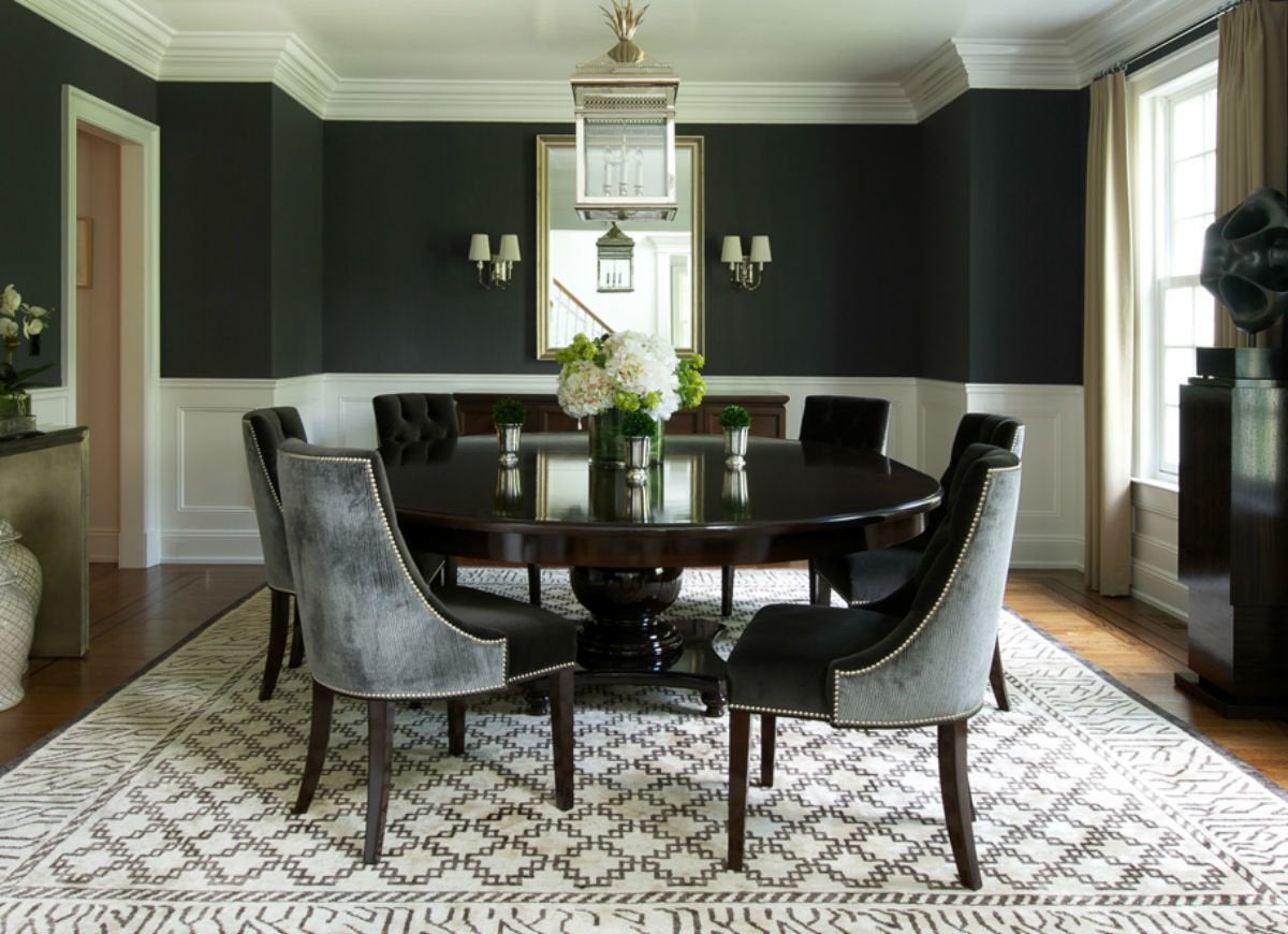
Design: Roughan Interior Design; Photography: Jane Beiles
Let’s be honest: Black is not the first color choice that comes to mind for most homeowners. But a brave few have embraced this dramatic hue for interior use—and the effects are stunning. For instance, black paint imbues elegance to this dining room by Roughan Interior Design, especially when paired with classic moulding and clean lines. The key to making black work indoors is to balance the visual weight of the color with lighter shades like crisp white or pale gray.
Related: 12 Reasons to Embrace the Elegance of Black and White
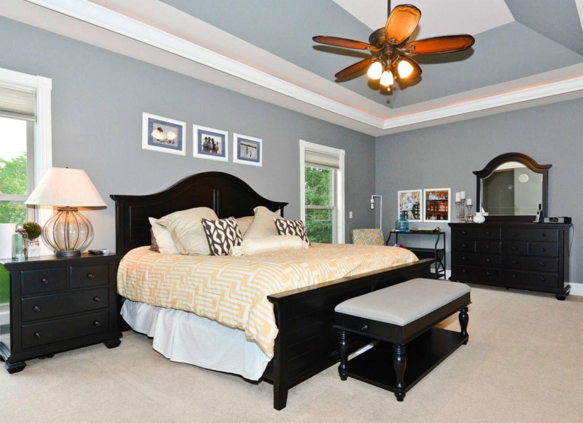
"Use Only Restful Colors for the Bedroom"
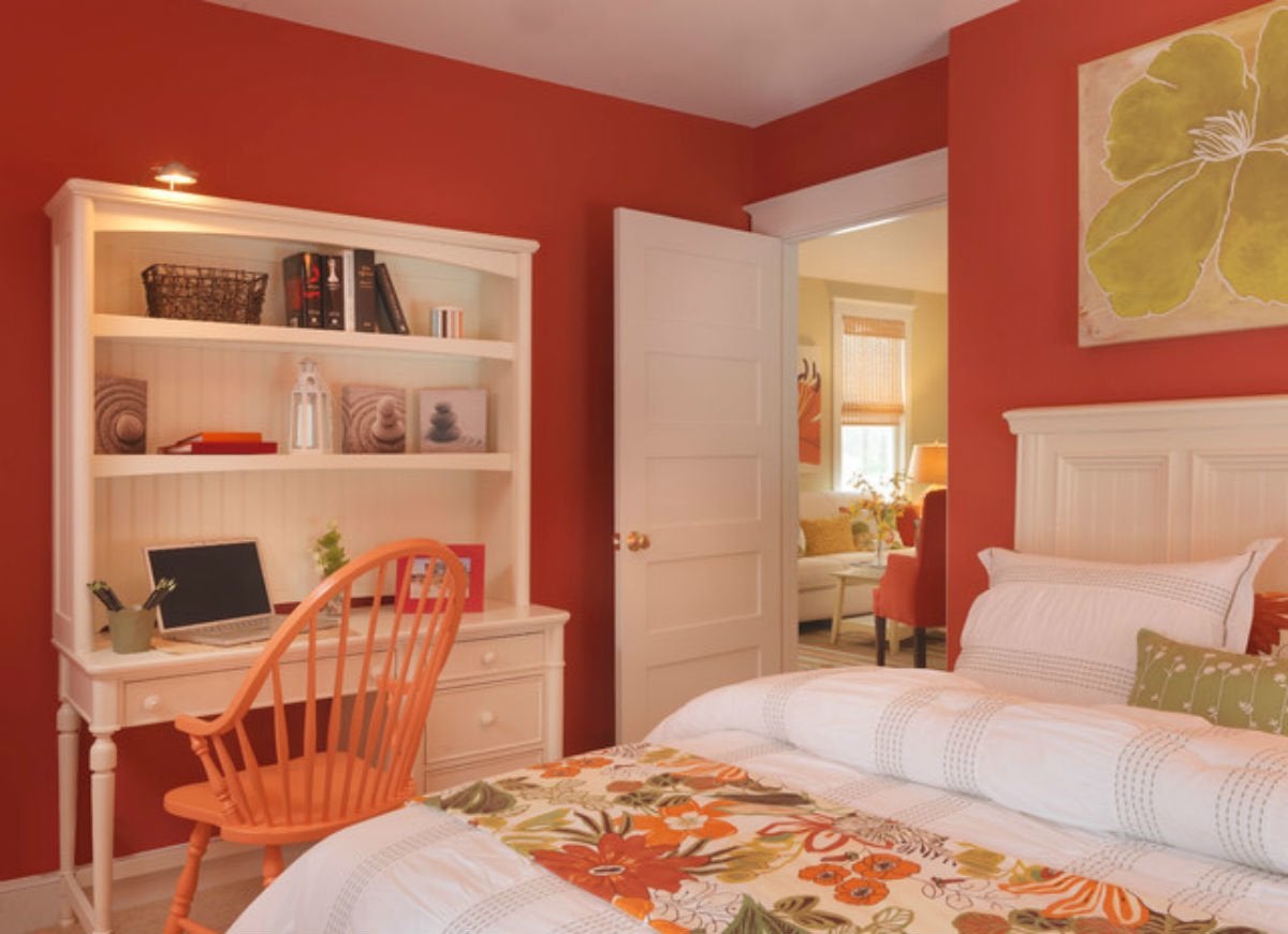
Design: Mandeville Canyon Designs
If you love bold colors like fire-engine red or lemon yellow, don’t settle for soft neutrals or seaside blues for the most personal spaces in your home. Bedrooms are no longer just the places where we sleep—we work, read, and relax there too, so having your favorite colors around will both inspire and soothe you. The key to toning down the most intense shades is to mix in a healthy dose of white details in woodwork, furniture, and cushy fabrics, as seen in this colorful bedroom by Mandeville Canyon Designs.
Related: In Living Color: 7 Tips for Brightening Your Home’s Palette
"Beige Is Boring"
Design: Tobi Fairley; Photography: Nancy Nolan Photography
Beige gets a bad rap in home design, often viewed as the sensible option for anyone too timid to play with color. But the truth is, beige can be a fantastic backdrop for highly energetic interiors. This room, designed by Tobi Fairley, makes beige fun by layering in eye-catching details like bold fabric patterns and bright color accents on furniture and accessories.
Related: The New Neutrals: 9 Colors You Can Trust for Today’s Home
"Never Use Dark Colors in Small Spaces"
Zillow Digs home in Lake Orion, MI
While it’s true that lighter shades of paint seem to visually expand small spaces, there are times when homeowners might choose a dark color to accentuate a room’s cozy atmosphere. In these cases, dramatic colors like charcoal gray or jewel tones like emerald or amethyst rise to the challenge. Underscore these elegant hues with luxurious details like ornate picture frames or velvet pillows, and look to slim and elegant pieces of furniture to make the room feel spacious.
"Pink Is for Kids"
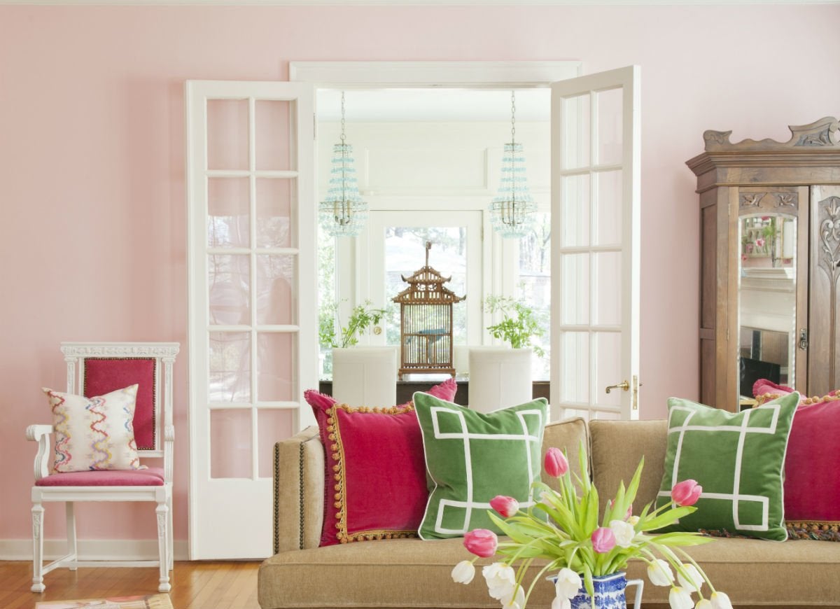
Design: Andrea Brooks Interiors; Photography: Nancy Nolan Photography
Think pink is only for little kids’ bedrooms? Think again! Today, this ultra-popular paint color is showing up all through the house. Available in a wide range of shades, from palest seashell to brightest fuchsia, pink succeeds in more grown-up settings, such as this subtly pink room by Andrea Brooks Interiors. When paired with sophisticated details like French doors and gilded accents, this living room looks both regal and playful.
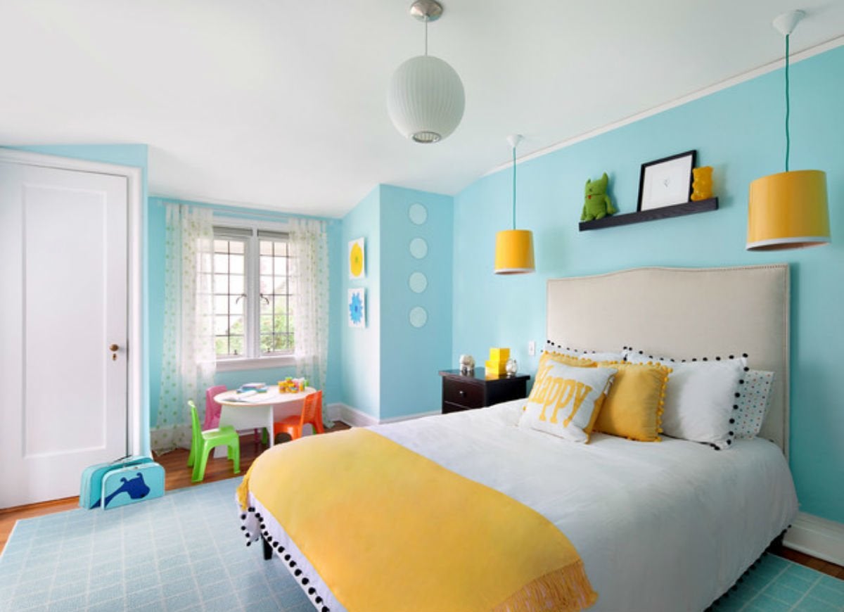
"Blue Is for Boys"
Zillow Digs home in Chesterfield, MO
Kids’ bedroom design has evolved in the past decade, and one result has been that pale shades of cerulean and turquoise have become as popular for girls as they’ve always been for boys. Versatile blue works with any decorating style: Layer in white curtains and bedding for a more airy, romantic feeling, or add bursts of bold color and modern details for a more playful flair.
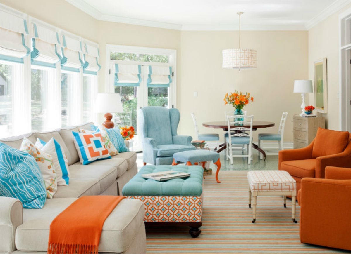
"You Have to Pick a Dominant Color"
Design: Clean Design; Photography: Donna Dotan Photography
We’ve all heard the warning that using more than one bold color in a room can overpower the space. But sometimes it’s worth throwing caution to the wind. If you love the look of bright colors and have a few favorites you want to combine, go for it! Paint two accent walls, one in each hue, or opt for a bold color for the walls and a bright splash of color for linens and accents, like in this charming kids’ room by Clean Design. As long as you achieve a sense of balance, there’s no reason you shouldn’t risk breaking this old-school rule.
"Brown Is Drab"
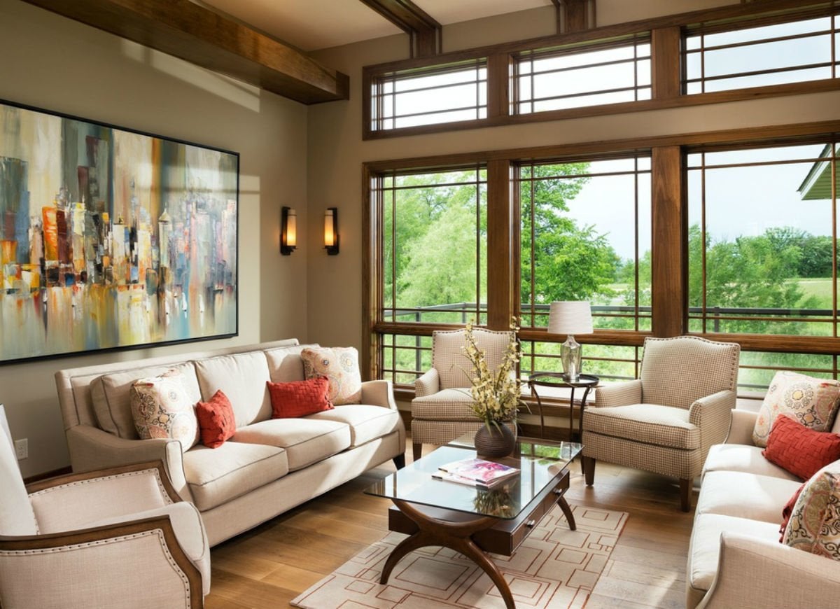
Zillow Digs home in North Oaks, MN
Some brown rooms can be drab—as you’ve probably seen—but they don’t have to be. In fact, when the right shade is chosen and the details are spot on, brown rooms can be some of the most elegant of all. Choose your undertones carefully by living with paint samples to see how a room’s natural and ambient light affects the color, and then balance the strength of brown with more lighthearted details and plenty of white trim.
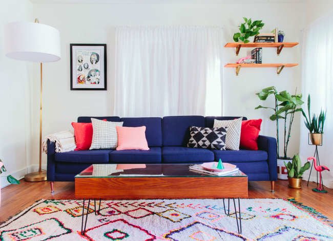
"White Is Always Serene"

Design: Taylor + Taylor; Photography: Echo + Earl
Wonderful, versatile white can create any atmosphere you need in your home—from a space that is peaceful and soothing to a room that energizes and inspires you. The trick to turning up the visual vitality in a white room is to start with a crisp shade featuring cool undertones (steer clear of creams and ecrus), and then accessorize using bold accents in fabrics and furnishings. This modern space, brought to you by Taylor + Taylor, shows how you can decorate with white paint, while having fun and letting your passion shine through!
Related: 7 Things You Need to Know Before Painting Your Walls White