We may earn revenue from the products available on this page and participate in affiliate programs. Learn More ›
Choosing a paint color is never easy and can lead to stress and even conflict. With an abundance of shades available, color selection can quickly feel overwhelming. It’s also a very subjective decision, dependent on each person’s preferences and perspective. Some colors get a bad rap for being too boring, too bright or loud, difficult to complement with other colors, etc., but, interestingly, these same colors end up being what home design experts actually love using in homes.
“The colors we tend to stay away from are often the ones we end up liking the most,” says Richie David, CEO and president of Totally Home Furniture. For Samantha-Jane Agbontaen, interior designer and founder of House Designer in the United Kingdom, a lot of these colors only get a bad reputation because people have seen the wrong version of them. “I would never choose a paint color in isolation, since lighting, flooring, furniture, and other finishes in the room can completely change how it looks,” she explains.
We spoke to several experts to identify the most divisive paint colors that you should give another chance and consider using in your home.
1. Greige
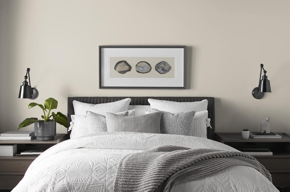
Greige probably gets the most unfair criticism because people automatically think it’s too bland or dated, says Agbontaen. “I still use it because sometimes you need the walls to sit back and let the furniture, art, and materials do the work,” she explains. The key is choosing one with the right undertone. She prefers warmer, slightly muddier versions rather than anything that feels yellow.
While people are labeling greige as a safe, beige-like neutral, it’s actually the easiest wall in the house to own, says Branden Wells, CEO and founder of TrueCraft Construction in Costa Mesa, California. “At a light reflectance value around 55, it’s got just enough brightness to make a small room feel larger, yet not so much that it will show every fingerprint like a stark white would,” he says. It’s also really easy to maintain. When it comes time for touch-ups, a scuffed greige can be fixed with a small brush in only about 10 minutes.
Our Recommendation:
Revere Pewter by Benjamin Moore
Vintage Pewter by BEHR
2. Brown
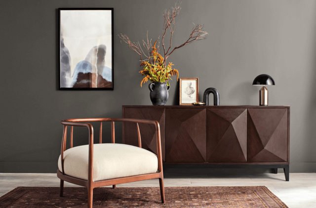
It’s not uncommon for people to associate brown with dated interiors, especially old brown kitchens. However, it’s making a comeback. “A good brown paint feels warm and grounded, and it works particularly well with cream, natural wood, brass, and burgundy,” says Agbontaen. She recommends avoiding any brown shades that are too orange- or red-looking.
Brown is a complex color with endless possibilities. Think chocolate, tobacco, coffee, caramel, and more, says Elena Navarro, interior designer and professional organizer at Sparkly Maid Austin in Austin, Texas. “Rather than using brown in a one-dimensional way, choose a more interesting hue that’s full of nuances,” she suggests. These deeper hues bring warmth and dimension to a room, allowing objects like artwork, books, or decor to pop. “Lighter upholstery or accessories, metallics with warm undertones, organic materials, and luxurious textures will all look stunning against a backdrop of brown walls,” she adds. So will doors and trim. Finally, use rich shades of brown to embrace low lighting in libraries, dining rooms, home offices, and bedrooms.
Our Recommendation:
London Clay by Farrow & Ball
Urbane Bronze by Sherwin-Williams
3. Yellow
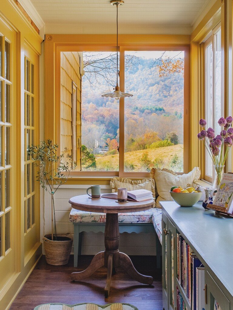
Yellow can be a tough color to tackle since it’s a bit of a loud, energetic hue that can feel overwhelming when used on all four walls, warns Navarro. If you’ve been afraid to choose yellow because of overly bright hues like citron, she recommends trying a more nuanced take on yellow. “Muted butter, straw, and ochre shades have gray or green undertones that serve as neutrals, injecting warmth into rooms that are overly cool or receive little to no natural light, such as north-facing rooms,” she explains. Balance them with darker woods and metallics with gold undertones for an unexpected twist on neutrals.
Our Recommendation:
Hawthorne Yellow by Benjamin Moore
India Yellow by Farrow & Ball
4. Black
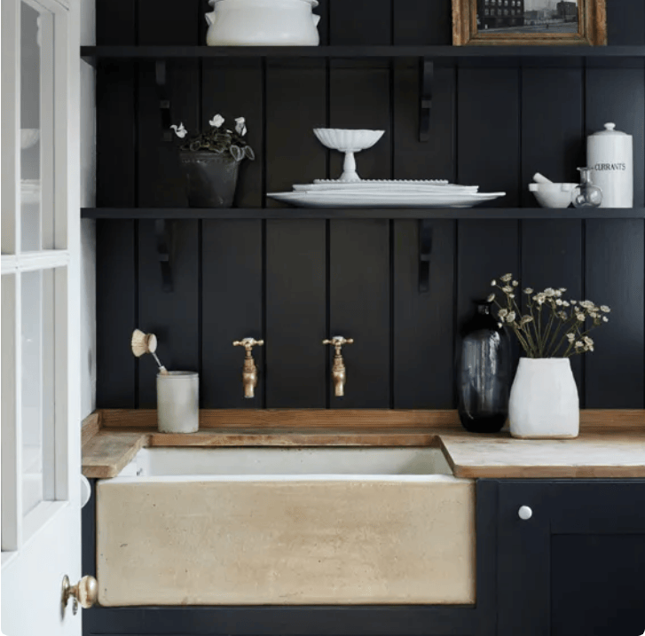
Believe it or not, interior decorators also enjoy using some black paint to sharpen home design. Many people avoid it because they think it will make a room feel gloomy and smaller, says Agbontaen. However, she thinks dark colors like black can actually make a room feel much more finished, such as in a small study or dining room.
“When used correctly, black paint can be subtle and elegant while still making a bold statement,” adds David. He prefers to use black paint on doors, cabinets, and built-ins since it helps accentuate these parts of the home.
Navarro also likes black paint, as long as it’s used sparingly. “The color is already making waves, with window frames, fireplaces, built-ins, and other millwork trending black,” she notes. “If you’re feeling brave, consider going all-in on the color. It’s a great option for small rooms that can feel larger since it obscures corners and adds dimension.” To keep it from feeling flat, choose paint finishes like eggshell and satin and install multiple lighting options to give a black-painted room depth and personality.
Our Recommendation:
Railings by Farrow & Ball
Tricorn Black by Sherwin-Williams
5. Pink
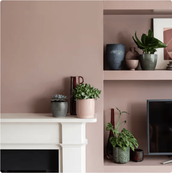
Another color that is often overlooked is dusty pink. Keep in mind that pink doesn’t have to mean Barbie pink, says Navarro. “Dusty pinks have beige, gray, or clay undertones and work beautifully as neutrals in a variety of spaces,” she explains. “Not only do they look lovely in unexpected spaces like studies and powder rooms, but pink paint also happens to be one of the most flattering colors for skin tones, making it a dreamy choice for bedrooms and bathrooms.” Balance dusty pink with natural textures like stone and weathered wood, and crisp, dark accents for a modern interpretation of the color. “Dark woods, metals, and sumptuous, tailored fabrics also look beautiful with pink,” she adds.
Our Recommendation:
Stolen Kiss by BEHR
Sulking Room Pink by Farrow & Ball