We may earn revenue from the products available on this page and participate in affiliate programs. Learn More ›
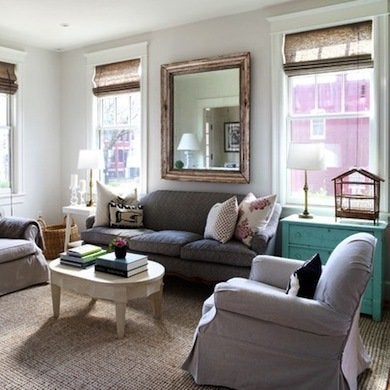
Beige
To focus attention on a pair of blue sofas in one client’s home, Joni Spear chose a tried-and-true beige for the walls—Benjamin Moore’s Simple Pleasures (#1097). On the ceiling she added a subtle gray, Sherwin-Williams’s Samovar Silver (SW6233) to balance the beige and enhance the blue. “The colors play well off each other,” Spear points out.
Pink
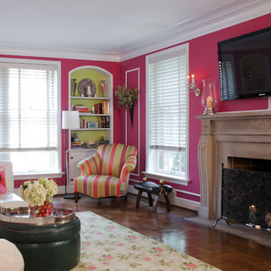
A prized F. Schumacher rug provided inspiration for the color scheme in Joni Spear’s own living room. Benjamin Moore’s Pink Corsage (#1349) brightens the walls, while Sherwin-Williams’s Gleeful (SW6709) adds a hint of green inside the bookshelves. “Pink and green are my favorite colors, and I’m a firm believer in picking living room hues you want to live with 365 days a year,” she explains.
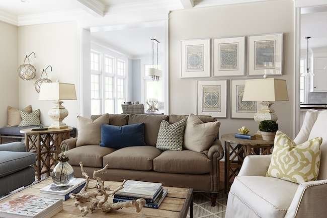
Stone
“Neutrals are always popular choices for living rooms to create a calming backdrop for patterned furnishings and art,” reports Sarah Cole, creative director for Farrow & Ball. Increasingly, she adds, homeowners choose grayer neutrals like Purbeck Stone (#275) and Skimming Stone (#241), which was used in this sunny space. “These soft grays have a very relaxed, easy-to-live-with feel,” she observes.
Pale Turquoise

“Benjamin Moore’s Bali (#702) is a favorite soft turquoise of mine,” says interior designer Carla Aston, principal of Designed with Carla Aston, in The Woodlands, Texas. “So many fabrics work with it, and it appears differently when the light changes—sometimes blue or green or even gray. I love colors that add a bit of mystery to a room!”
Gray
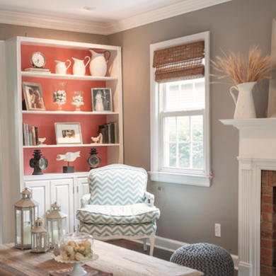
For interior designer Cory Connor, principal of Cory Connor Designs, in Chatham, New Jersey, gray is a go-to backdrop for living rooms. “It works with everything,” she says. A case in point is this vibrant, beach-inspired space. “I wanted a nice neutral that worked with the coral bookshelves and turquoise-and-white furniture,” Connor says. On the walls is Restoration Hardware’s Graphite, part of their Slate Paint Collection.
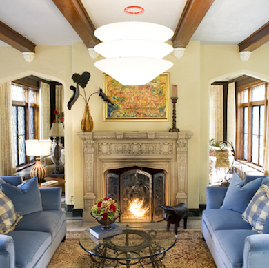
Navy Blue

To help a client achieve a look that is “sophisticated yet cozy,” Cory Connor chose a classic navy blue for this room. “The color entices guests to come in and relax with a good book,” she says. The walls are covered in Wedgewood Blue grasscloth wallpaper from Thibaut; Benjamin Moore’s Newburyport Blue (HC-155) coats the bookshelves and trim.
Parchment
A pale neutral like this one—Sherwin-Williams’s Balanced Beige (SW7037)—is a favorite for Amy Hendel, designer for Hendel Homes, in Wayzata, Minnesota. “For the living room, I love to start with a neutral on the walls and add in the color with fabrics and accessories,” she says.
Jewel Tones
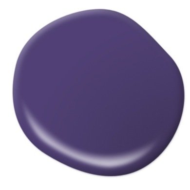
“The living room is the center of activity in the home, so it’s important to choose a color scheme that captures the essence of your family’s lifestyle,” says Erika Woelfel, director of color marketing for Behr Paints. “Neutrals set a serene tone, a cool palette of blue-greens soothes the senses, and bold jewel tones like purples and reds provide a touch of drama and bolster energy.” Here, Behr’s Berry Jam (640B-7).
Lightly Tinted Neutrals
“Light and soothing colors are popular choices for living rooms,” says Valspar color strategist Sue Kim. “I think it’s fun to play with a hue outside of the beige family, like a pale shade of blue, gray, or pink, like Valspar’s Frosted Clover (1001-8B). These lightly-infused neutrals reflect our need to restore our balance at home.”
For More…

Jane Dagmi
If you are interested in more inspirational paint ideas, consider:
17 Ways to Make Any Space Pop with Color