We may earn revenue from the products available on this page and participate in affiliate programs. Learn More ›
Selecting a single color for your home’s exterior can be difficult enough, but trying to find two or more hues that work well together in a whole-house color scheme makes the decision even more challenging. Whether your aim is to highlight architectural details or simply to find a complementary shade for shutters and trim, the choice is an important one.
“Color can make a big impact on the look of a house,” confirms architect Jim Rill, principal of Rill Architects in Bethesda, Maryland. For inspiration, consider your home’s style and scale as well as architectural styles typical of your neighborhood and region. “The best exterior colors are contextual to their environment,” Rill observes. Here, find 15 color-scheme combinations that hit the mark.
1. Two-Tone Olive
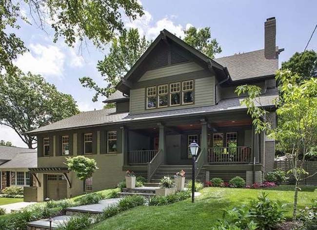
Deep natural colors that recede into the landscape are typical of Craftsman-style houses. For this renovation, Rill Architects chose a duo of Benjamin Moore olive greens: Gloucester Sage (HC-100) and Dakota Woods Green (2139-20). A yellow-orange stain on the front door adds a lighthearted dash of color. “Front doors should always have character and draw subtle attention to themselves,” Rill says.
RELATED: The 10 Best Accent Colors for Your Home Exterior
2. Straw and Sage

“A balanced look always provides plenty of curb appeal,” says interior designer Kerrie Kelly, principal of Kerrie Kelly Design Lab, in Sacramento, California. “Starting with a neutral shade in straw yellow sets a welcoming palette, while accents in sage green give a lively look to traditional architecture. This combination is an approachable classic year-round.”
3. Putty and Gray

Older neighborhood dwellings guided the color choice for this Midwest home. “We chose a soft neutral for the body of the house that would allow it to stand out and yet still complement the other homes around it,” reports Kristen Schammel, interior designer for Highmark Builders in Savage, Minnesota. “This exterior is simple, traditional, and admired!”
RELATED: 7 No-Fail Exterior Paint Colors
4. Red and Black
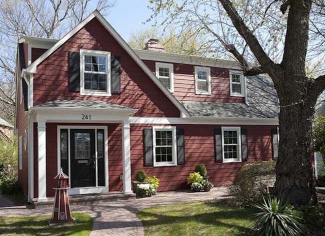
“Red is a classic color,” says interior designer Cindy Grossmueller McClure, owner of Grossmueller’s Design Consultants in Washington, D.C. “I love using it on smaller homes because they handle the color so well. Black accents like the front door and shutters look great when set off by white trim.”
5. Gray and Blue
“Gray is a great neutral that can match just about any style of home and is a beautiful complement to brick,” says Jackie Jordan, former director of color marketing for Sherwin-Williams. “The slightly more saturated shutters and door provide a sophisticated accent and bring in the tones of sky and sea.” Seen here are Sherwin-Williams’s Comfort Gray (SW 6205) and Rain (SW 6219).
6. Green, Cream, and Burgundy
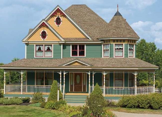
“The combination of green, cream, and burgundy is a favorite for Victorian-style homes,” reports Erika Woelfel, vice president of Color & Creative Services at the Behr Paint Company. “The bold color scheme gives this home a dramatic yet warm appearance.” The trio of Behr colors used here are Ivy Wreath (QE-46), Terra Sol (QE-20), and Country Lane Red (QE-07).
7. Charcoal and Lime
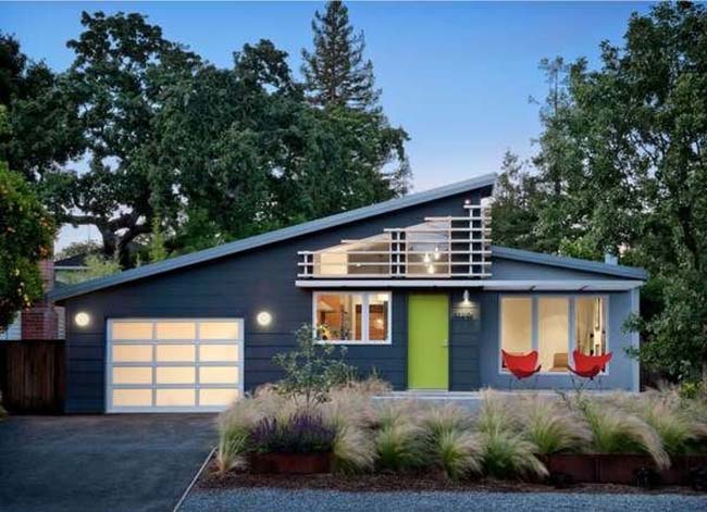
A wonderful way to make a bold color statement on modern houses—even the smallest ones—is to start with a strong neutral and add a bright pop of color on the front door. This home, designed by Ana Williamson Architect in Menlo Park, California, combines two Benjamin Moore hues: Gunmetal (1602) for the siding and Tequila Lime (2028-30) on the door.
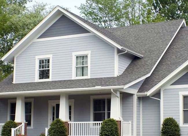
8. Greige and Teal
You can still achieve a modern look without using shocking hues if those colors just aren’t for you. Here, greige—that’s gray and beige—with a teal shutters puts a modern spin on the traditional neighborhood home. This combination still looks warm and welcoming without feeling dated.
9. Blue, Red, and Tan
Blue is a popular exterior color for homes in waterside settings like this one. Adding red and tan to highlight trim and architectural features was an eye-catching choice by designers at New Urban Home Builders in Grand Rapids, Michigan. The trio of hues also gives the lakefront compound a Scandinavian feel.
10. Black and White
Black and white never goes out of style. Whether you have an old home or a new build, this classic combo looks fresh forever—plus it really pops against a green lawn.
11. Black and Taupe
A twist on the traditional black-and-white color scheme. If crisp white and classic black looks classy, swapping in taupe warms up the look and adds a touch of warmth and coziness to your home exterior.
12. Yellow and Blue
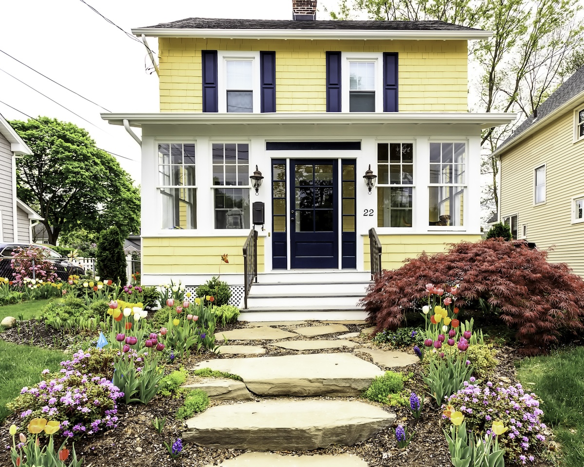
Some might think that a double dose of primary colors is too bold for a house, but when executed with finesse, it’s a real charmer. Here, navy blue and mellow yellow play off each other for a quaint effect.
13. Brown and Sand
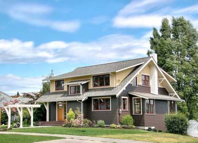
Nearby houses inspired the color scheme of this charming home. “The sandy color on top resembles the muted tones common on neighboring houses,” says architect David Neiman of Neiman Taber Architects in Seattle, Washington. “The brown is a darker complement that provides a strong visual base. Red window frames add an extra punch of color.”
14. Turquoise and White
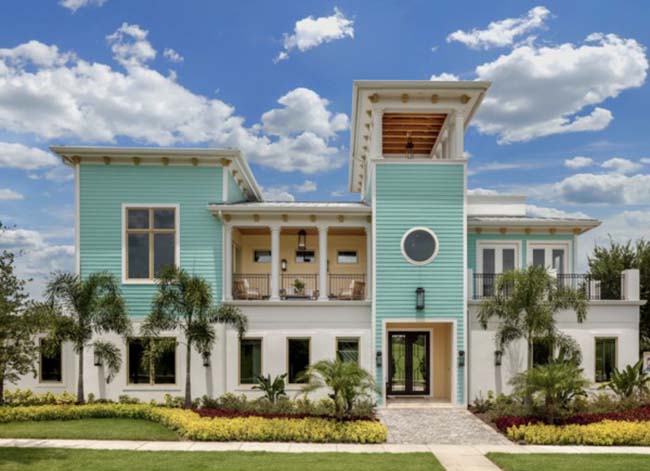
Turquoise is a fun choice for those who live in warmer climates; it evokes sunny skies and the sea. If you’re nervous that it’s too bold of a color for your neighborhood, cool it down with white accents. When used in combination, the palette is bright and cheerful.
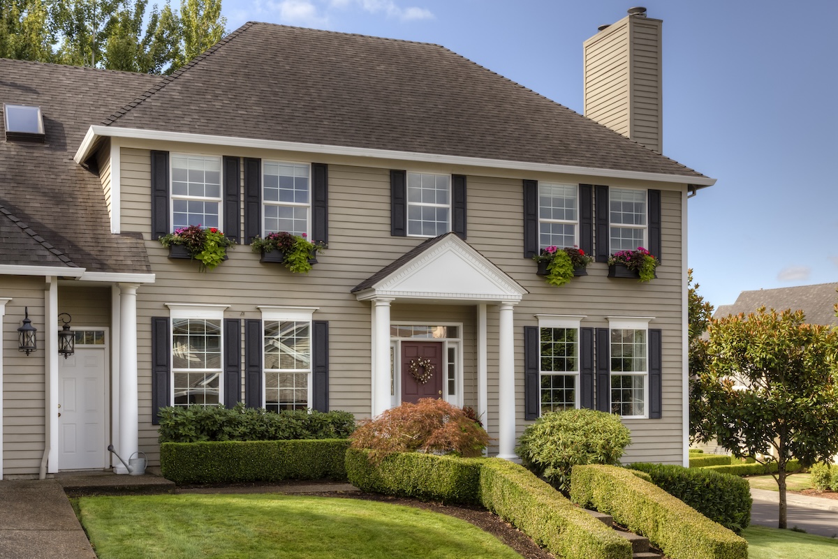
15. Taupe, Red, and White
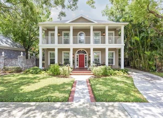
Honor the history of your home with a simple palette. The white columns maintain the old house charm, but the soft taupe and red give it a 21st-century twist.
Get HGTV by Sherwin-Williams paint at Lowe’s
Get Benjamin Moore paint at Ace Hardware
Get Behr paint at The Home Depot
A version of this article appeared first on BobVila.com on June 11, 2018.