We may earn revenue from the products available on this page and participate in affiliate programs. Learn More ›
After choosing the perfect wall color, many default to choosing a white trim paint without giving it a second thought. Although white molding is a classic for a reason, there are many other options that can make a bigger impact and may better suit your home’s style and space.
We spoke to three color experts from top paint brands who shared a few of their favorite paint color combinations for both traditional and unconventional spaces. Keep reading to check out their picks for the best wall and trim color combinations.
Classic Color Combos for Walls and Trim
When choosing wall and trim colors, sometimes it’s best to stick to the basics. The following five color combinations are tried-and-true options that have been known to work in nearly any kind of room.
1. White Walls, White Trim
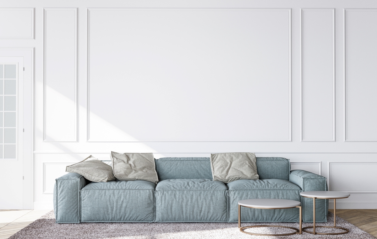
Let’s start with what many hold to be a true classic: white walls with white trim. Arianna Cesa, Associate Manager of Color Marketing & Development at Benjamin Moore, says, “One of my favorite looks is to use the same color on the walls and trim but use a different sheen for a subtle contrast. This allows for guaranteed cohesion and uninterrupted color flow.”
When painting walls and trim the same color, opt for a higher sheen on the trim than the walls. In terms of specific colors, she says, “If you are feeling overwhelmed, and don’t know where to start when it comes to selecting a trim color, look to bright clean white paint colors like Chantilly Lace (OC-65) or Super White (OC-152).”
Get Benjamin Moore Paints at Ace Hardware
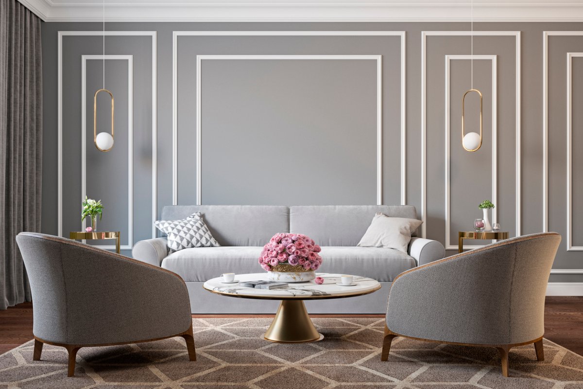
2. Greige Walls, White Trim
Greige has been a popular wall color for years, acting as a neutral that can lean either warm or cool. “A greige like Stonehenge Greige (PPG1024-5) can be paired with a white trim—such as Commercial White (PPG1025-1)—for a fresh, cozy look,” says Ashley McCollum, PPG color marketing manager.
Get PPG Paints at The Home Depot
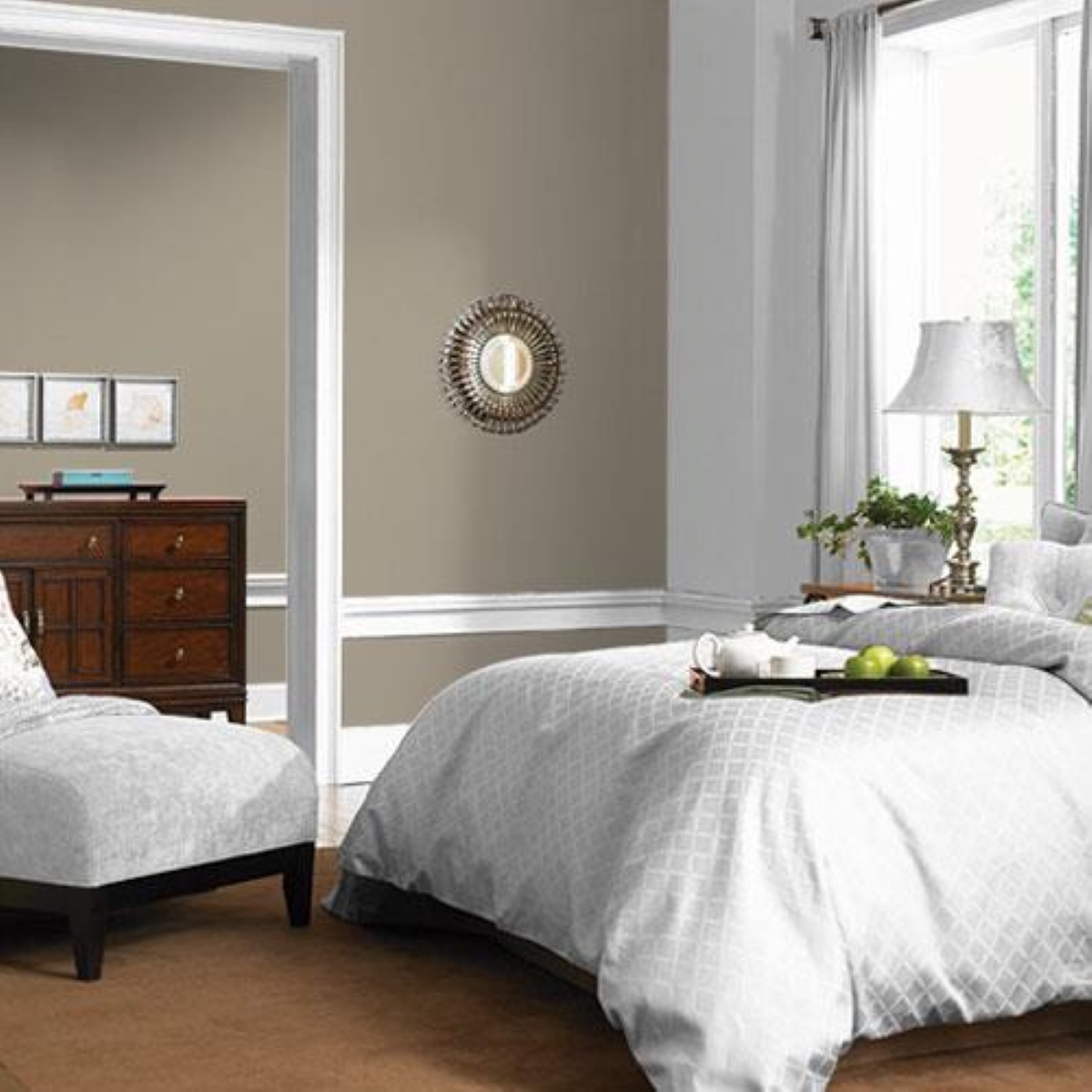
3. Light Walls, Black Trim
If you’re looking to highlight architectural details like window frames and original baseboards, consider a dark trim with light walls.
Sue Wadden, Sherwin-Williams Director of Color Marketing, says “Tricorn Black (SW 6258) is our truest black and another one of our most popular colors year after year. It helps modernize a space and makes for a very sophisticated and classic focal point when used on trim.”
Even when painting trim darker than walls, it’s best to paint the trim first before painting the walls to avoid the lighter wall color splattering onto the dark trim.
Get Sherwin-Williams Paints at Lowe’s
4. Blue Walls, Cool White Trim
Arianna Cesa suggests using two colors with a similar underdone when choosing a wall and trim pairing. She advises, “If you have blue walls, look to white paint colors that have a blue undertone as options for the trim for a cohesive look.”
One of her favorite combinations for a classic look is using Benjamin Moore’s Hale Navy HC-154 for the walls with Decorator’s White OC-140 for the trim. Similarly, Ashley McCollum shares that combining Glidden’s Blue Fjord (PPG1163-6) and Delicate White (PPG1001-1) for “the perfect way to jump into the world of color while giving your space a timeless look.”
Get Glidden Paints at The Home Depot
5. Clay Walls, Beige Trim
Pairing two warm neutrals together is an excellent go-to combination that can create a welcoming space. “Neutral colors create a warm environment that’s timeless and looks good forever,” explains Sherwin Williams’ Sue Wadden. “For example, you could paint a wall in Redend Point (SW 9081) and use a tonal neutral like Kestrel White (SW 7516) on the trim to add more dimension to a space.”
Bold Color Combos for Walls and Trim
Looking to break the mold and do something unexpected in your home’s interior? These unconventional color combinations can help make a major statement.
1. Light Pink Walls, Green Trim
Cesa recommends looking to the color wheel when attempting to create a high-contrast trim. Find complementary colors by looking at those that sit opposite one another on the color wheel.
“Complementary color combinations don’t have to be the traditional red and green. Think soft, light, pink-tinged walls with deep gray-green trim,” says Cesa, recommending Georgetown Pink Beige (HC-56) and Kennebunkport Green (HC-123) as an excellent pairing.
2. Olive Walls, Greige Trim

Those looking for a unique wall and trim combination who still want to maintain a relatively neutral look should consider pairing PPG’s Olive Sprig (PPG1125-4) with Glidden’s Whiskers (PPG1025-3).
Backing up this color combo, McCollum says, “An elegant, grounded, versatile, and highly adaptable green, Olive Sprig embodies homeowners’ current desire to emulate nature and earthy tones in their homes.” She adds that Whiskers, “a soft greige with a sepia undertone,” can be paired with Olive Sprig for a calming and natural look that works particularly well in kitchens and bathrooms.
3. White Walls, Bright Trim
Many opt for bright colors when decorating children’s rooms, but those colors usually end up on the walls rather than the trim. Switch it up by opting for white walls and using a bright color for the trim instead to provide a bold accent. When choosing a trim color for white walls, the possibilities are endless. Consider a sunny yellow like Sherwin-Williams’ Daisy (SW 6910) or a bright aqua like Tantalizing Teal (SW 6937).
4. Light Gray Walls, Dark Gray Trim

Unique wall and trim combinations don’t necessarily need to provide tonal contrast. Cesa explains, “If I’m looking to make a statement in the space, I love a monochromatic color combination with darker trim.”
She explains that “monochromatic color schemes use tints and shades of the same color, so it allows you to really be surrounded by that particular color family.” To get this look, try pairing Benjamin Moore’s Wickham Gray (HC-171) walls with a Duxbury Gray (HC-163) trim.
5. Tan Walls, Mustard Trim
Looking to lean into the on-trend warm tones that are taking over social media? PPG and Glidden’s color expert recommends pairing tan walls with mustard trim.
“If you’re looking for something different and trendy, pairing Cool Clay (PPG1071-5) with Spicy Mustard (PPG1108-5) is a great way to break the status quo,” remarks McCollum. “These colors are perfect for the adventurous DIYer who is ready to move on from neutrals and looking to add vibrant cheer to their space.”
RELATED: How Much Paint Do I Need?