
We may earn revenue from the products available on this page and participate in affiliate programs. Learn More ›
Selecting colors for the exterior of your house can feel a bit daunting. Even if you usually feel confident about color picks for an interior space, the exterior is a huge canvas, the cost to paint the exterior of a house can be an average of $3,200, and there are a lot of fixed features to consider that can’t be updated.
Beyond just the neighborhood setting, roof color, and landscaping, there are often HOA restrictions in play, too. I asked three other color experts to weigh in on their current picks for modern exterior house paint colors and to share their advice for helping homeowners to choose colors for their homes.
Before you start an exterior house painting project, here’s what you need to know about choosing modern exterior house colors, whether you have a newer home or an historic property.
Meet the Experts
1. “Modern house colors for 2026 focus on earthy neutrals.”
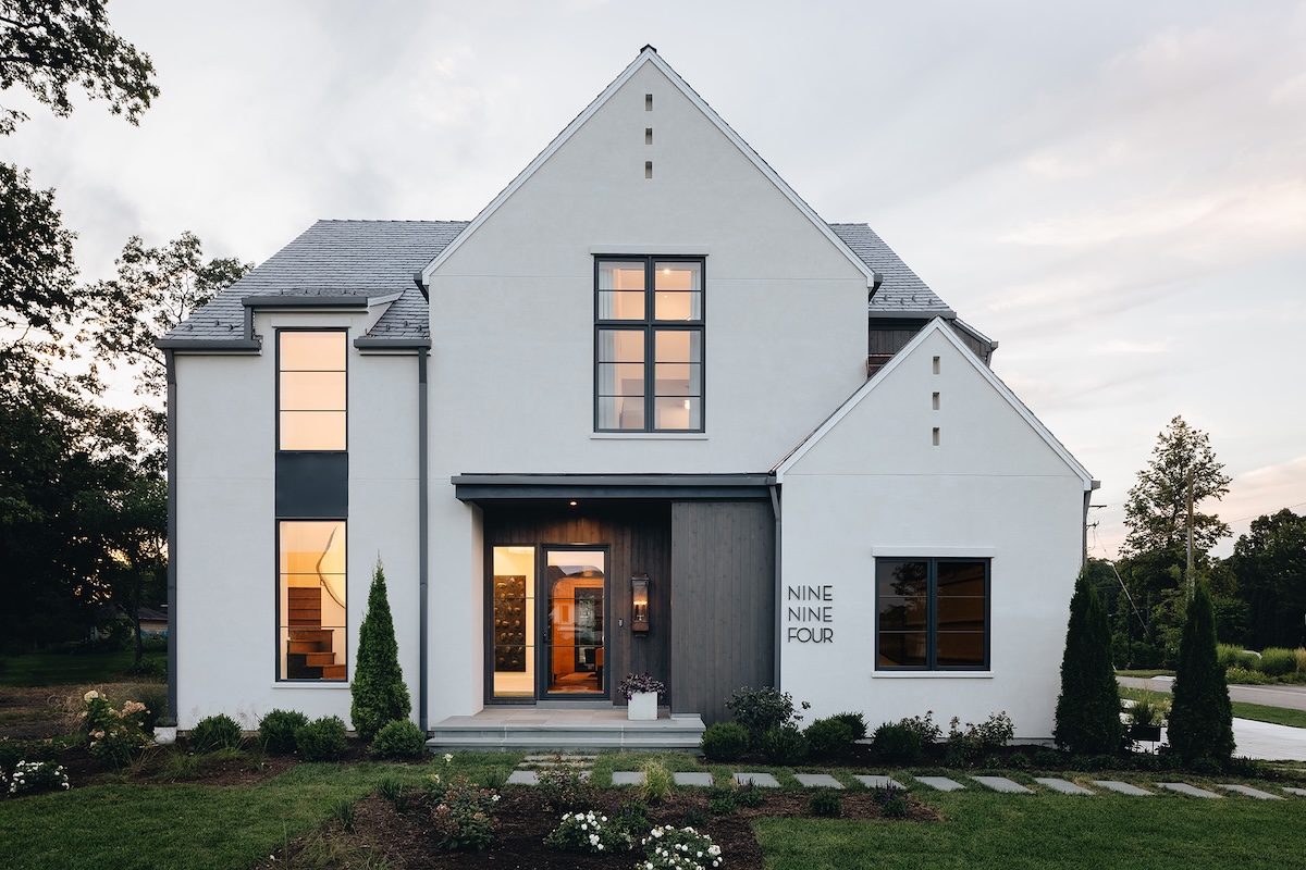
Contemporary house colors that appeal to many people aren’t flashy. They are natural, grounded, and welcoming. Kate Smith, color expert at Sensational Color, says: “Modern house colors for 2026 focus on earthy neutrals, such as clay, taupe, and soft sand; organic greens, including sage, olive, and forest; soft blacks and charcoals; warm whites, natural blues; and muted terracottas.”
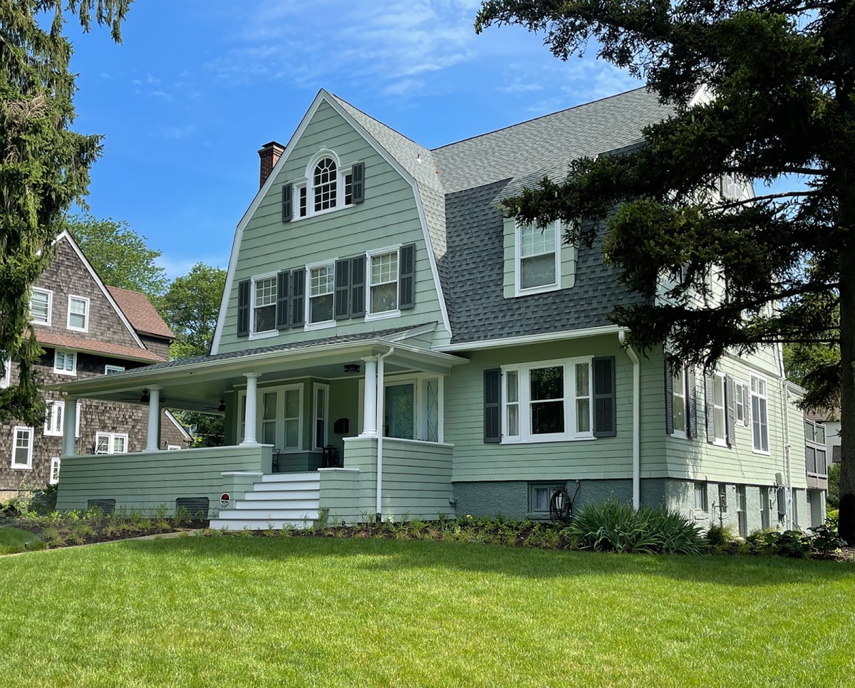
Color expert Amy Wax agrees. “Colors that are popular for today’s homes range from the understated to more saturated colors, both drawing attention to the style of the home. Accentuating the details with contrasting lighter trim, popular home colors are softer greens, lighter earth tones, and soft blue-grays. The darker colors being used today range from softer grays to richer charcoals and navy blues.”
2. “Contemporary or current colors tend to be cleaner.”
Among exterior house color ideas, not all earthy, soft neutrals are considered “modern” by color experts. What defines and differentiates modern colors, explains Wax, is that they are “colors [that] tend to be cleaner without the muddy undertones of a historic palette.”
Smith adds: “Modern colors are characterized by several key features: a connection to nature, a preference for authenticity over trends, and a focus on wellness, versatility, comfort, and individual expression.” This description may seem a bit abstract to a non-color nerd, but the purity of a color’s authenticity is what makes it modern.
3. “Black remains a popular choice” for window frames, as does white.
Beyond just the house color, there are the window frames to consider. Window frames painted a dark color can make the windows recede into the facade, while a lighter color can make the window become more of a focus.
“Black remains a popular choice for modern farmhouses and contemporary homes,” enthuses Smith. “Charcoal also creates high contrasts to light-colored exteriors. Bronze is a shade less harsh but still deep enough to look great with lighter exteriors. Other gray tones are another choice that looks modern. Putty and taupe complement most contemporary colors.”
Wax’s preferences lean toward lighter hues. “Popular window-frame trim colors are clean whites, off-whites and very pale grays, a great choice against the darker body colors,” says Wax. She recommends Benjamin Moore’s Chantilly Lace for a clean white, Paper Mache from Benjamin Moore for an off-white, and Drift of Mist from Sherwin-Williams for a very pale gray.
“The ones that I am picking most often are a deep ruddy red musket brown, a dark bronze, a light bronze, and then, like a linen color,” says Lisa Jenkins, Certified Architectural Color Consultant. She says those colors work for most styles of modern construction.
4. “The crisper and cleaner the white, the more ‘modern’ it is.”
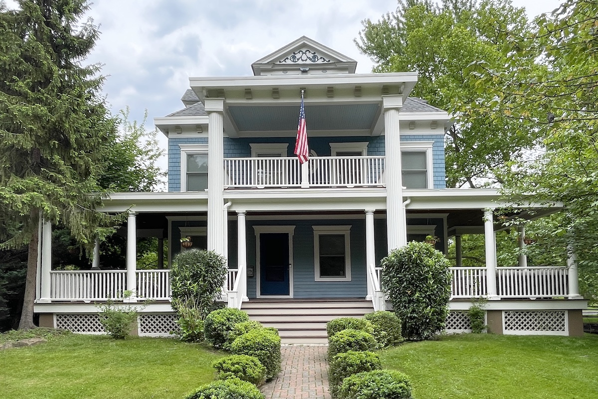
When it comes to exterior paint colors that don’t miss, white remains a top choice for homes among exterior house paint colors. But there are many more whites than you might imagine, and selecting the perfect white takes some strategy. I always use the back of a paint chip as a baseline so I can compare whites against a common, stark white. So what, exactly, is a “modern” white?
“Generally, a white that is clean and bright without leaning towards a creamy yellow or cool blue is your best choice if you are looking for a ‘modern’ white,” says Wax. “The crisper and cleaner the white, the more modern it is.”
Jenkins favors a particular white from Benjamin Moore: “Vapor is one of my favorite warm, creamy whites,” she says. “And, yeah, I love those blushy beiges, very 2026, on trend. And, you know, it’s a nod to the feminine.” For those who want a subdued exterior, Smith advises that “off-white shades reduce glare while having lower contrast and adding warmth.”
“The front door is the expression of the family who lives inside of it. In my world, you can color outside the lines a little bit on your
—Lisa Jenkins, certified architectural color consultant
front door.”
5. “Gone are the days of neon door colors.”
“Gone are the days of neon door colors as we embrace the more elegant hues for a front door,” says Wax. “Deep burgundy, a midnight navy blue, or even a hunter green gives off the elegance of a classic color palette, creating an inviting statement at your front entrance!” Wax recommends Bewitched from Benjamin Moore for deep burgundy, Sherwin-Williams’ Anchors Aweigh for a midnight navy blue, and Dark Hunter Green from Sherwin-Williams.
If you aren’t into richer saturated colors, Smith offers a few more modern choices. “Front door colors include shades that express personal style, such as green, blue, turquoise, red, plum, or purple,” she says. “Stain is another modern option as natural wood becomes popular on exteriors.”
Jenkins is fond of a midcentury modern palette. “And the easy way to do this is to put that avocado color on your door: Benjamin Moore Thicket,” she says. Beyond being true to the home’s style or just what’s considered contemporary, the entry door is the easiest part of the façade to update. Jenkins reminds us that “the front door is the expression of the family who lives inside of it. In my world, you can color outside the lines a little bit on your front door.”
6. “I’m a big fan of painting the door and the sidelites.”
If your entry door has sidelites, you have another set of color choices for the best exterior house color combinations. You could treat the sidelites and door trim as separate from the door. This is a typical painting scheme, just like inside a home when the trim is painted white and the walls are painted another color. However, you could paint the trim the same color as the door.
Jenkins is working on a 1910s Craftsman-style home that has entry door sidelites, yellow brick walls, and an historic preservation society to consider. So she chose to paint the door, sidelites, and trim the same color: Autumn Leaf. The copper rust color “makes the scale of the door bigger. This is a very big house, and the brick has some visual weight, so it just feels better, the streetscape looks better.”
7. “Always select colors that complement stone’s natural color cast and variations.”
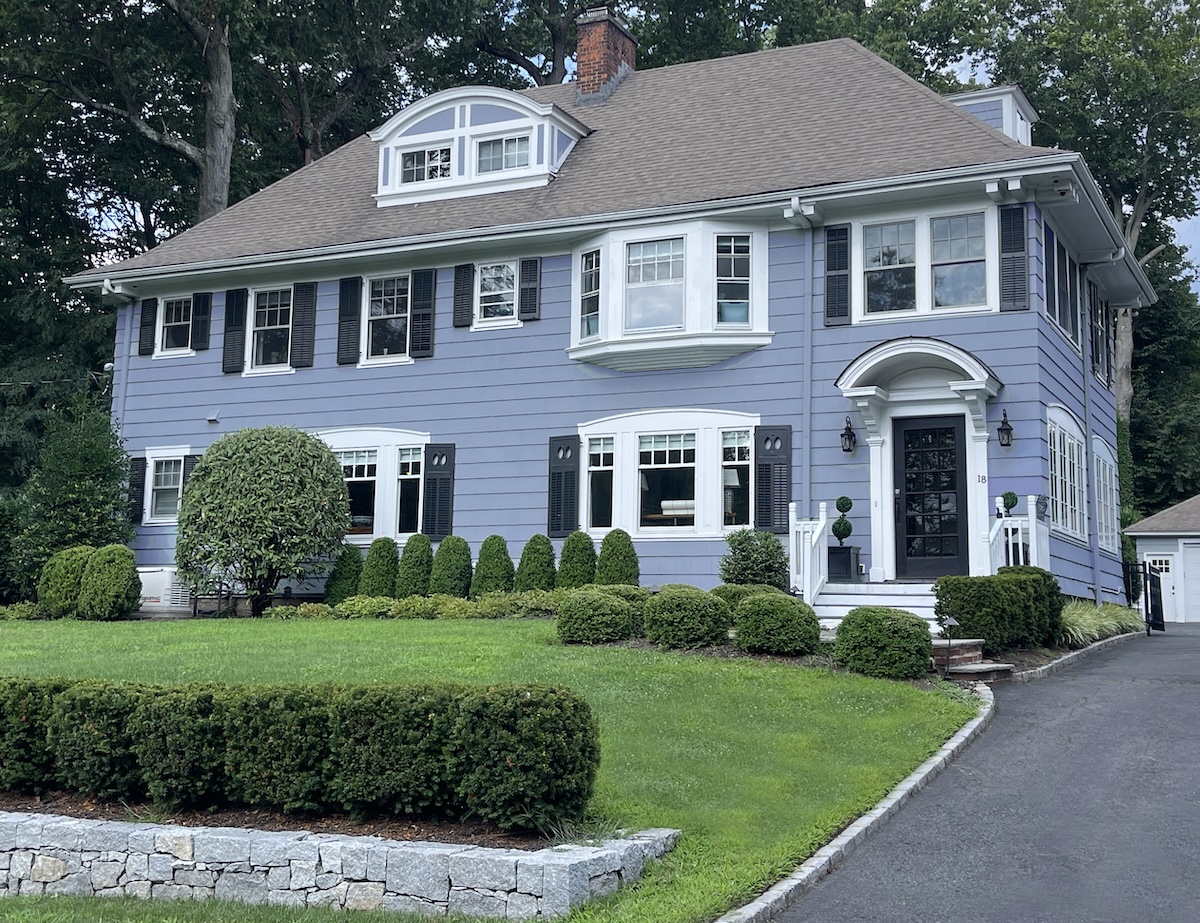
Fixed features like stone and brick are part of a house’s color palette. Sure, you could paint stone and brick, but it adds to the timeline, expense, and maintenance of the painting project. For modern colors that naturally go with stone, Smith advises homeowners to “always select colors that complement the stone’s natural color cast and variations…Warm off-whites, and earthy neutrals—gray, beige, and browns—are modern colors for stone exteriors, or a mix of stone and brick.”
Wax takes a keen eye to the colors in the stone. “To choose the best colors for your stone, look at the deepest colors within your stone palette: Darker grays, golds, cool or even warm grays can be the place to go to compliment the beautiful colors within your natural stone.” For a dark gray, she recommends Grizzle Gray from Sherwin-Williams; her go-to pick for gold is Benjamin Moore’s Dorset Gold.
8. “Earth tones complement brick without competing for attention.”
Brick is a traditional building material that often appears in historic properties, and in some contemporary homes as accents to a façade. Red brick is already a strong color and forces a harmonious modern house color scheme down a particular pathway. “Earth tones compliment brick without competing for attention,” says Wax. “Look at colors like wheat tones, warm grays, or pale colors in the terra cotta or brown family to embrace the natural brick color palette on your home.”
9. “One must respectfully and thoughtfully choose all colors for a historic home.”
Historic homes can be painted in contemporary colors, “because nature-inspired colors have been used historically and are excellent options,” says Smith. “One must respectfully and thoughtfully choose all colors for a historic home.” Usually the easiest way to achieve a modern look for an historic home is to pull the historic color palette for that era and then match it up with what’s modern right now. Sherwin-Williams offers an historic paint color collection that makes it easy.
“When I create a color palette for a home, my first consideration is the style and taste of the homeowners that live inside,” says Wax. “Creating a color palette to reflect their style, I will choose the perfect colors for their home whether it is a contemporary or historic home.”
10. “Pay attention to what the neighborhood has.”
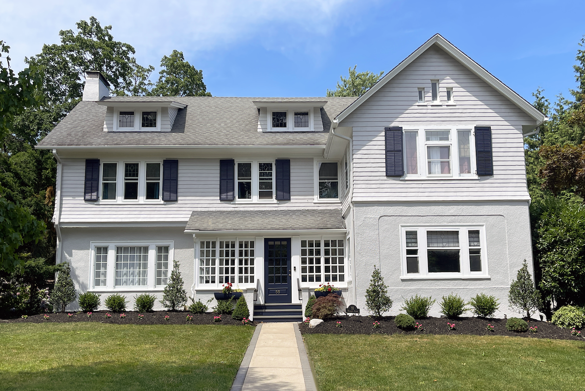
Whether you’ve lived in your home for a few days or a few decades, it’s a good idea to walk around the neighborhood and really look at your neighbors’ homes as a collection. Snap a picture of your home among the other houses so you can really get a good look at how the colors blend together.
“You might have a 1910s craftsman, a 1940s colonial, and then you have an infill of a 3½-story modern farmhouse, and then you have a midcentury modern so I try to pay attention to what the neighborhood has,” says Jenkins.
When you take a look around the neighborhood, you might discover color choices and details that would suit your house, too. There’s color inspiration for your home’s color everywhere.


