We may earn revenue from the products available on this page and participate in affiliate programs. Learn More ›
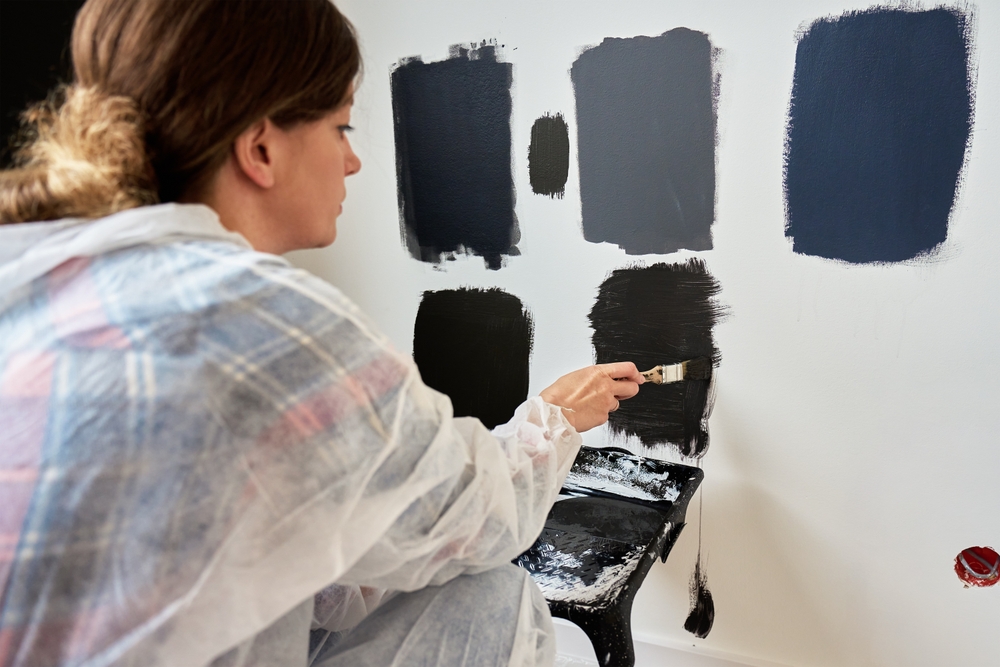
Dark, bold, saturated paint colors are trending again, and I don’t like it. A recent survey by Zillow of thousands of potential homebuyers found that most respondents prefer dark, bold paint colors found in nature, such as deep greens and blues, as opposed to pale neutral hues. We’re also seeing dark grays and browns, along with jewel tones like dark plum and burgundy. I am shocked by this trend and am concerned about this shift in preferred paint colors—and not just because of my own decorating decisions.
Two years ago, my family and I moved into a brand new home. We chose all light neutral paint colors, along with white and cream sofas, for a fresh, modern aesthetic. The intention with every one of our design choices was to create a homey, yet spa-like environment to call home. Dark paint colors seem like the antithesis of that vision. Here are the main reasons why I prefer a neutral color palette for interior walls throughout a home.
Neural colors provide versatility and timelessness.
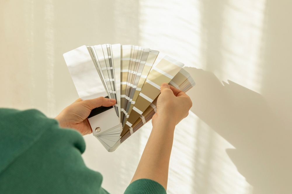
Neutral paints consisting of whites, beiges, and soft grays are safe choices. These colors go well with any type of pattern, color palette, or style (from traditional to ultra-modern), and can outlast a fad. While slapping on a fresh coat of paint when changing colors is doable, it still costs money, takes time and effort, and makes a mess.
I’d prefer to make the best choice up front and stick with classic neutral hues that can serve as a backdrop to any other decor elements I choose, such as furniture fabrics and accessories. I feel like the off-white walls throughout our house will last forever, minus a few touch-ups over the years.
They create a calm and relaxing atmosphere.
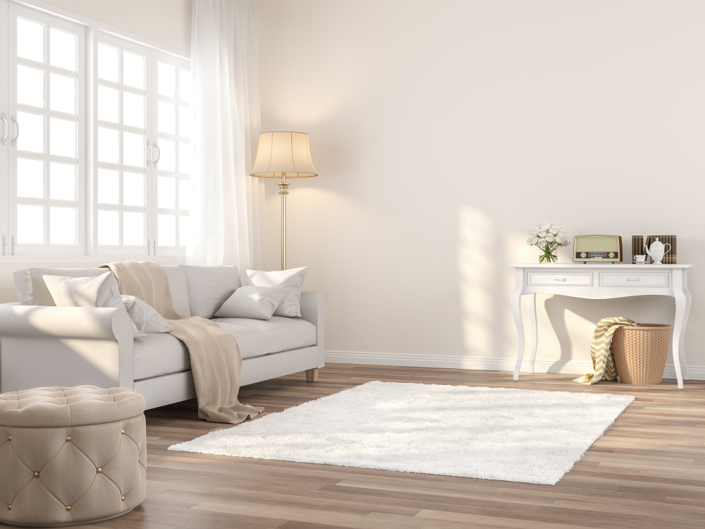
What I love most about neutral tones is that they can create a relaxing and peaceful environment, according to color psychology. We wanted to design our home to be a retreat from the stresses of daily life, so we appreciate how the soft walls evoke a feeling of tranquility throughout the various rooms. When I step back and look around the house, it feels clean and calm because of the off-white walls. A large part of that feeling is because there aren’t any major distractions, such as brightly colored walls exuding an energetic or what I would consider a chaotic vibe.
Light colors make a room feel spacious.
Light neutral colors can provide an illusion of ample space and really open up a room. This is especially beneficial for smaller rooms or those with limited natural light. Paint colors like soft whites, warm beiges, and greiges reflect light, which makes a room feel larger and more airy. When we enter a light-colored room, our eyes continue looking at the entire space instead of stopping to focus on a dark shade that would otherwise distract from the home’s architecture or even make the room feel smaller.
Neutral colors enhance décor to ease redecorating.
Neutral paint colors provide a blank canvas to highlight any type of decor throughout your home. They also help those accessories pop. You can get creative with fabrics, artwork, rugs, and other items while retaining the flexibility to swap out those colors and patterns over time without having to redo the entire room. Also, muted walls don’t compete with those colorful elements like bright wall colors might.
I can’t imagine painting a wall a bold color and then trying to find a roomful of decor items to match it. We also enjoyed adding some texture and interest to accent walls by installing wallpaper. With a neutral paint color on the wall, we had more flexibility to get creative with our wallpaper choices, which are more intriguing than any paint color.
Light colors brighten up a space.
Another interesting aspect of choosing neutral paint colors like white and cream is that they can maximize the impact of natural light, brightening up a room and making it feel more welcoming. This is particularly helpful in smaller areas or rooms that don’t get a lot of light. This works because lighter colors reflect sunlight beaming in from outdoors. I definitely notice this, especially living in sunny South Florida.
Light interior paint can reduce energy bills.
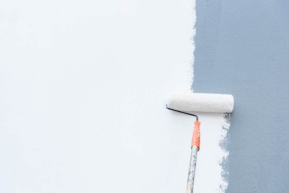
Speaking of living in Florida, it gets quite hot, especially in late spring, early fall, and during the summer. I recently learned that lighter paint colors reflect more light and can keep a space cooler, while dark paint colors absorb more light and raise the temperature. This means that choosing a lighter paint shade can help a room feel cooler, so you can run the air conditioner less and ultimately reduce the energy bill.
Neutrals appeal to potential buyers.
Even though the Zillow survey shows that homebuyers today are more interested in dark, bold colors, in the long-term that trend will likely fade. Ultimately, it will be easier to have neutral paint colors on the wall if you try to sell your house. As many realtors will agree, neutral paint colors are generally more appealing to a wider range of people, as they can more easily envision themselves living in the space or adding paint to a light wall. One wrong paint color can really turn someone off; I know that was the case for me when I was shopping for a new home.