We may earn revenue from the products available on this page and participate in affiliate programs. Learn More ›
Extreme Makeovers on Modest Budgets
Your house may still be rough around the edges, but with vision, willpower, and sweat equity, you can transform that fixer-upper into the house of your dreams. Fortunately, thanks to the internet, inspiration is always right at your fingertips, in the photos and narratives of bloggers and homeowners across the country who have taken drab or dated spaces and turned them into something truly special.
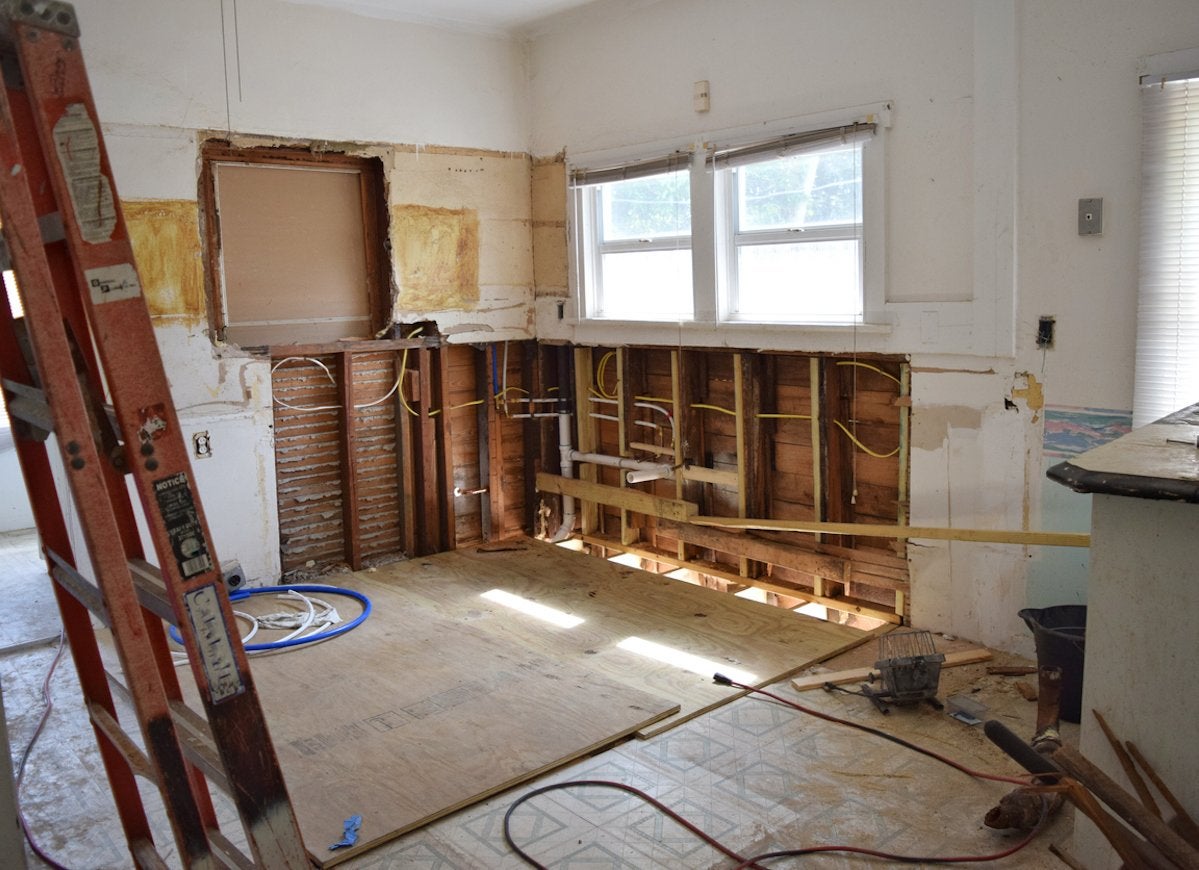
Small Kitchen: Before
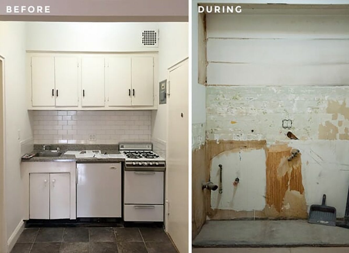
Cramped, narrow, and outdated—three words you never want associated with your kitchen. Yet that’s what Kate Meagher and Arthur Liu had to work with. So they hired Sweeten, a free service that matches eager renovators with local contractors.
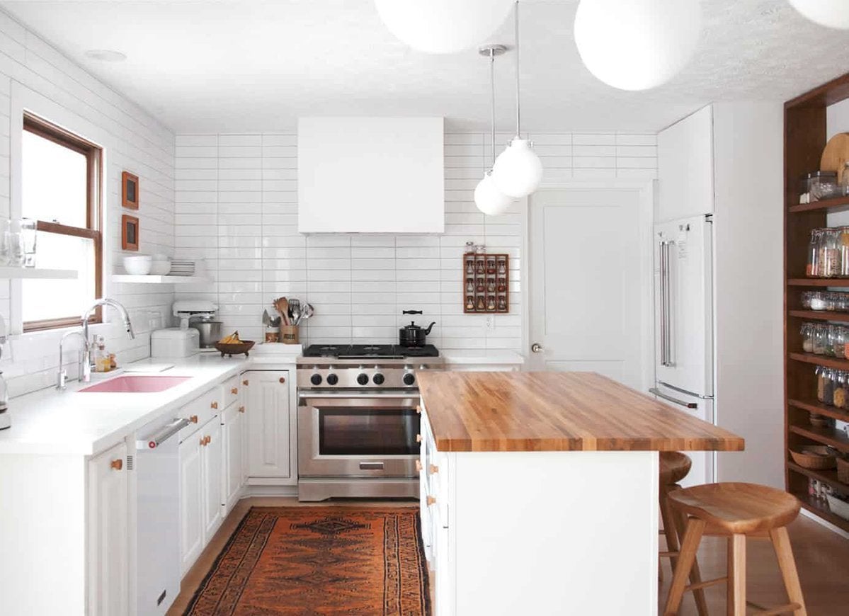
Small Kitchen: After
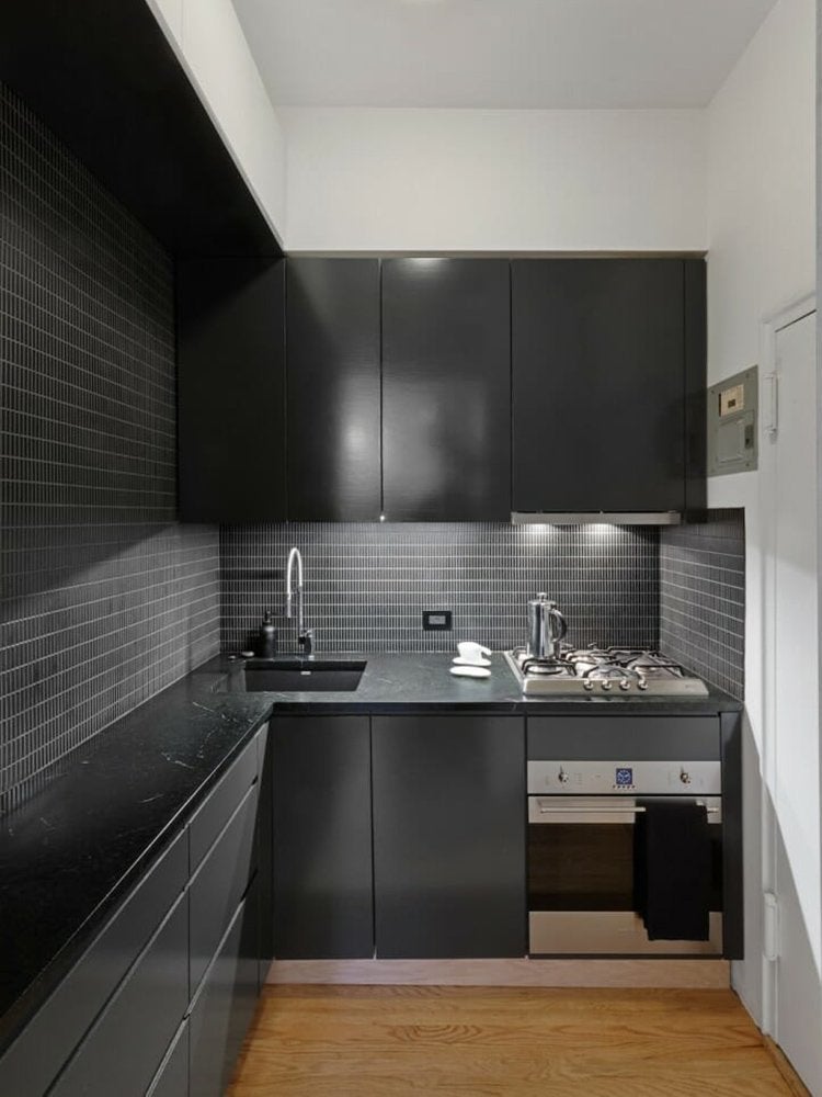
The kitchen was reconfigured into an L shape to provide more work space while preserving original details, including the door frame. Contemporary appliances, black cabinetry, and a minimalist backsplash of matte black tile complete the transformation.
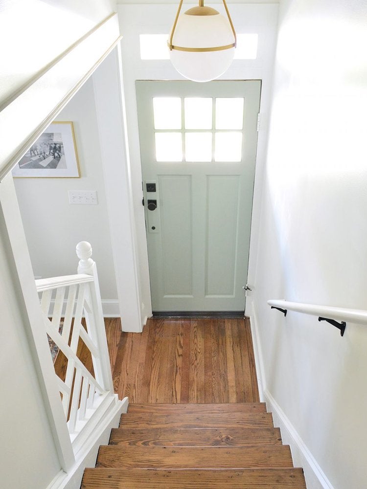
Entryway Expansion: Before
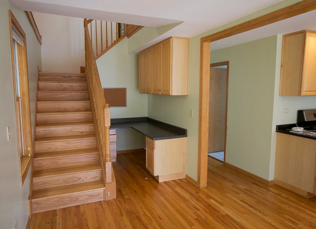
Casey and Finn, who blog about their Chicago reno projects at The DIY Playbook, were thrilled to have finally bought a house, but they weren’t as thrilled with the staircase swathed in orangey oak. An office wedged in alongside the stairs added to a generally cramped look. They just knew there had to be a better, more attractive use of this space.
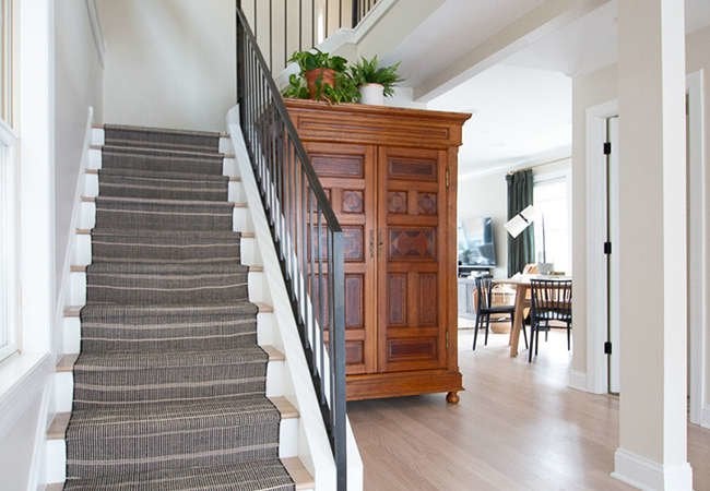
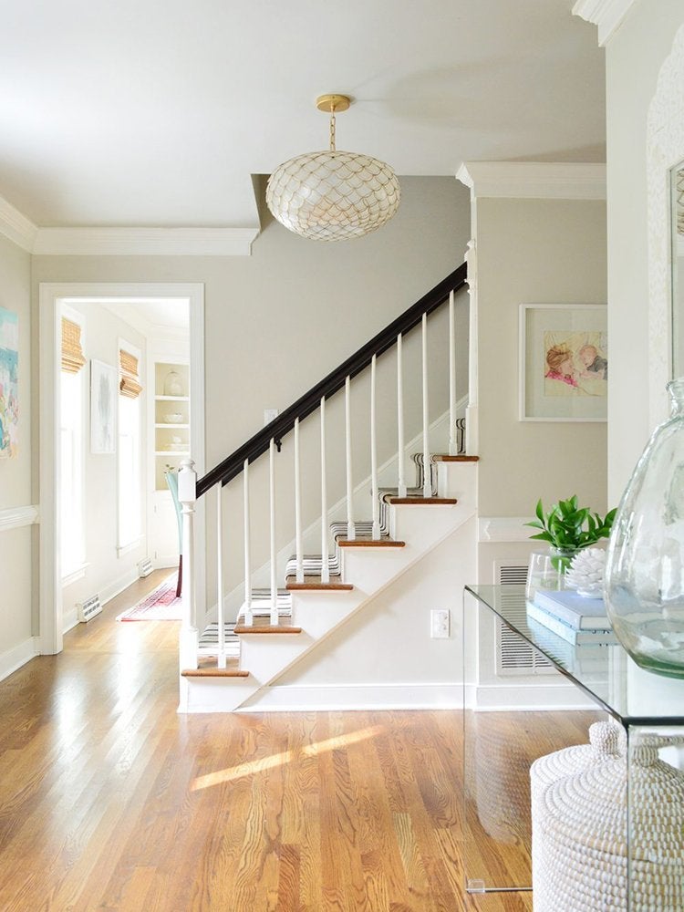
Entryway Expansion: After
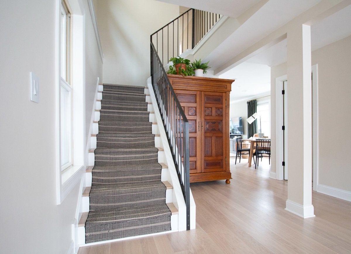
The couple removed the dated oak trim and flooring, and took out a wall to open up the space. Add in the magic effects of white paint—in this case, Ballet White by Benjamin Moore—and the formerly awkward space becomes light and airy.
Outdated Kitchen: Before and After
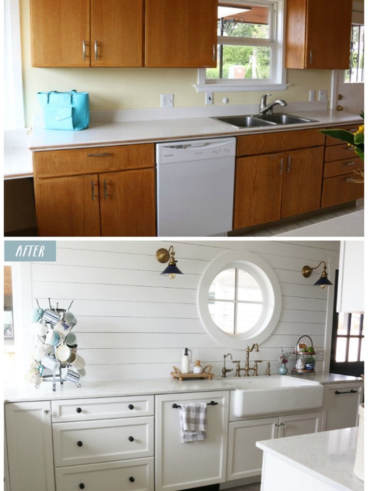
Though the flat brown cabinets and stark countertop of this Seattle kitchen screamed “blah,” Melissa, the blogger behind The Inspired Room, loved the cottage-like intimacy. Her goal was to inject a little personality without losing the cozy character of the space—and she succeeded in spades! The drab little kitchen got a total face-lift, with white shiplap walls and white cabinetry standing in sharp contrast to the black knobs and drawer pulls and the Dutch blue door and lampshades. A round window reminiscent of a ship’s porthole completes the beachy look.
Updated Foyer: Before
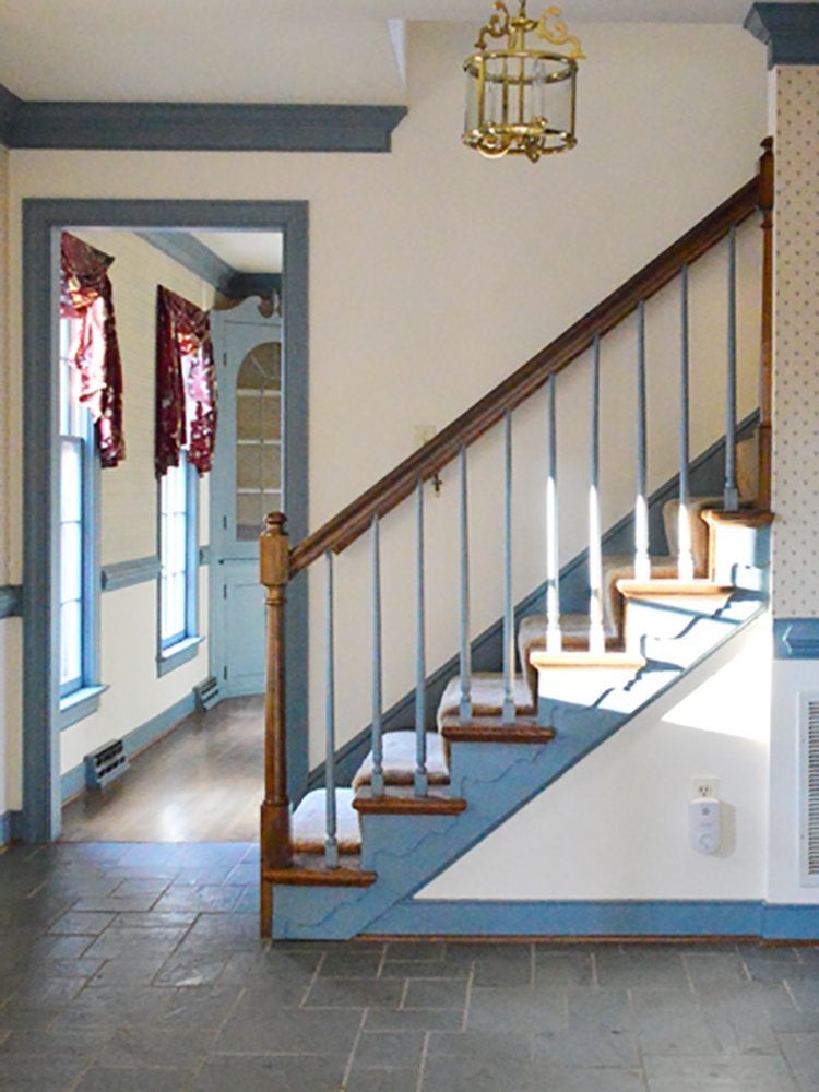
John and Sherry of Young House Love have fixed up five homes and had two kids, but their latest project may be their favorite. The colonial-style brick home was in a great neighborhood, but the house itself had a few drawbacks, including a foyer that was dressed up in dated wallpaper and an abundance of blue trim.
Updated Foyer: After
By stripping the wallpaper and coating the walls and trim in complementary off-white hues, the couple opened up the space without having to take on major reconstruction. Wood floors replaced the old slate tiles, making the sleek metamorphosis complete.
Hallway TLC: Before
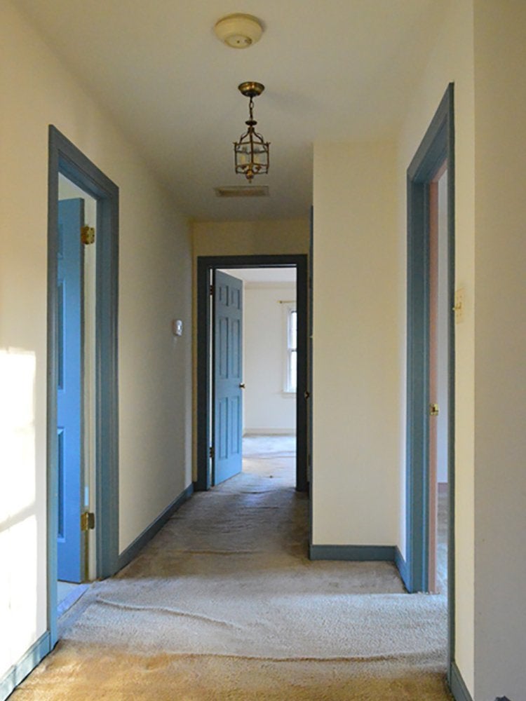
Lumpy old carpeting made the upstairs hallway in John and Sherry’s Virginia home look dingy and unloved, and the too-small light fixture and old-fashioned color scheme of cream and Wedgwood blue didn’t help much.
Hallway TLC: After
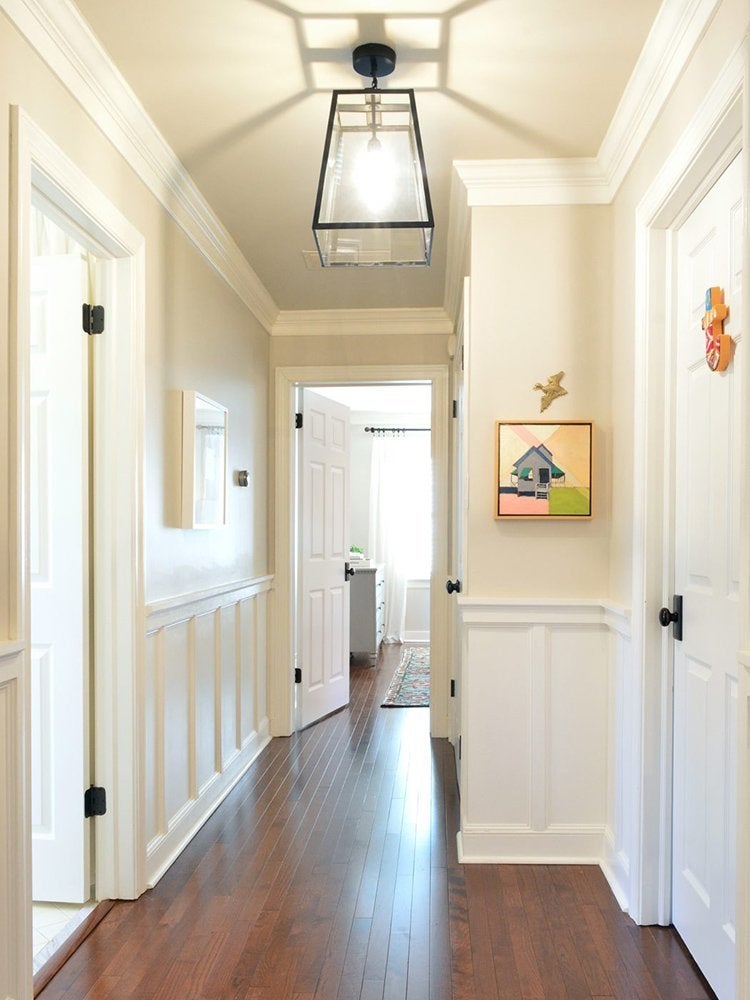
Away with the rumpled carpets! In their place, the couple laid a dark-toned wood floor. Wainscoting and crown molding add character and dimension, and creamy white walls and a larger, more modern ceiling fixture make the space brighter and lighter.
“Ugly Duckling” Duplex: Before
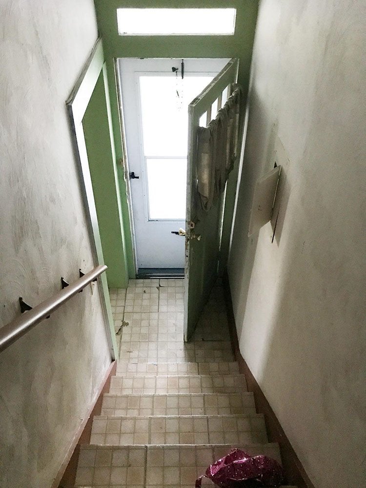
In a different project, which John and Sherry dubbed their “ugly duckling” duplex, the couple had to all but gut the property to bring it back to life. In the renovation, the cramped, narrow entryway, painted in drab shades of taupe and green, experienced a particularly dramatic reinvention.
“Ugly Duckling” Duplex: After
By widening the entrance into the living room, the Young House Love bloggers breathed new life into the dark foyer. With the airy railing, new wood floors, and a trio of Sherwin-Williams paints (gray Oyster Bay for the door, Spare White for the walls, and Extra White for the trim), the stairwell bears almost no resemblance to its former self.
House Flip: Before and After
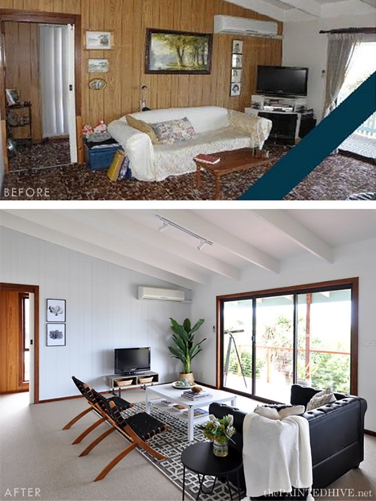
Kristine, the blogger at The Painted Hive, was in the unenviable position of having to flip her grandmother’s incredibly dated-looking house. But even if your situation isn’t quite so fraught, you can take some useful lessons from her experience. Given the tight budget and tight timetable, Kristine focused on decluttering and updating the interiors. That way, she could give potential buyers a sense of the home’s potential without having to shell out for major renovations. Fresh paints (Natural White and Gray Pail by Dulux) strike a crisp note, and the room got a further injection of light when Kristine removed the security screens from windows and sliding doors. Contemporary furnishings, many of which came from Kmart, lend sophistication and make the room seem larger.
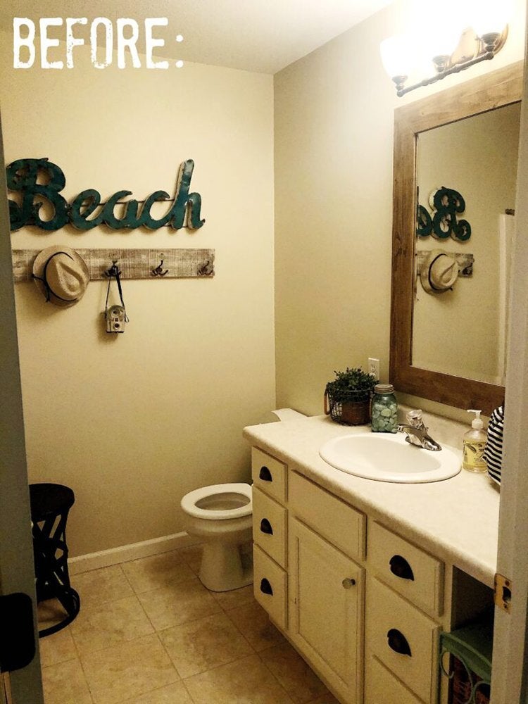
Bathroom for Two: Before
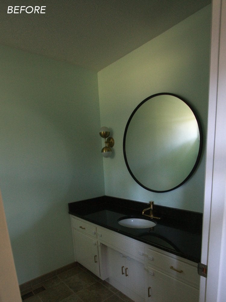
Bathrooms should be inviting, not terrifying. Yet Laura, staff writer at A Beautiful Mess, had learned to avoid her tiny, dark, and sometimes moldy master bathroom—the room that time forgot. Finally, however, she became fed up with the dark brown tile, black countertops, and the general cave-like feeling of the room. She decided it was time to renovate and to blog about the project.
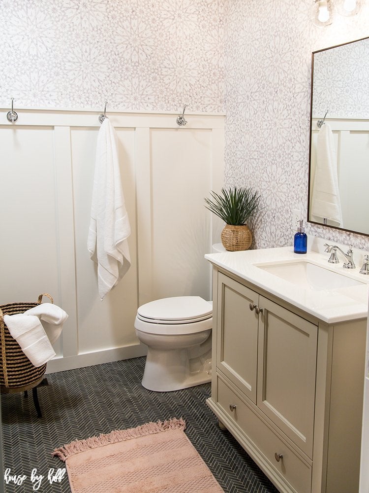
Bathroom for Two: After

White cabinets, countertop, and flooring, paired with pale pink walls (Morning Blush by Ecos Paints), bring light and the illusion of space into this small room. By choosing a wall paint with just a tinge of color, Laura added visual interest without sacrificing any brightness. A vanity with double sinks and plenty of storage makes the bathroom easier for two to share.
1980s Kitchen Redo: Before
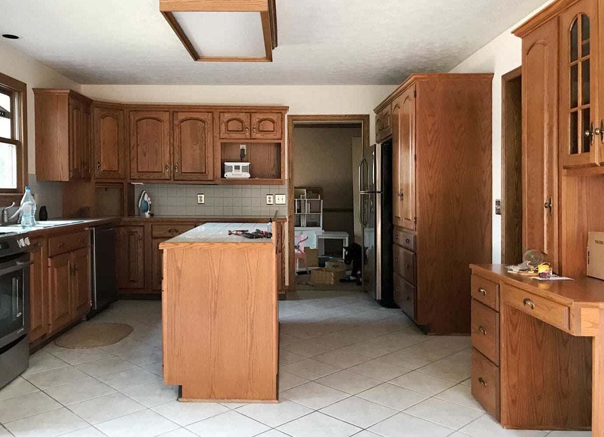
The kitchen of your dreams may be hiding under heavy wood cabinets and gray tile floors. Mandi, a contributing blogger at A Beautiful Mess, saw the potential in this “odd-looking ’80s home” and got to work, ripping out the cabinetry and posting step-by-step photos on the site.
1980s Kitchen Redo: After
No more dark, dilapidated cabinets! In the reborn kitchen, bright white cabinets, countertop, and wall tiles are warmed up by the unpainted wood of the kitchen island, bar stools, and open shelving unit. A variety of tone-on-tone textures, including the glossy white subway tiles, add visual depth and interest.
Guest Bathroom Makeover: Before
When the reno bug bites, the guest bathroom is often overlooked. That’s why April, blogger at House by Hoff, was primed for action when the New Year New Room Refresh Challenge rolled around. Finally, it was time to punch up her least favorite room in the house, her boring beige powder room.
Guest Bathroom Makeover: After
April started by ripping out the drab old vinyl floor and replacing it with an of-the-moment herringbone-patterned tile. A board-and-batten wall provides a classic touch and a lovely backdrop for a trio of hooks, and easy-to-install removable wallpaper (Tangier Moroccan Sand by Spoonflower) in a subdued shade adds personality without disturbing the room’s calm aesthetic.
Hallway Refresh: Before
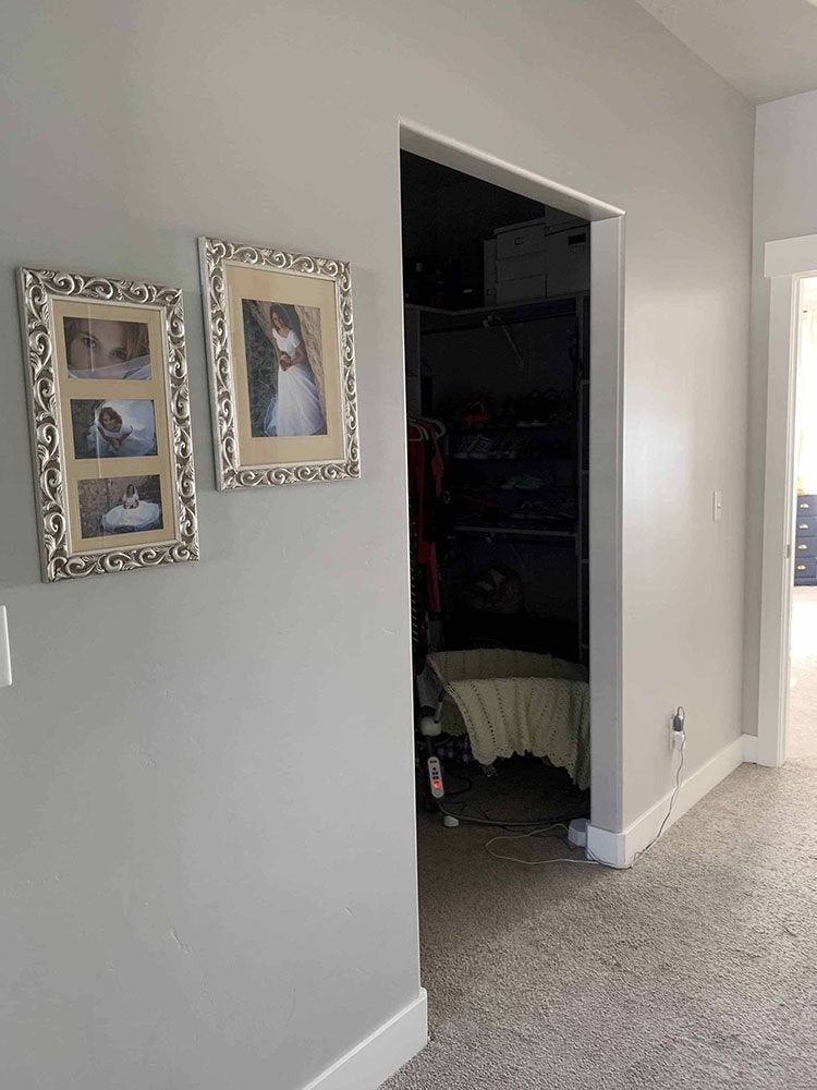
While you can avoid a less-than-inspiring room, a tired-looking hallway is a constant eyesore, even if it’s seen only by your family. Every time Heidi of Honeybear Lane walked past her hodgepodge closet, she noticed the hallway’s lack of style—and the closet’s lack of a door. The wide expanse of unrelieved gray wall didn’t help the situation.
Hallway Refresh: After
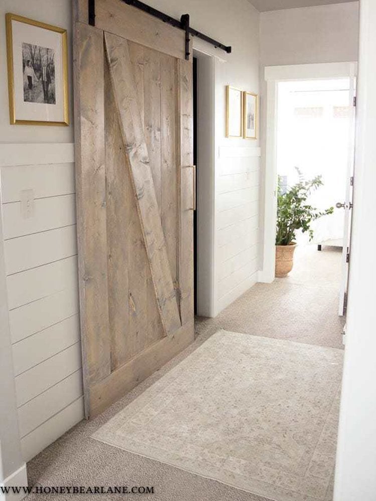
A sliding barn door was the perfect solution, adding beauty and distinction without impinging on the narrow passageway. Handy Heidi built the door herself and hung it using hardware purchased on Amazon. A course of shiplap paneling brings dimension to flat drywall.
Entryway Flow: Before
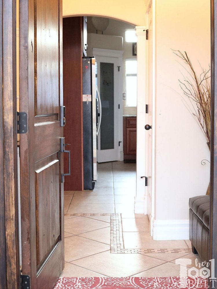
Sometimes, you need to add a wall to improve flow. At least, that’s what Amy, the blogger at Her Tool Belt, decided. Her home’s open entryway didn’t provide a functional foyer; instead, it just led straight into her kitchen and living space. Outdated tile floors and dried foliage contributed to the haphazard atmosphere.
Entryway Flow: After
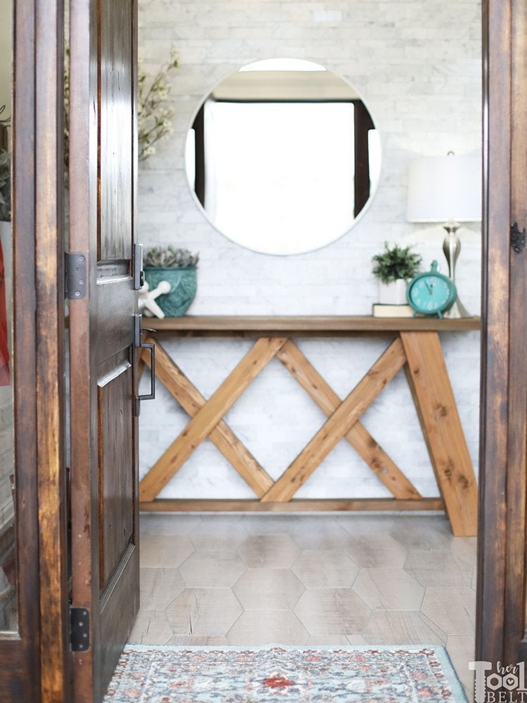
April walled off the space to create an official foyer as well as a grand entrance to the living area to the right. Though she initially planned on having the front door open onto a wainscoted accent wall, Amy ultimately went for marble tiles that add tone-on-tone texture as well as light. A smart choice for such a heavily trafficked spot, wood-look porcelain tiles in a gentle gray cover the floor.
Laundry Room Joy: Before
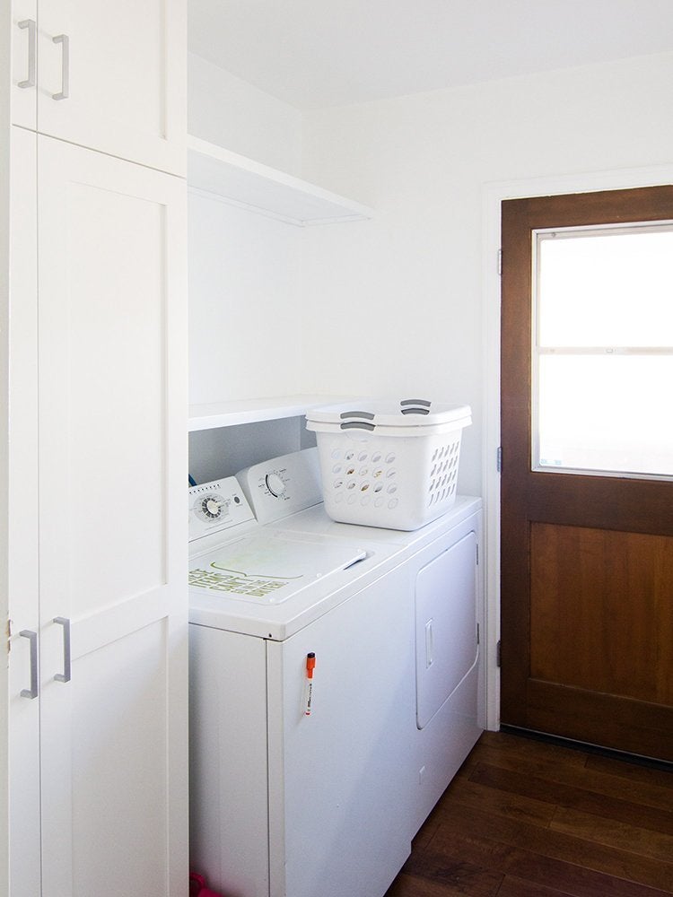
Laundry day is now a source of joy for Sarah, the blogger behind Sarah Hearts, but it wasn’t always so pleasant. The white-and-wood laundry room was a bit of a downer—but it was also the perfect blank slate for an imaginative redesign.
Laundry Room Joy: After
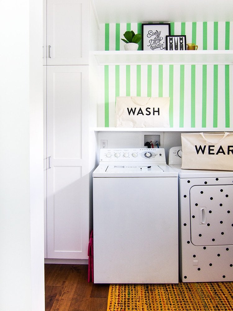
All those white surfaces turned out to be an ideal backdrop for green striped wallpaper and a polka-dot-patterned dryer. If you’d like to add similar whimsy to your appliances, just grab some removable vinyl stickers and get to work.
Home Office Clarity: Before
There was nothing wrong with Heidi’s home office, but there was nothing special about it either. The Honeybear Lane blogger saw potential in this functional-yet-uninspiring craft room, and she was particularly keen on concealing all her creative clutter.
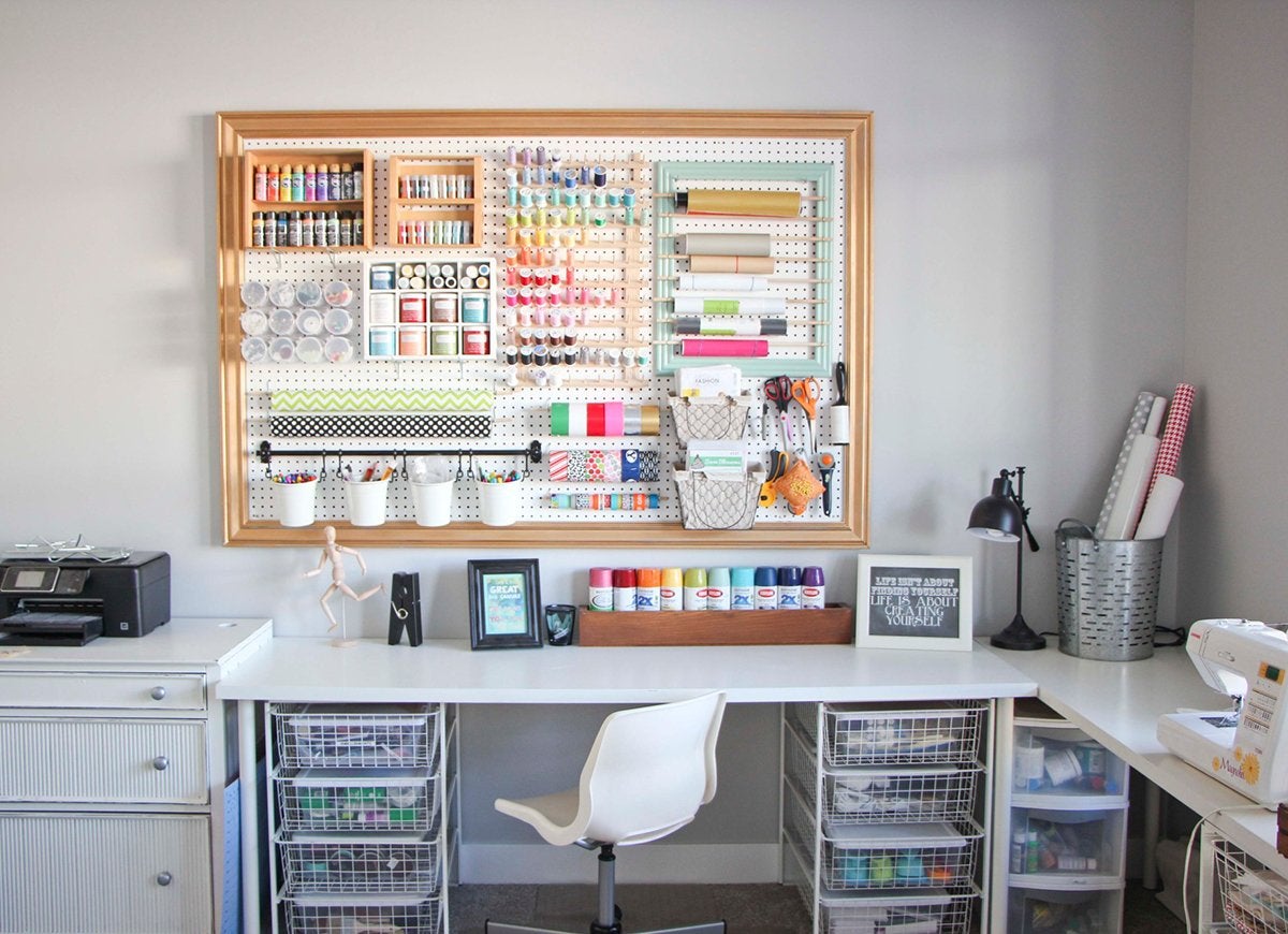
Home Office Clarity: After
An expansive built-in storage unit maximizes display space while also hiding clutter. Heidi bumped up the elegance factor by painting the shelves a deep gray-blue (Benjamin Moore’s Cheating Heart, to be exact). She also ripped out the old carpeting and replaced it with laminate in an ash finish.
Great Room Built-Ins: Before
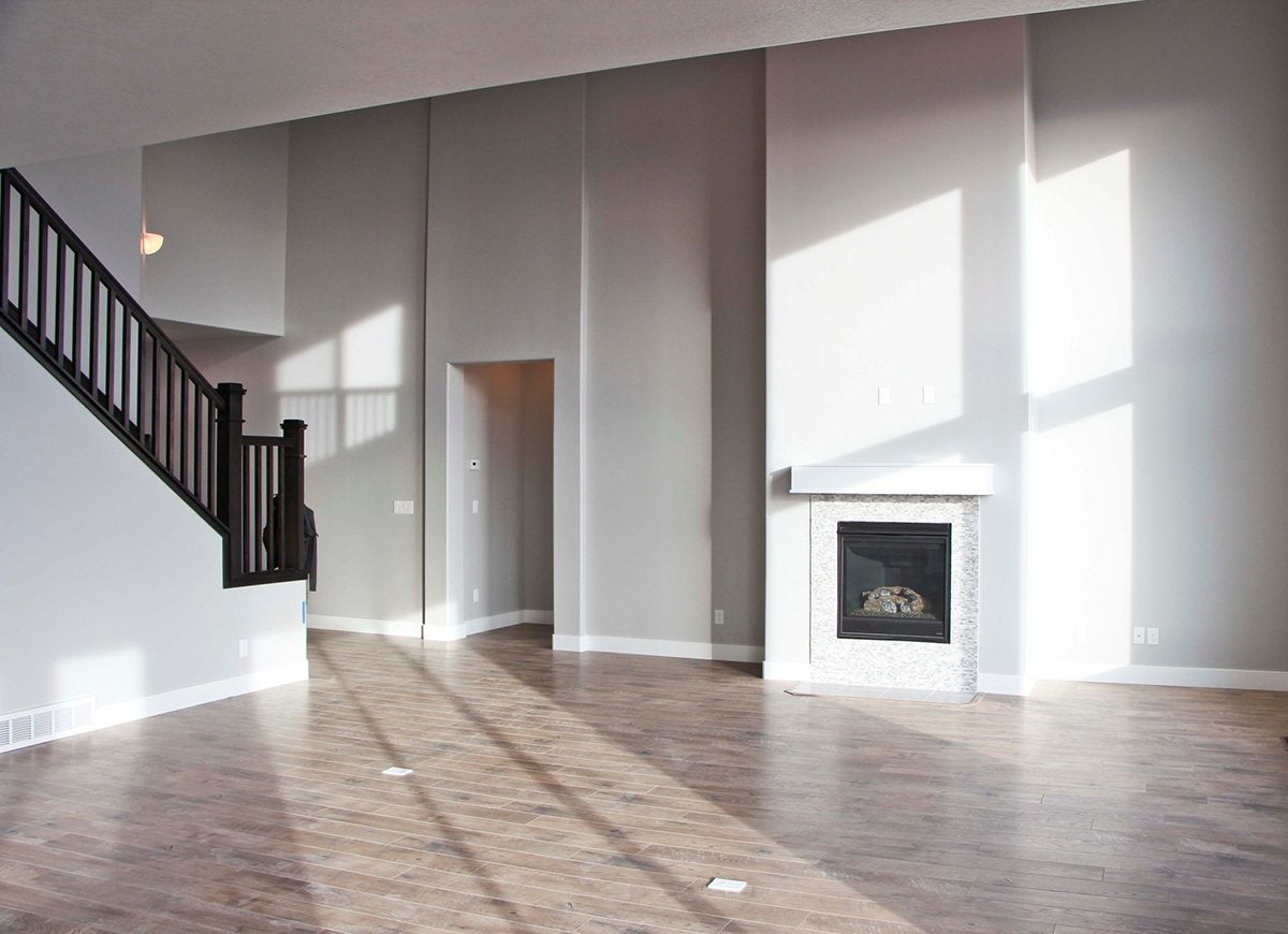
Moving into a new home can be daunting—and exciting. Heidi of Honeybear Lane was faced with a spacious but characterless living room that needed good doses of function and personality. The solution? She designed and installed custom woodwork throughout the space. By doing the work herself, she spent only $1,080, saving many thousands of dollars.
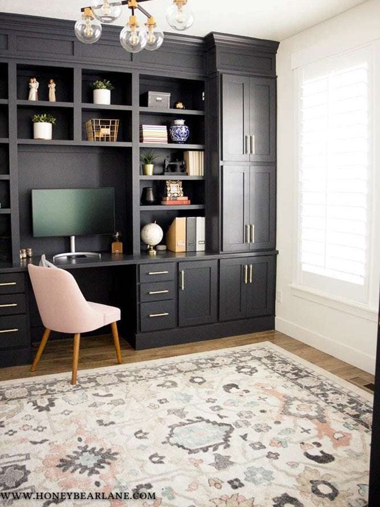
Great Room Built-Ins: After
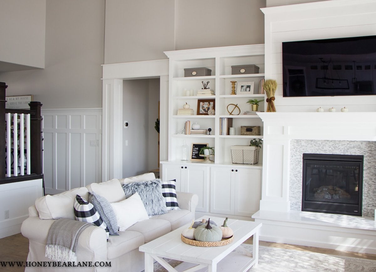
While Heidi admits that her homemade shelves aren’t 100 percent flawless, she notes that because she did it herself, “the mistakes are really only noticeable to me.” In addition to built-in bookshelves, Heidi installed white wainscoting and a classic mantel around the fireplace, architectural details that make the large space feel both more formal and more intimate.