We may earn revenue from the products available on this page and participate in affiliate programs. Learn More ›
Choosing the perfect paint color can completely transform your home, and the trend in neutral color palettes continues to evolve beyond basic beige and gray, embracing subtle undertones that add depth and character to any room. Plus, neutral paint colors are a timeless choice for creating sophisticated, adaptable spaces.
According to Elizabeth Vergara of Vergara Homes, Design and Construction: “Neutral paint colors in 2025 are all about versatility and creating a sense of calm. They serve as a subtle backdrop, allowing textures, furnishings, and accents to take center stage.”
Neutrals play perfectly with accent colors: try pairing them with rich emerald, warm terracotta, or golden yellow to create dynamic, personalized spaces that still feel cohesive and balanced.
Whether you’re looking to refresh your living room or create a calming bedroom retreat, these expert-selected neutrals offer the perfect balance of warmth and versatility. While these colors often look beautiful on walls, many can also be used on kitchen cabinets for a fresh, updated look.
Pro tip: For the best results with any of these colors, make sure you’re using high-quality interior paint that provides good coverage and a lasting finish.
Here are our top picks for the best neutral paint colors that will define home interiors in 2025.
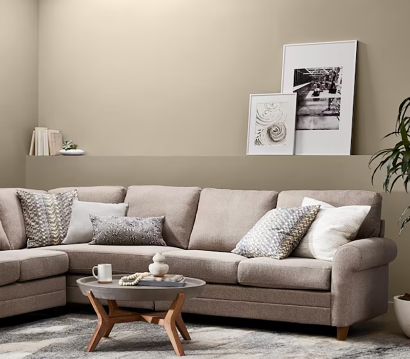
1. Adirondack Path, Valspar
This versatile brown works beautifully with natural materials like wood and stone, making it perfect for creating organic, nature-inspired spaces.
George Crew, a principal painting contractor with Chicago Paint Crew, explains why this color stands out: “Known for its soft earthy greige, Adirondack Path is a balance of warm and cool tones, one that is very versatile. Its understated elegance combines to bring a grounded, welcomed feeling for living rooms, bedrooms or entryways.”
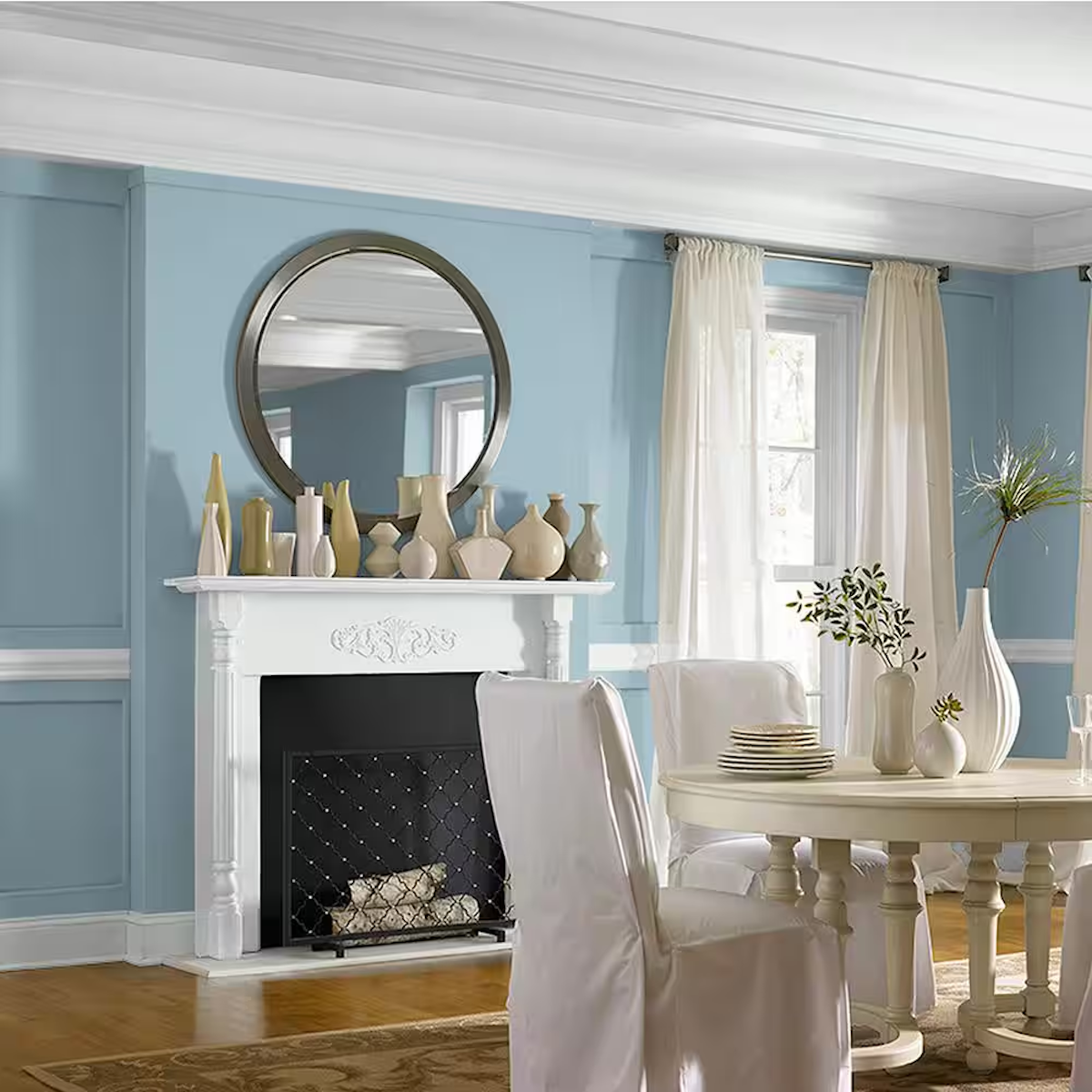
2. Blue Opal, Glidden
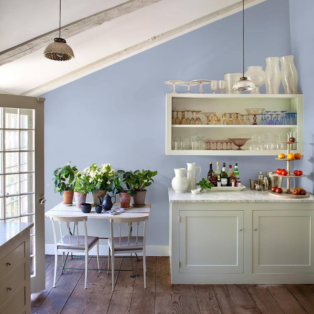
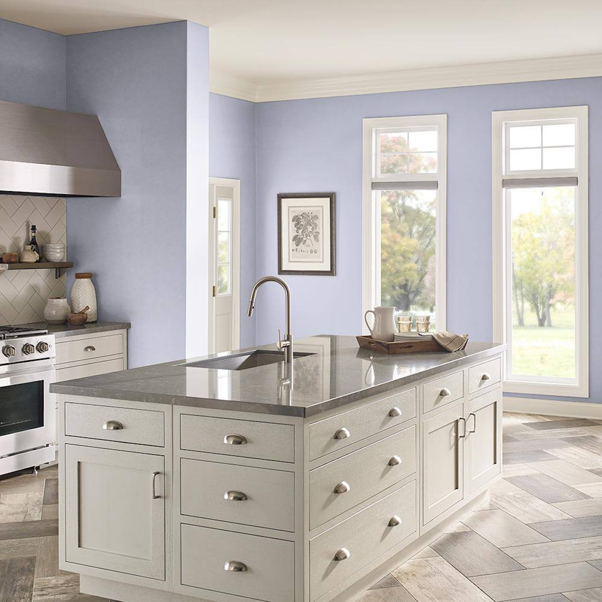
This subtle, sophisticated light blue represents the growing trend toward modern home interior colors that blur the line between neutral and colorful. Blue Opal offers a barely-there hint of blue that reads as a neutral, making it a great choice for those wanting to experiment with color while maintaining a serene atmosphere. Its versatility makes it perfect for bedrooms, bathrooms, or any space where you want to create a calm, cooling effect.
3. Essential Gray, Sherwin-Williams

This sophisticated gray has emerged as one of the most popular modern paint colors for 2025.
“Essential Gray is an earthy mid-tone warm gray that has more depth to it than the grays we’ve been seeing in the past few years,” notes Trina Rogers, color consultant for Five Star Painting of Temple, a Neighborly company. “That little extra warmth in it creates a gray that is more inviting to the current trends in home interiors.”
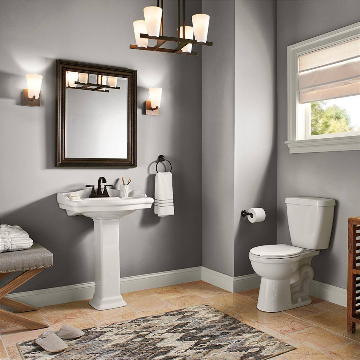
Essential Gray pairs beautifully with metallic accents and creates an ideal backdrop for both modern and traditional furnishings, making it perfect for contemporary spaces. It’s also a great choice for basements, where its warm undertones help create a welcoming atmosphere even in below-grade rooms.
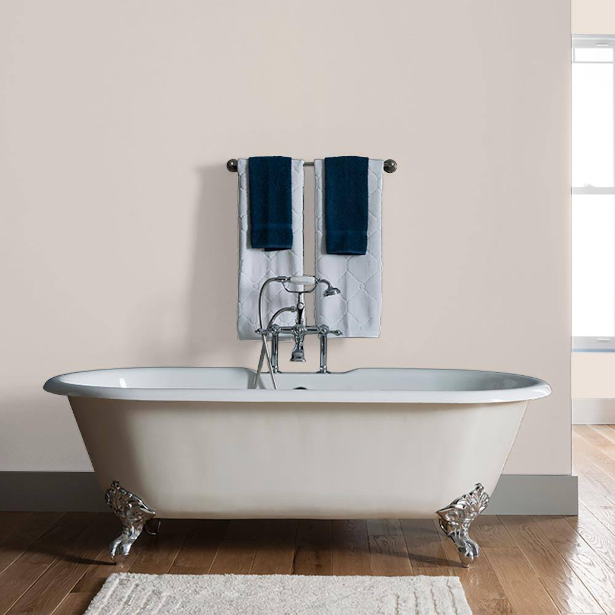
4. Commercial White, Glidden
Commercial White from Glidden is a clean and versatile neutral interior paint color that proves that not all white hues are created equal. This sophisticated color sits between pure white and greige, offering enough warmth to feel welcoming without becoming too beige. It’s a great choice for brightening spaces while maintaining depth and visual interest, making it especially useful in rooms with limited natural light or as part of a warm neutral color palette.
5. Fashion Gray, Behr
This modern take on classic gray shows how neutral coloring can be both sophisticated and inviting. Behr’s Fashion Gray strikes an ideal balance between warm and cool undertones, making it a versatile choice for many different design styles. Its medium depth provides enough contrast to highlight architectural features and moldings while maintaining a subtle, refined presence that works well in both traditional and contemporary settings.
6. First Frost, Glidden
This ethereal hue shows how modern paint colors can push the boundaries of traditional neutrals. Behr’s First Frost introduces a subtle blue undertone that reads as an atmospheric neutral, similar to the color of early morning mist. While technically a blue, its muted quality allows it to function as a sophisticated neutral base that’s particularly effective in spaces where a serene, cooling effect is the goal. It pairs beautifully with both warm and cool tones, making it an adaptable choice for neutral paint combinations in most any room of the house.
7. Foxglove, Behr
This very subtle mauve demonstrates how a contemporary neutral can incorporate gentle hints of color while maintaining versatility. Vergara says that colors like Foxglove “inject a modern yet understated elegance without overpowering the room.” It’s particularly effective in bedrooms or dining rooms where you want to create a soft, sophisticated atmosphere with just a touch of warmth.
8. Freshly Baked, Valspar
This warm, creamy neutral exemplifies the modern approach to beige paint colors, offering subtle depth that elevates it beyond basic beige. It’s part of a new wave of warm neutral color living room options that create an inviting atmosphere without feeling dated. The color’s gentle warmth makes it particularly suitable for spaces where you want to encourage relaxation.
9. Icelandic, Sherwin-Williams

This sophisticated hue demonstrates how some colors can bridge the gap between neutrals and statements. With its subtle light blue undertone, Icelandic by Sherwin Williams creates a unique atmosphere while maintaining the versatility of a neutral. The color adds a touch of unexpected sophistication to a space while still functioning as a reliable backdrop for design styles that range from modern to traditional.
10. Insightful Rose, Sherwin-Williams

This sophisticated take on pink demonstrates how neutral color palettes can incorporate subtle color and warmth while maintaining versatility and sophistication.
“Sherwin-Williams Insightful Rose is a lovely pink with a gray undertone, giving it a soft, dusty rose appearance,” explains Rogers. “This is a beautiful choice if you love pink but are looking for something with a bit more of a subdued and organic aesthetic.”
11. My Alibi, PPG
As modern neutrals continue to evolve, this sophisticated offering proves that light beige paint colors can be anything but boring. My Alibi by PPG Paints offers a perfect balance of warmth and lightness, creating an inviting atmosphere while maintaining a contemporary feel. It’s particularly effective in spaces where you want to create a welcoming environment without choosing a color that’s overwhelming.
12. Natural Linen, Sherwin-Williams

Natural Linen by Sherwin-Williams is an excellent choice for creating a warm environment in a space where comfort is key, and is particularly suitable for kitchens. “Natural Linen is one of my favorite beiges. It is modern, bright, and has very subtle warmth,” says Rogers. “It is a perfect choice if you want to keep a light and neutral backdrop in your home without going white.”
Crew adds: “The creaminess of this beige tone makes it inviting in either traditional or modern setting.”
13. Olympus White, Sherwin-Williams

Olympus White has emerged as a standout choice in the white-neutral category. This refined paint color carries subtle undertones that shift throughout the day, creating visual interest while maintaining the clean and sharp qualities of a white paint. It’s particularly effective in spaces where you want to maximize light reflection while adding more depth than a pure white would provide.
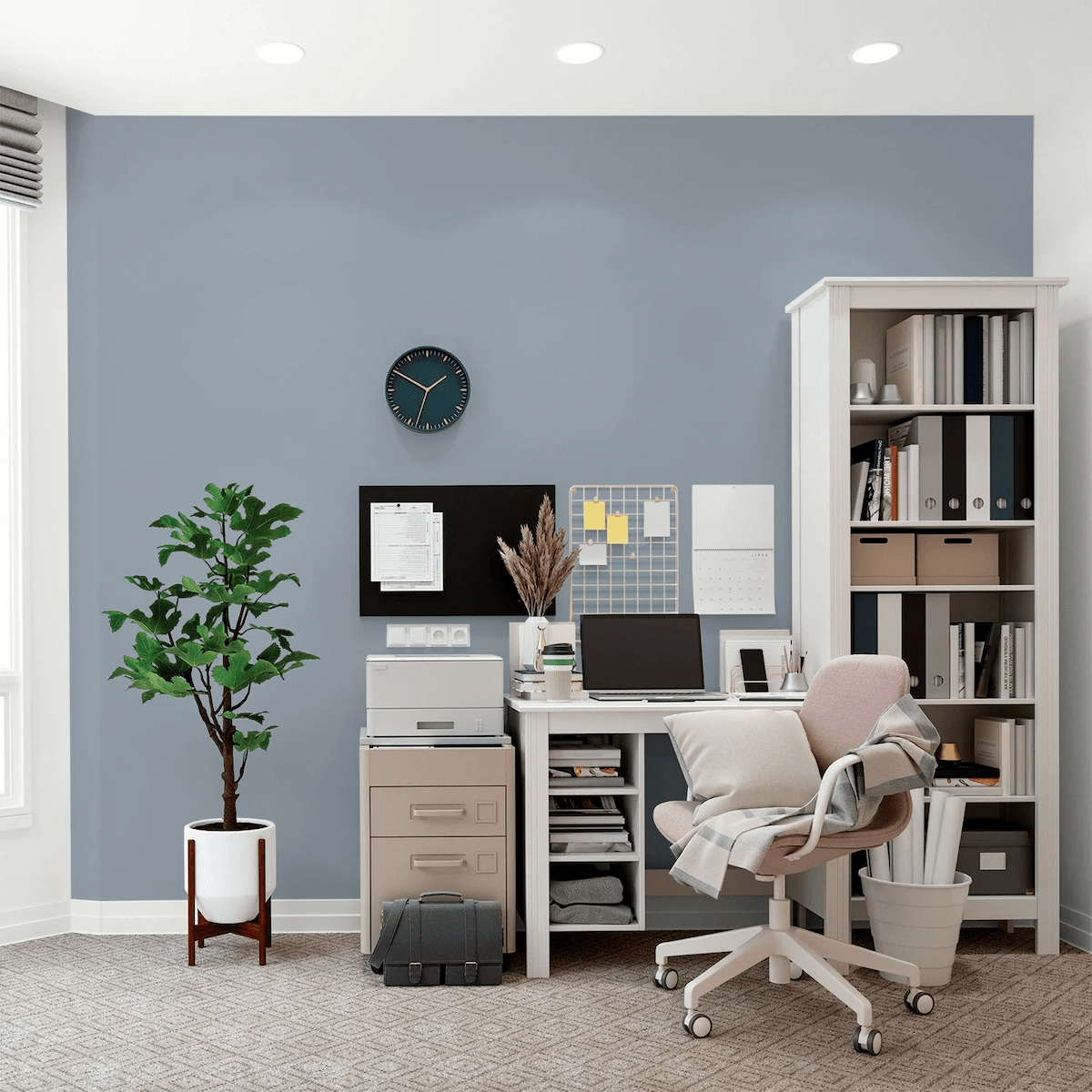
14. Peaceful Blue, Behr
While blue, this muted version functions beautifully as part of a neutral color palette. Its subtle coloring creates a serene atmosphere while maintaining the versatility of a neutral, making it an excellent choice for bedrooms, bathrooms, or any space where you want to create a sense of calm and promote relaxation.
15. Plateau, Behr

“Plateau is a soft, pastel orange that brings hints of energy and optimism into a room without being too intense for day-to-day living like more vibrant oranges,” explains Rogers. “It creates a perfect balance of joyfulness and serenity that would be a great choice for family rooms, dining areas, or anywhere people gather together.”
Unlike your typical neutral, this fresh take on orange shows you can have a bit of warmth and personality in your space while still coordinating easily with the rest of your decor.
16. Quicksilver, PPG
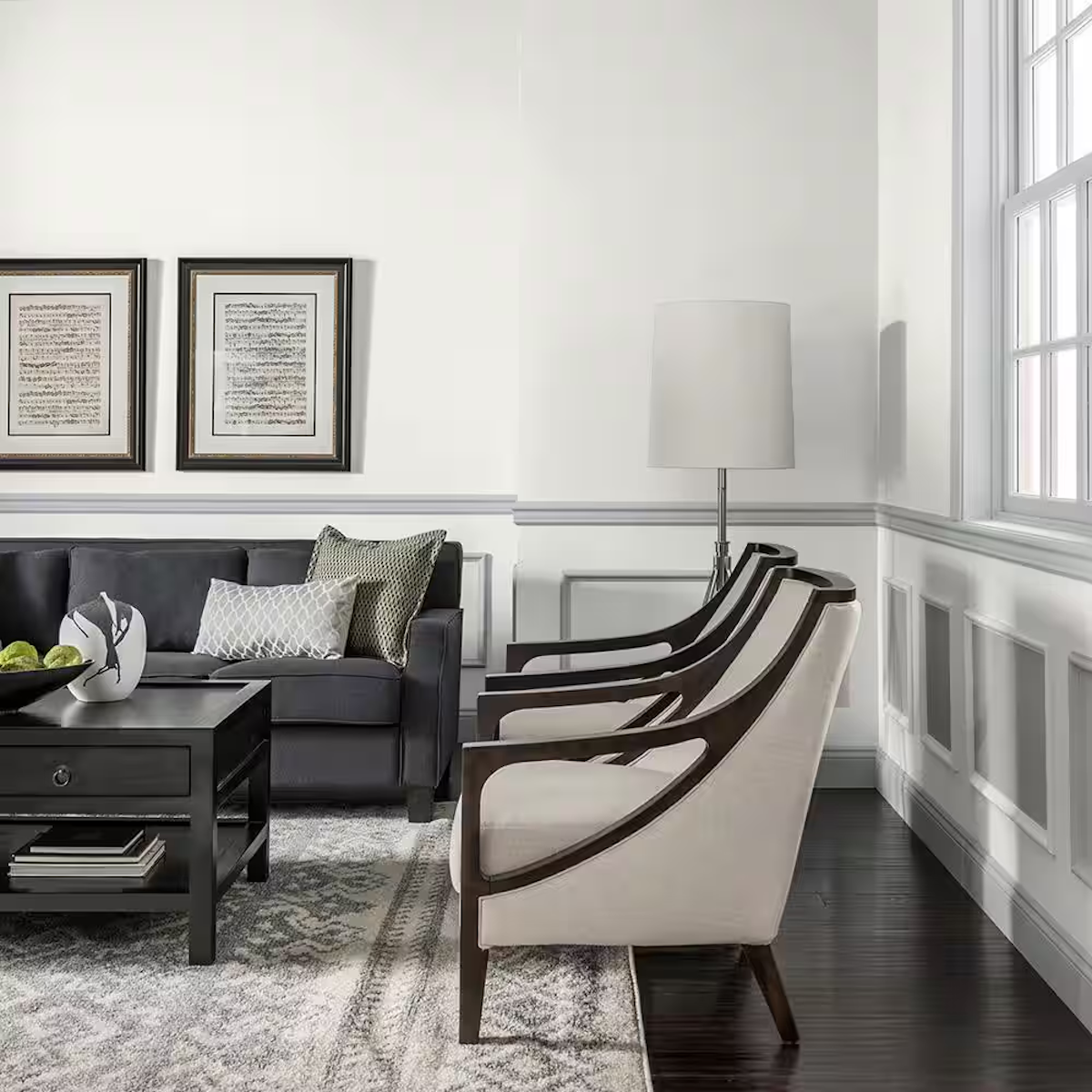
This rich gray-blue puts an unexpected twist on modern paint colors. With its subtle lavender undertones, Quicksilver adds just enough drama to make things interesting, especially in spaces with chair rails or wainscoting where it can be paired with lighter grays above. It’s moody and luxe without being dark, making it perfect for adding some personality to your space while keeping things sophisticated.
17. Restoration, Sherwin-Williams

Think of this color as the perfect middle ground between greige and taupe—not too warm, not too cool, just right. It’s like the Swiss Army knife of neutrals, looking equally at home in your living room or bedroom. And while it might seem boring on paper, there’s something about its depth that keeps things interesting. It’s the kind of color that makes a room feel pulled together without trying too hard.
18. Spanish Fortress, Kilz

This isn’t your basic beige—it’s a rich, earthy neutral that brings in just enough warmth to make your space feel cozy without going full-on terracotta. It’s especially great if you’re into that modern desert vibe or want to warm up a north-facing room that needs a little sun-kissed glow.
19. Statue Green, Kilz

This weathered sage infuses a mature elegance to any room. Like a garden statue that’s developed the perfect patina over time, it is a sophisticated take on green that reads as a classic neutral. It’s a great choice for spaces where you want to incorporate a touch of nature while maintaining a refined atmosphere.
20. Stonehenge Greige, PPG

As its name suggests, this robust neutral combines the enduring qualities of gray and beige into one versatile paint color. It’s a balanced greige that manages to feel both grounded and contemporary, making it an ideal choice for those who appreciate the sophistication of gray but want the welcoming qualities of beige. The color adds subtle depth to a space while maintaining enough neutrality to work with virtually any design style or decor choice.