
We may earn revenue from the products available on this page and participate in affiliate programs. Learn More ›
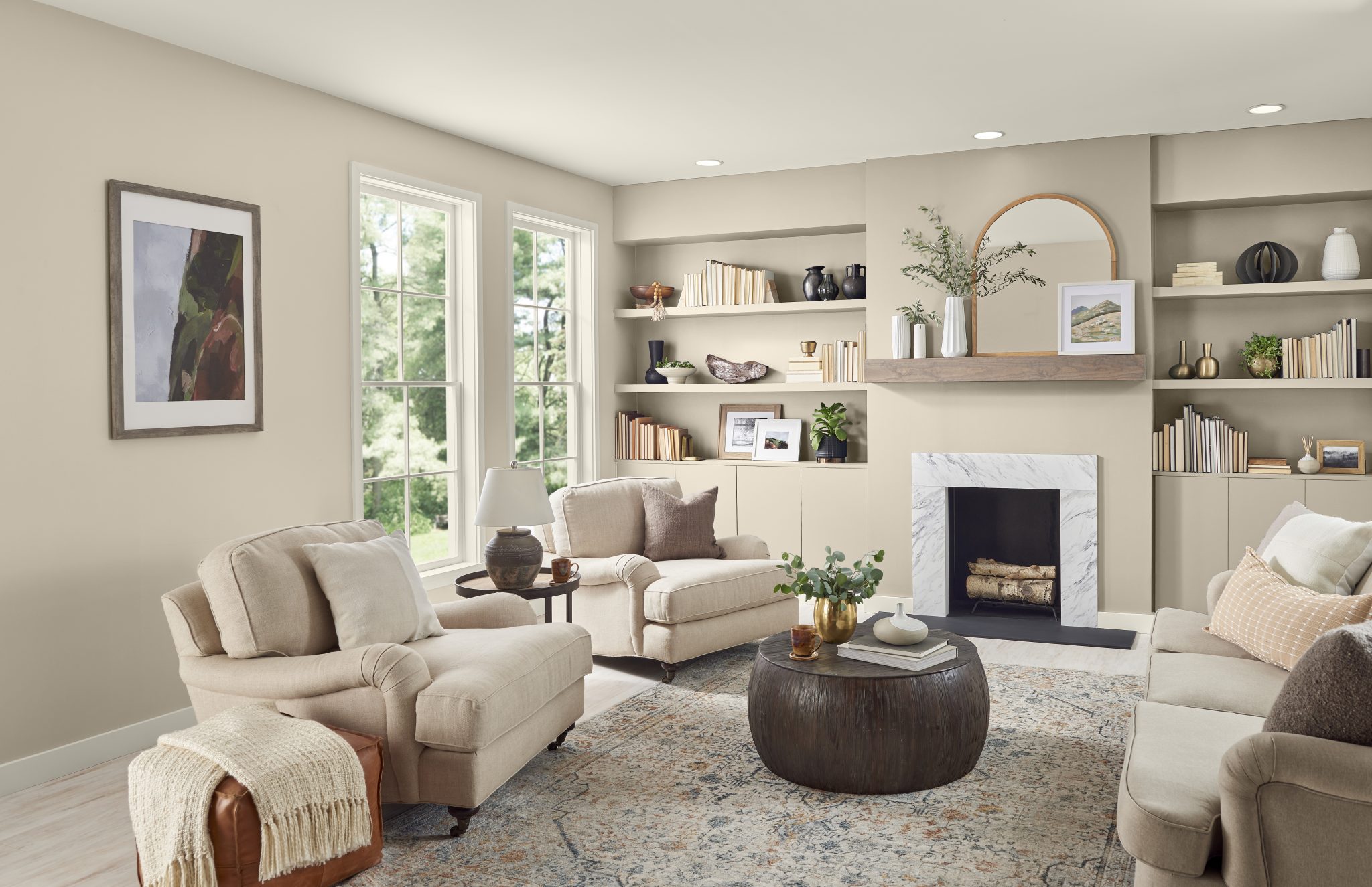
Neutral paint colors are the most popular for good reason. People choose these interior paint colors because they’re versatile and timeless, make a room seem bigger or brighter, and they’re excellent choices if you want to sell your home and appeal to most buyers. But let’s face it, neutrals can feel mundane.
Colors such as beige, gray, white, and greige are top sellers nationwide—check out this map from All Star Home to see how much Americans love neutrals. Though we appreciate the evergreen appeal of these shades, a bold accent color can give a room personality without overtaking the entire design scheme.
We asked the experts who make and sell paint to tell us which neutrals are their best sellers and which bold accent colors they recommend for the perfect pairing. Here’s what they told us.
Blank Canvas by Behr
Behr’s Blank Canvas DC-003 was the brand’s color of the year and its top-selling color last year. According to Erika Woelfel, VP of color and creative services at Behr, “Blank Canvas is the perfect backdrop to build upon to highlight other features in the home. It offers limitless design possibilities with its inviting and warm white hue.”
As an accent color, Woelfel and Monica Mothershead, senior merchant of interior paint at The Home Depot, agree that Cracked Pepper is an excellent compliment for this neutral. This soft black offers elegance, warmth, and opulence to a room; pairing these two colors creates a beautiful tuxedo effect.
Revere Pewter by Benjamin Moore
Among Benjamin Moore’s top-selling neutrals is Revere Pewter HC-172. This color is a favorite among consumers because it goes well with cool and warm tones. As a versatile neutral, this paint color pairs beautifully with attention-grabbing accent walls or painted decor.
To give this classic color a little oomph, Arianna Barone, color marketing manager at Benjamin Moore, recommends the jewel-toned Beau Green 2054-20 or rich and earthy Black Bean Soup 2130-10. Not sure you’re ready to commit to painting an entire accent wall? Use small additions, such as the back panel of a bookshelf or wood photo frames.
Swiss Coffee by Valspar
One of Lowe’s best-selling neutral paint colors is Swiss Coffee by Valspar, according to Monica Reese, Director of private brands style. This warm white ages beautifully but can look even better when paired with an accent color or two.
Reese recommends a couple of color options like Dusty Olive and Persimmon to bring personality to a white-walled room. The former can make a room feel cozier, while the latter offers personality to your living space.
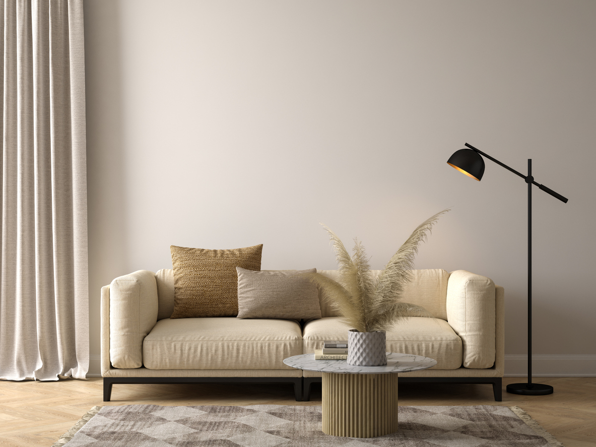
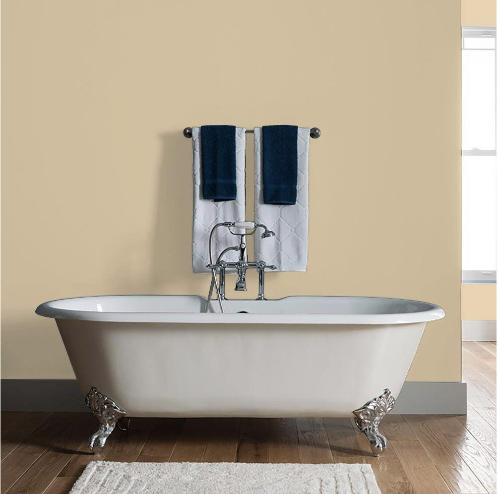
Even Better Beige by Behr
Neutral beige colors are a perennial favorite. According to Mothershead, Behr’s Even Better Beige is one of the top-selling neutrals at The Home Depot.
Woelfel from Behr notes that this hue “is a light, timeless neutral that exudes warmth.” It’s a terrific option for creating an inviting atmosphere inside your home. This gentle, earthy hue looks sensational when paired with bold accents painted in Mountain Olive. This dark green has a warm undertone, depth, and contrast that pairs wonderfully with beige and other neutrals.
White Dove by Benjamin Moore
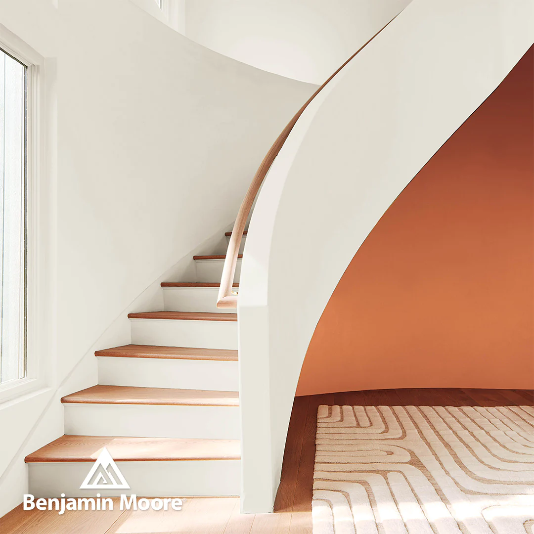
A clean and classic shade of white, Benjamin Moore’s popular White Dove OC-17 makes a space feel fresh and bright. Pairing a stark white with the elegant and sophisticated Regent Green 2136-20, a pine green verging on black, can elevate your aesthetic and create a sense of soothing comfort in your living space. Barone also recommends combining this white with accent colors like Blue Nova 825. This combination of violet and blue looks stunning in an entryway, as an accent wall, or as a shelf color.
Ponytail by PPG
Taupe is a versatile neutral. Mothershead mentions that taupe colors, such as Ponytail by PPG, make an excellent backdrop or subtle accent. With taupe, you can choose between warm hues with red undertones, or cool hues with green undertones.”
When pairing with a bold color, Mothershead recommends colors such as “forest green to invoke a sense of nature and tranquility or burnt orange to infuse an energetic vibe against a taupe-colored wall in the home.” Bold colors to consider are Behr Equilibrium or Behr Colorful Leaves.
Agreeable Gray by HGTV HOME® by Sherwin-Williams

Agreeable Gray is one of the most popular neutrals sold at Lowe’s. As far as pairings, Reese recommends Waterloo or Valspar’s Friendly Yellow as eye-catching additions.
People may conjure images of rich and dark colors when they think of bold accents. Reese from Lowe’s says, “Accent colors don’t always have to be bold! Harmonizing warm-tone neutrals with cooler accent shades like blue, green, or purple can also add a pop of color to walls. For a more classic route, pairing cheerful orange, red, and yellow hues with cool-tone neutrals creates a bright, airy essence in rooms.”