We may earn revenue from the products available on this page and participate in affiliate programs. Learn More ›
A new coat of paint is a perfect, relatively inexpensive, way to refresh a room. Years of grubby handprints and paws tracking in dirt can do a number on painted walls and trim. Not every paint color, however, is an improvement over what was already on the walls. Some hues can actually make rooms look dingier than before. If you want a fresh, clean appearance, avoid paint shades that can instantly turn a room from fab to drab—and heed our expert advice about better hues that can brighten up your space.
1. Warm Earth Tones
Jerith Bailey, an interior designer and general contractor with Mahogany Builders in Chicago, says that she tries to stay away from warm earthy tones because they tend to take on a dingy appearance. Wall paint has a significant visual impact, she says, so avoiding tans and browns is key.
“Builder’s beige and tan are generally easy to pair furniture with, but their foggy tones are a nightmare when you want to make a space seem clean and bright,” she adds. Her tip for indecisive DIYers? If you can’t instinctively name the color you’re considering, it’s probably going to look terrible on your walls.
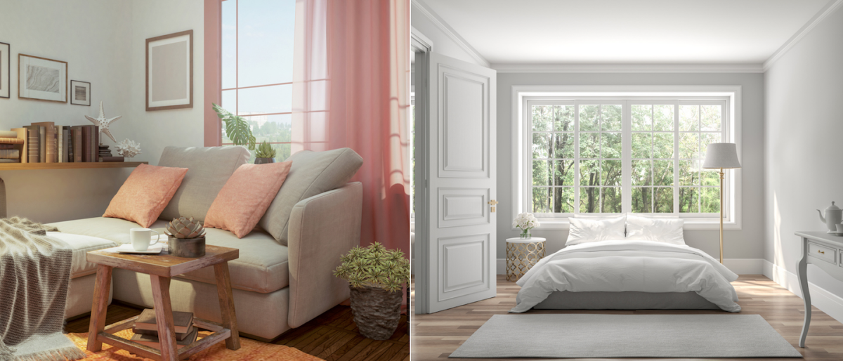
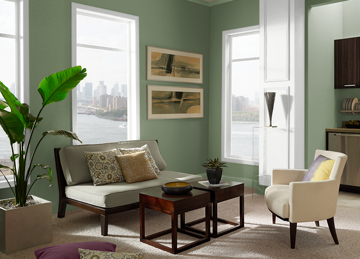
For those searching for a clean neutral, Angela Hall, a certified home stager and residential redesigner with Friar Tuck Home, suggests going with a greige tint like Sherwin-Williams’ Accessible Beige (pictured above).
2. Wood Trim That’s Painted Any Color but White
When designing a clean-looking room, Bailey notes the importance of trim paint and says that crisp white is the way to go. She suggests staying away from muddy hues and opting for classics like Benjamin Moore’s Chantilly Lace or Decorator’s White.
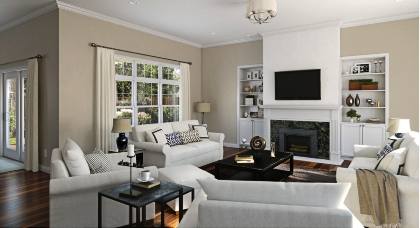
But, pairing a clean white with an earthy, warm tone may actually make walls look dirty by causing them to stand out. Avoid bogging down the walls by picking a color that pairs well with a crisp white. A few of Bailey’s favorites include Benjamin Moore’s Hale Navy (pictured below), Sherwin-Williams’s Mineral, and Behr’s Silver Drop.
RELATED: Solved! Which Comes First: Painting the Wall or Trim?
3. Paints That Don’t Hide Imperfections
Paying attention to a paint’s light reflectance value (LRV) is also essential, says Bailey. Lower LRV colors, like deep plums and navys, aren’t just great for creating a clean room. They also tend to hide actual dirt, smudges, and fingerprints. Higher LRV colors, like whites and cool grays, tend to brighten up a room. “Those extremes, where you either bounce a lot of light around or swallow it, are the sweet spot,” she explains.
When it comes to paint sheen, though, Bailey suggests aiming for a middle ground. Paint that’s ultra matte is challenging to clean, but super high sheen paints tend to highlight imperfections. The best choice for most walls is somewhere in-between, like an eggshell paint finish.
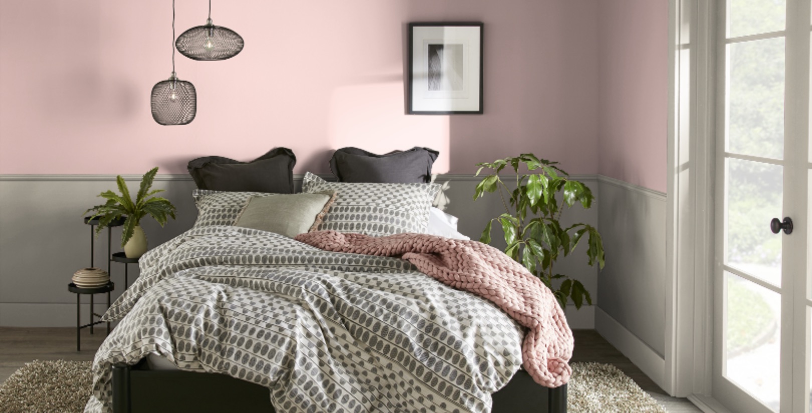
4. Dusty Rose Hues
Dusty, romantic rose was once a favorite wall and accent color. Anyone who’s seen The Sopranos, for instance, has likely spotted the dated dusty rose-peppered window treatments prominently on display. Andra DelMonico, lead interior designer for Trendey, explains that the wrong shade of rose—one that’s too dark—can make your walls look dull.
If you have your heart set on pink, DelMonico suggests opting for a pink with light undertones, like Behr’s Rose Sorbet (pictured below).
RELATED: 12 Calming Colors for a Serene Home
5. Painting Walls Yellowy-White
White seems like a foolproof color choice but whites with yellow undertones, says Hall, can sometimes leave walls looking dirty. Pairing a yellowish-white with a bright, cool white can make walls look even dirtier.
Neutral whites or those with cool undertones—with hints of blue, green, or purple—are a safer bet for a crisp, fresh look. Hall’s favorite is Benjamin Moore’s Simply White.
6. Purple-Based Grays
Purple hues have been all the rage the last few years: Pantone’s 2018 Color of the Year was Ultra Violet and, in 2022, it was Very Peri (a dynamic periwinkle blue with violet undertones). Beware of purple-based gray paint colors, however. Bonnie Kespohl, owner of KASA Interior Design, said purple-based gray tones can often appear fuzzy and dull, almost like a layer of permanent dust. “The purple can come through,” she explains, “giving the gray a dull pink overtone, enhancing the drab factor.”
If you’re looking for a lighter gray, Kespohl recommends Winter Orchard from Benjamin Moore. For a darker gray, try Kendall Charcoal, also from Benjamin Moore.
RELATED: The Best Interior Paints for Every Room of the House, Tested and Approved
7. Colors with Brown Undertones
“It’s easy to assume warmer colors will create an earthy or grounded aesthetic, but colors with brown undertones can have a dusty or shadowy effect, which can infer a dingy look,” said Donella Olson, owner of Two Island Design Build. Olson explained that when you look to nature, rarely will you find dingy colors. Instead, leaves and grass are bold greens, daisies are bright white and vibrant yellow, and tree bark is gray, black and espresso so there’s no need to go for a more earthy shade with brown undertones if you want to give your room a nature-inspired feel. “Even sand and rock are more nuanced than simple ‘off white,’” she added.
“For deep green, Scallion from Behr is a great choice,” said Olson. She used the color (pictured below) in her own office.
RELATED: How to Match Paint: 7 Effective Methods
8. Yellow-Green Shades
When you think of fresh, vibrant, spring tones, yellow and green may come to mind, but if you’re looking to apply these colors to your walls, you’ll want to choose wisely. Kespohl said yellow-green hues can often read as puce, which is anything but fresh. “The lighter tones lack depth and the more intense shades end up too bright and unnatural,” she said.
One trick if you’re looking for something in the yellow-green family: Apply your favorite samples to the wall and live with the swatches for a few days. Look at them at various times of the day, in natural sunlight and with lights on as some colors can change hue or absorb reflections from adjacent rooms or materials. You may change your mind on the color family altogether.
Kespohl recommends Sherwin-Williams’ Crooked River for a green hue. If your heart is set on yellow, she says, try Stardust from Backdrop.
Shopping for paint brands mentioned in this article? Start here:
Shop for Behr paints at The Home Depot
Shop for Benjamin-Moore paint at Ace Hardware
Shop for HGTV Home by Sherwin-Williams paints at Lowe’s
Shop for Backdrop paints at Backdrop
The previous version of this article was published on April 13, 2021.