We may earn revenue from the products available on this page and participate in affiliate programs. Learn More ›
Gray on Gray
Layering various grays is a great way to use this popular color at home. However when it comes to choosing different shades to work with, resist the urge to simply slide up or down the paint swatch from the store, advises designer Lindsay Espinoza, of Lulu Designs. “Choosing a lighter and a darker shade from the same color family won’t give you enough contrast,” Espinoza says.
Related: Editors’ Picks—The 9 Greatest Grays for Your Next Paint Job
Balance the Bold
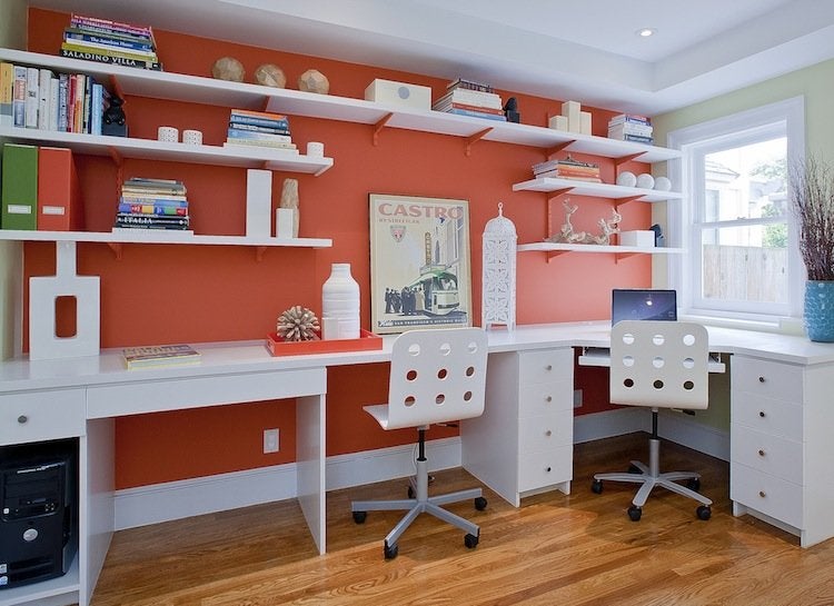
Accent walls can add a splash of color to a room, but when it comes to balancing a bold paint color you don’t have to rely only on white for the surrounding walls. In this home office, designer Melissa Lenox, of Melissa Lenox Design, combined energizing orange with a pale green for a fresh look that satisfied her color-loving clients without overwhelming the workspace.
Related: 9 Easy Designs for a DIY Desk
Go With a Classic
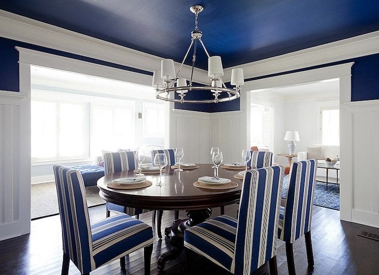
Some of the timeless color duos in interior design are pale blue and bright red, kelly green and pink, and navy blue and white. “Navy and white is definitely a classic combination,” confirms designer Lucie Ayres, of 22 Interiors. To give this palette different moods, Ayres says, “add yellow accents for an upbeat, preppy look or mix with grays and blacks for a more serious feeling.”
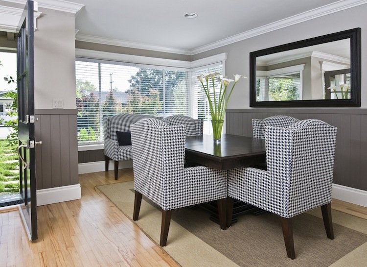
Twice as Nice
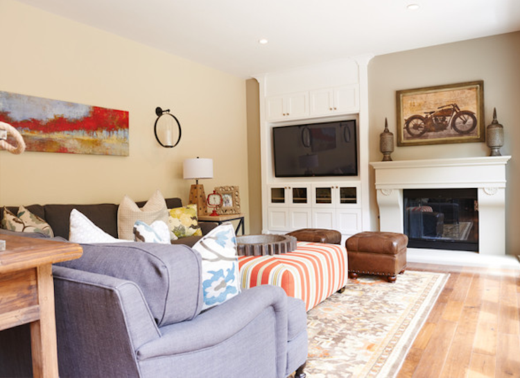
Design: luludesigns.com; Photo: Jeff Thayer Photography
On the hunt for the perfect interior neutral? There’s no need to zero in on just one. Designer Lindsay Espinoza freely mixes two or three go-to neutrals in a single setting. “I like to have one main neutral for hallways and most walls in a house,” she reveals. “Then I use a second darker color to make accent walls and architectural details pop.”
Related: The New Neutrals—9 Colors You Can Trust for Today’s Home
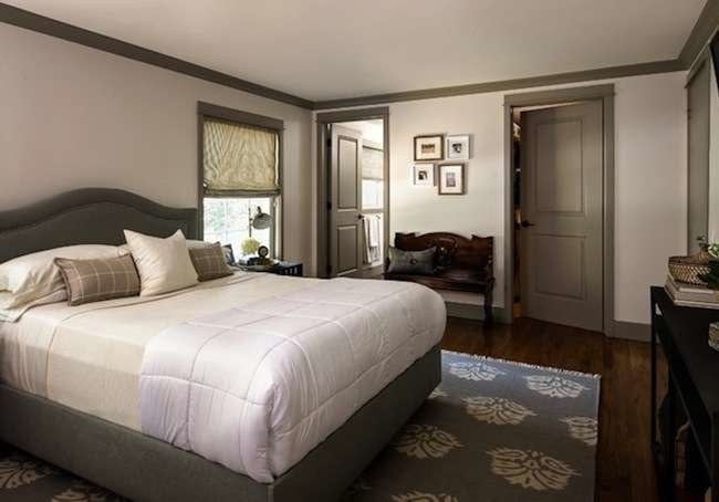
Trim Tips
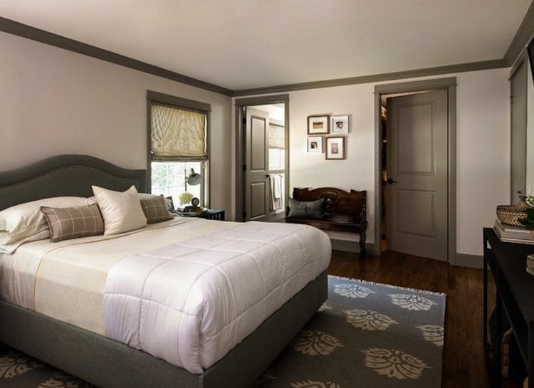
Design: redesignhomellc.com; Photo: Kate Benjamin Photography
If you already have a single color you love, consider painting the trim around doors and windows a color other than white, suggests color consultant Barbara Jacobs, of Barbara Jacobs Color and Design. You might pick up a color from an accent rug or upholstered bed frame, as in this gray and pastel bedroom by reDesign home.
It's Easy Being Green
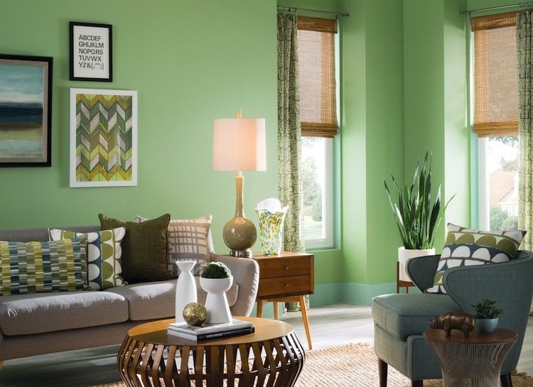
Green’s myriad variations not only look beautiful with other colors (think red, pink, yellow, violet), they also look great when mixed together. “One of the main reasons green works so well with other colors and with varying shades of itself is because it is found abundantly in nature,” says Jackie Jordan, Director of Color Marketing for Sherwin-Williams. This inviting living room features Sherwin-Williams’ Dill (SW 6438) on the walls.
Related: Living Room Paint Colors – 9 Top Picks from the Pros
Inspiration All Around
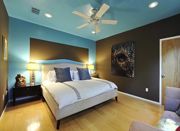
Some of the most pleasing color combinations can come from existing artwork or accents. That’s the case with this bedroom’s eye-catching blue and brown palette, which is inspired by the bird’s nest artwork on the wall. “The owner spends her mornings working in this room so she wanted a space that would both nurture and energize her,” says designer Sharon Radovich.
Go With the Flow
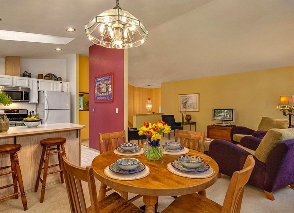
Zillow Digs home in Snohomish, WA
When faced with an open floor plan, many homeowners find it fun to distinguish separate areas using a variety of paint colors. To create harmonious views from one space to the next, choose colors that are close to each other on the spectrum—blue to green to yellow, for example—or hues that may be different but are alike in shade, such as soft tomato red and warm beige.