
We may earn revenue from the products available on this page and participate in affiliate programs. Learn More ›
Home Advice You Can Trust
Tips, tricks & ideas for a better home and yard, delivered to your inbox daily.
By signing up you agree to our Terms of Service and Privacy Policy.
Get a big refresh with less paint!
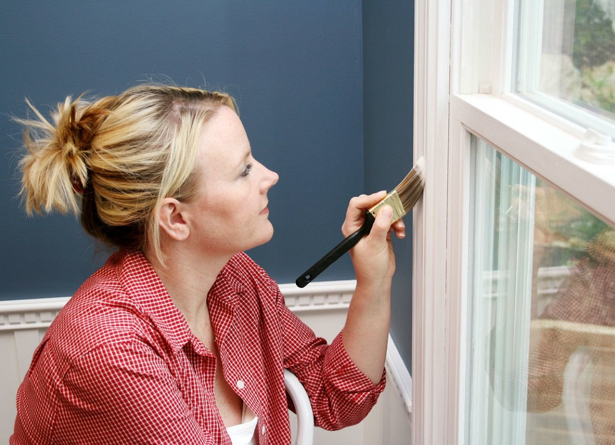
There’s no denying the impactful power of trim—be it crown molding in the bedroom, wainscoting in the kitchen, or window casing throughout in your home—on your décor. Yet all too often, the small scale of a trim painting project leads to a hasty decision when it comes to color selection. In truth, trim color is right up there with your choice of paint base and sheen in ensuring the longevity of the look and harmony with the overall color palette of the space. Before giving short shrift to your molding, check out the 21 best trim colors that experts agree pack the personality and practical benefits to make a big impression, indoors or out.
Tricorn Black (HGSW1441) from HGTV Home by Sherwin-Williams
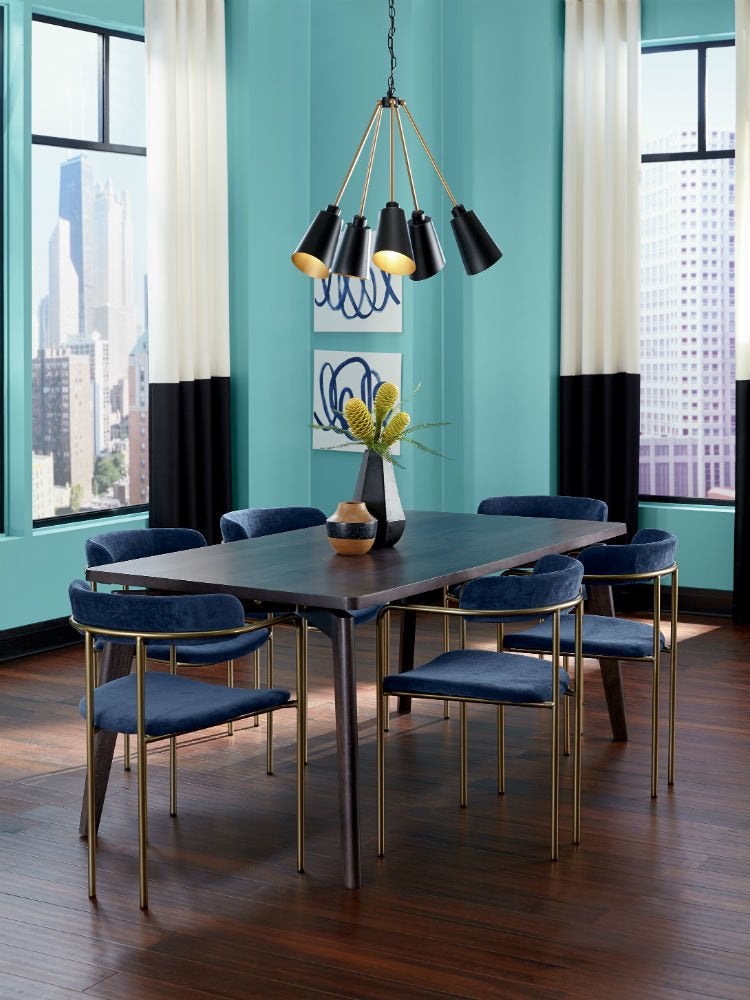
In addition to disguising small dents and divots in trim, this versatile ebony can “complement any shade as well as create interesting contrast,” says Ashley Banbury, Sherwin Williams’ Senior Color Designer. See how Tricorn Black on window trim in this art-deco-style dining room lends definition to the turquoise Reflecting Pool walls while accentuating the sculptural chandelier and the billowing monochrome curtains.
Dovetail (SW7018) from Sherwin-Williams
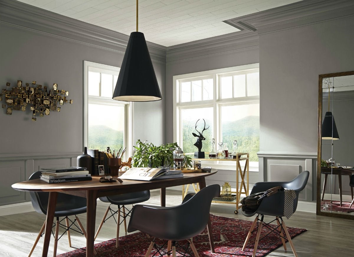
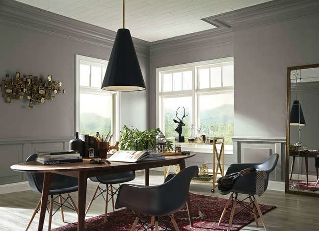
Cool trim colors like this dark gray with blue undertones lend tranquility and can dial down the effect of harsh sunlight. Dovetail crown molding and wainscoting imbue this sunny dining room and bar with a sense of calm, yet blend with the walls to showcase the lighter wood plank ceiling, rich wooden dining table, and golden abstract wall art.
RELATED: The 20 Best Neutral Paint Colors for Your Home in 2025
Moth Wing (SW9174) from Sherwin-Williams
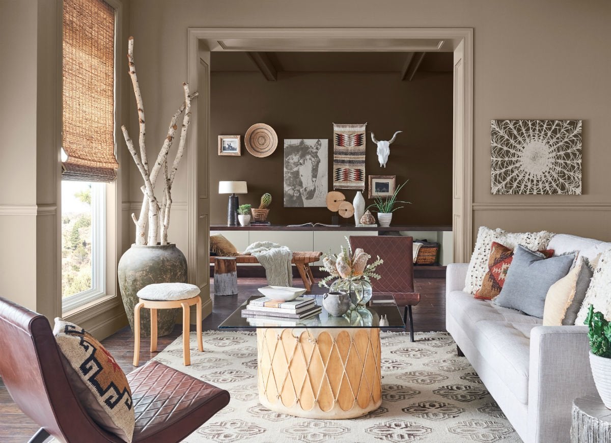
To turn a languishing living room into a desert escape, refresh trim with this light taupe tone. Set against walls of the same hue, the Moth Wing window trim, chair rail (low-height wall molding), and door trim add warmth while attractively framing artwork in the family room beyond.
High Reflective White (SW7757) from Sherwin-Williams
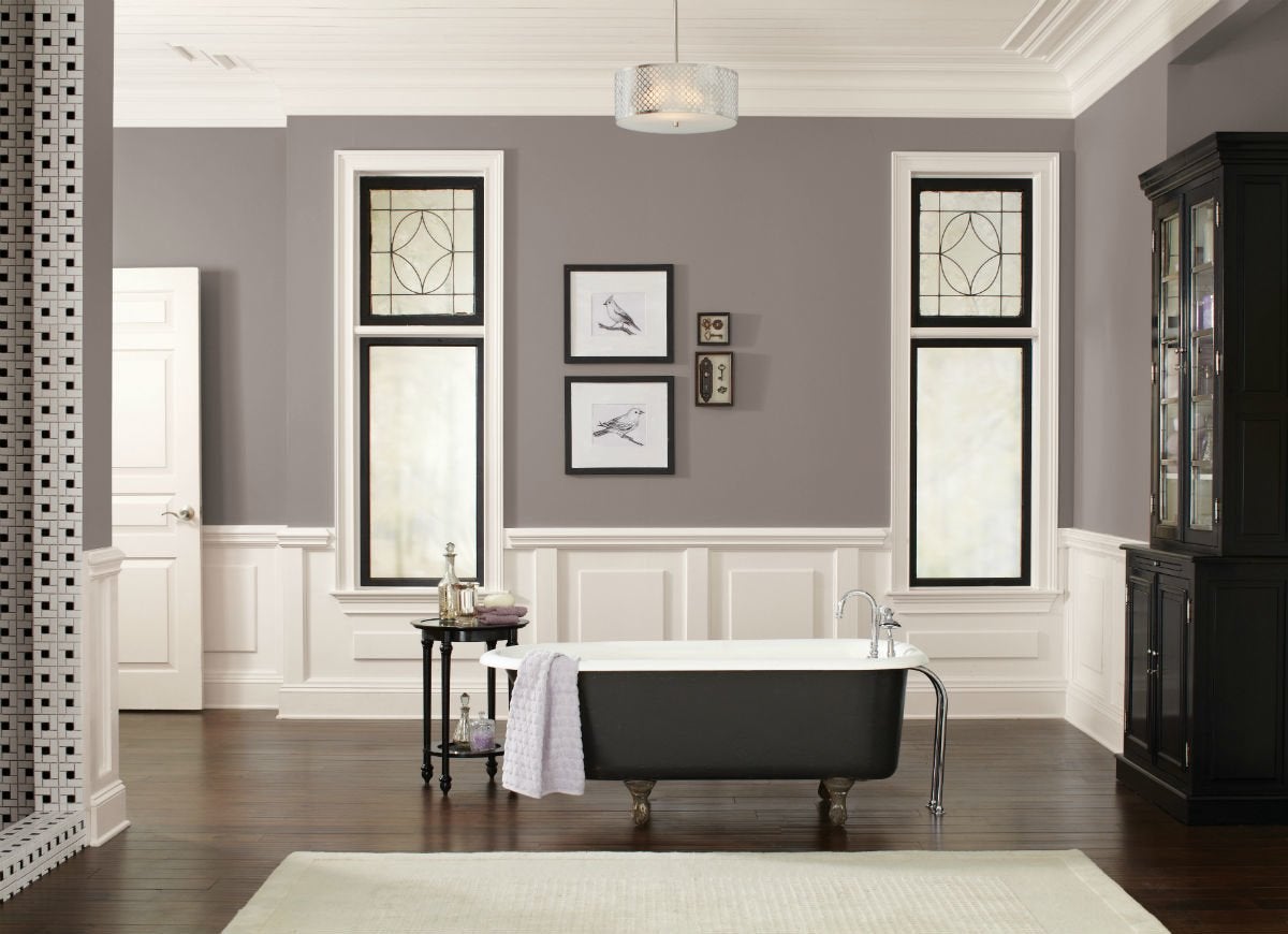
Brilliant but not overly bright, this stark white without a hint of gray or yellow undertones to mute or intensify it is perfect for trim for a high-contrast, two-toned look. In this modern bathroom, High Reflective White crown molding, wainscoting, and window trim marry with dark gray walls and an ebony tub and cabinet for a pure, polished look that draws the eye to the detailing on the frosted glass windows.
Wind's Breath (OC-24) from Benjamin Moore Natura
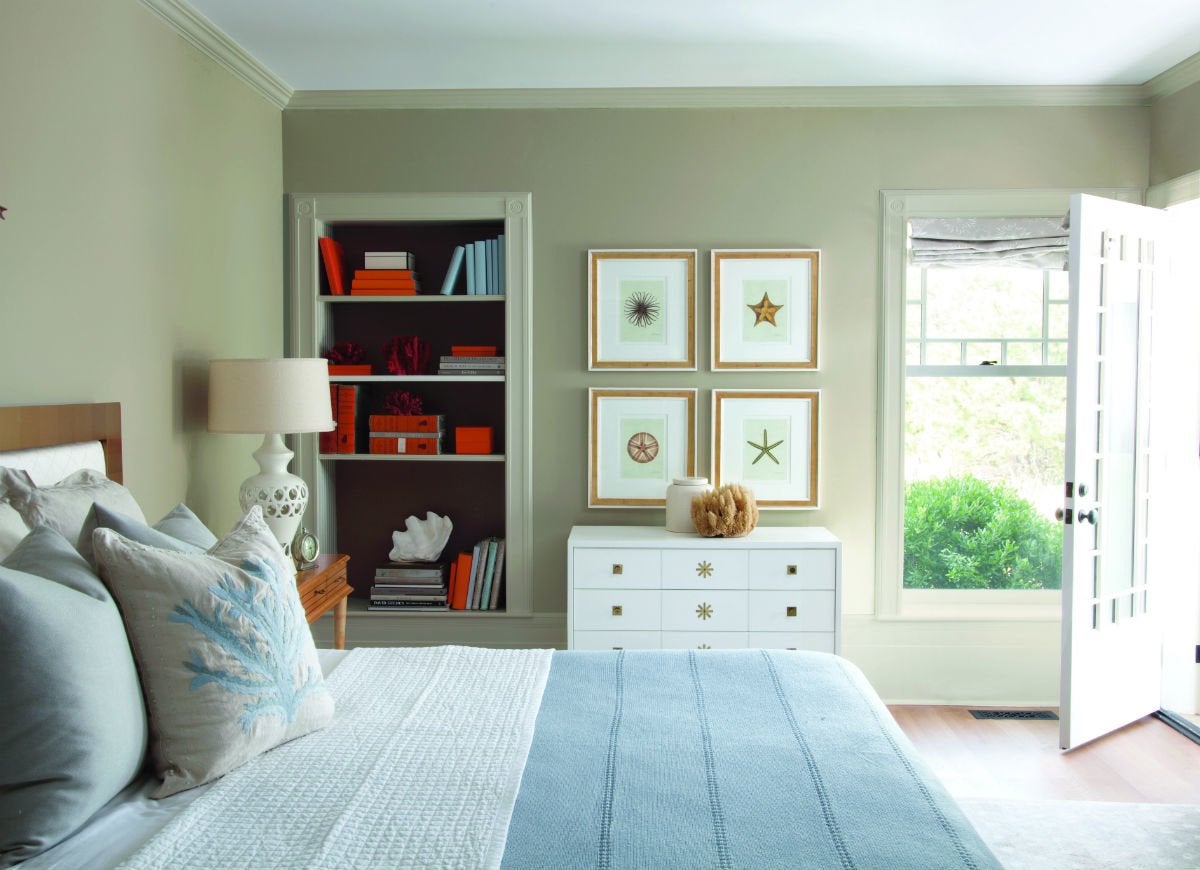
Perhaps no color hides dust and light debris better than beige, which makes it a natural choice for trim in lesser-used rooms. In this beach-inspired guest room, the soft gray-beige of Wind’s Breath, here in a semi-gloss sheen on the window and bookshelf trim and crown molding, downplays dust and dirt yet plays up the sand tones of the Pashmina walls and starfish artwork.
RELATED: Editors’ Picks: The 9 Greatest Grays for Your Next Paint Job
Chantilly Lace (OC-65) from Benjamin Moore ADVANCE
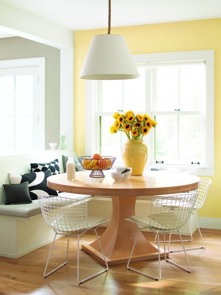
Delicate yet crisp, this white trim tone brings a sense of balance to any interior by serving as a cool counterpoint to warmer walls and furniture. In this country-style dining room, the semi-gloss Chantilly Lace window trim, baseboards, and ceiling offset the intensity of the Hawthorne Yellow walls, light wooden dining table, and vivid tabletop flora to give the room refinement.
Smoke (2122-40) from Benjamin Moore Regal Select
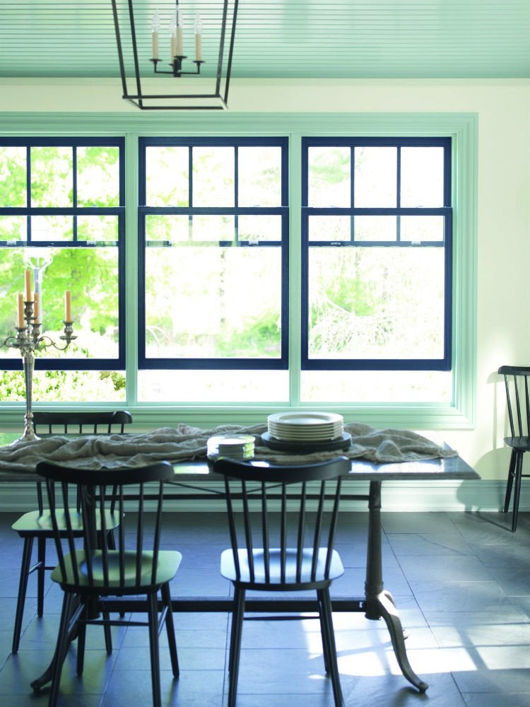
This dining room has the blues, and the homeowners couldn’t be happier! Paired with Cloud White walls and navy blue window sashes, subtle blue-gray Smoke on the window trim and baseboards, shown here in a pearl sheen, turns the common cookery into a jolly seaside retreat and amplifies the height of the space by drawing the eye upward to a ceiling of the same color.
RELATED: 12 Calming Colors for a Serene Home
Black Satin (2131-10) from Benjamin Moore Regal Select

Can two trim colors coexist in one room without clashing? Yes, as long as you allocate one shade for major trim and the other for accent trim. For this modern entryway, wintery white Frostine, with its blue-green undertones, appears in a semi-gloss sheen on the chair rail, baseboards, and crown molding, and in an eggshell sheen on the walls, to lend a look of largesse. The intense ebony of Black Satin around the wainscoting panels, door, and ceiling highlights the unique geometry of the lantern, the high-art armchair, and the striped rug.
Burnt Clay (LM120) by KILZ
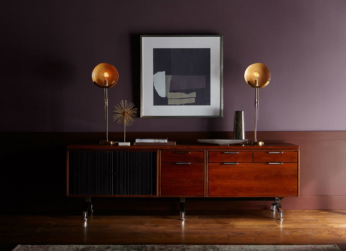
Dare to be dramatic by layering an already cozy, rich room with wainscoting painted Burnt Clay. The red undertones of this warm cocoa brown pair especially well with plum walls and wood furniture lacquered with mahogany or cherry finishes.
RELATED: 14 Paint Colors That Can Make a Room Feel Instantly Cozy
Bittersweet Brown (LM140) by KILZ
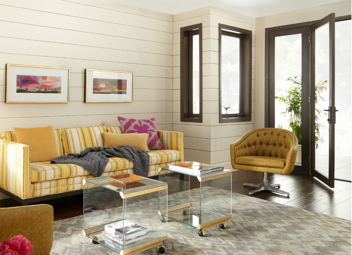
When dressing up the trim that frames idyllic outdoor views, consider a very natural shade that might be plucked from that scene. The chalky, earthy Bittersweet Brown around these patio-facing windows and sliding glass door, for example, softens the transition to the greenery that lies just outside.
Polished Mahogany (SW2838) from Sherwin-Williams
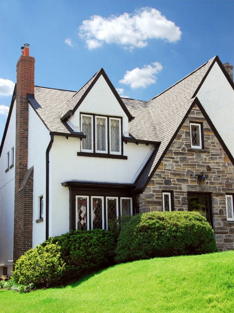
This chocolate brown with red undertones makes any exterior more appealing. But for maximum curb appeal, apply it on a gabled roof with steep sloping sides. The Polished Mahogany window frames and roof trim of this enchanting estate accentuate the contours of the gabled roof and dormer windows while artfully contrasting with white siding and complementing the earth tones in the stone facade.
Fundamental White (HGSW4001) from HGTV Home by Sherwin-Williams
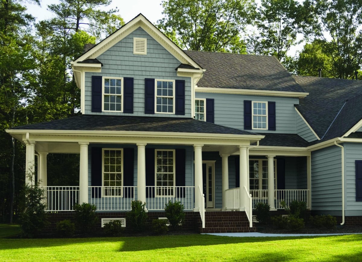
This highly adaptable warm white “goes with any color and style, framing the architecture perfectly and complementing the home’s overall color palette,” says color pro Banbury. For a winning combination, take a cue from this attractive abode and couple Fundamental White door and roof trim with gray-blue Aleutian siding and Naval blue shutters.
Tavern Taupe (SW7508) from Sherwin-Williams
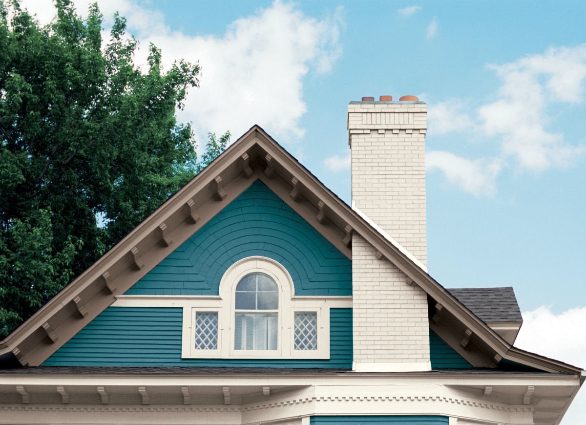
Stand apart from the cookie-cutter houses on your street by revamping your roof with this daring dark taupe with rose undertones. Tavern Taupe trim around the gables, coupled with turquoise siding and white window shutters, makes this exterior come alive with color.
Peacock House (5010-4) from Valspar
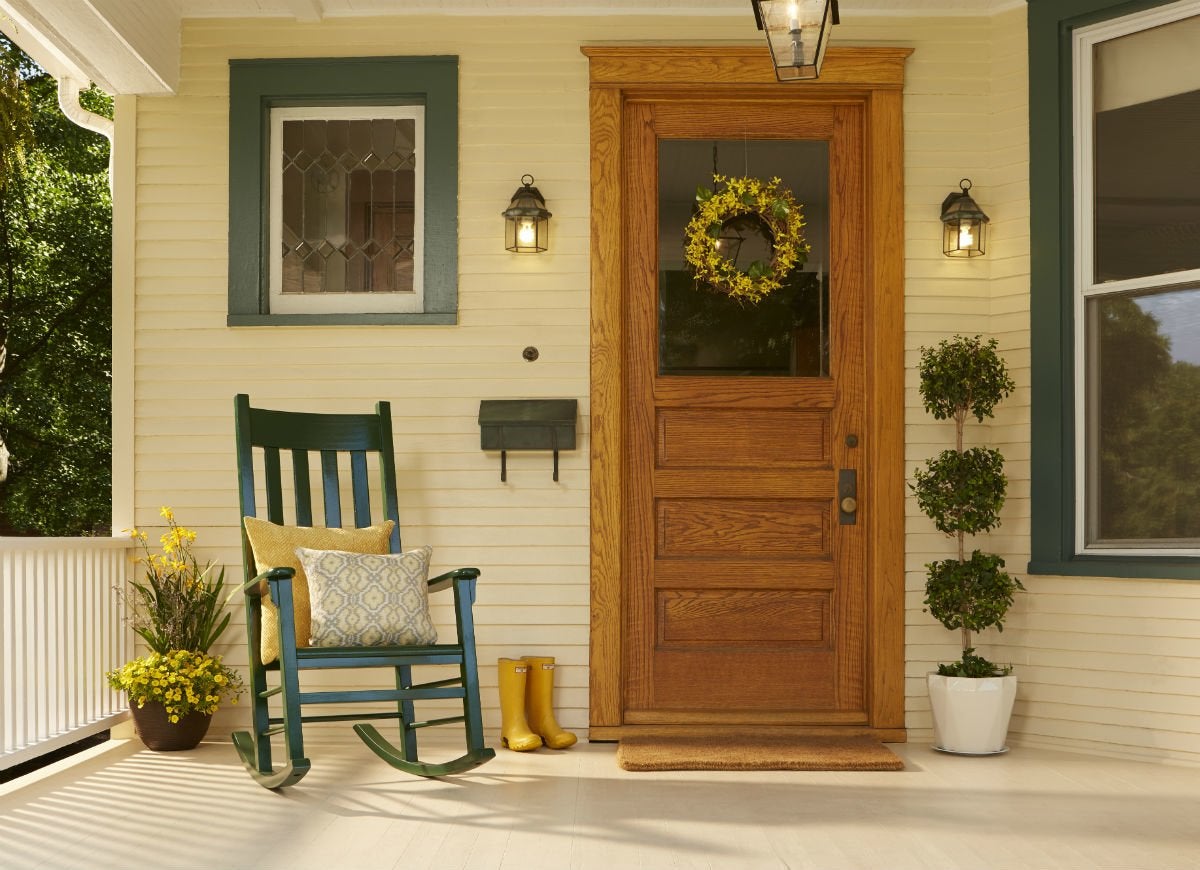
“Highlighting your home’s architectural features by mixing and matching different shades of trim creates an interesting, personalized look,” says Sue Kim, Color Marketing Manager at Valspar. These homeowners show their wild side through vibrant potted plants and the green-cyan of Peacock House on the window trim, patio furniture, and letter box. At the same time, they communicate sophistication through dignified Powder Soft cream siding and white porch roof trim.
Ultra White 7006-24 from Valspar
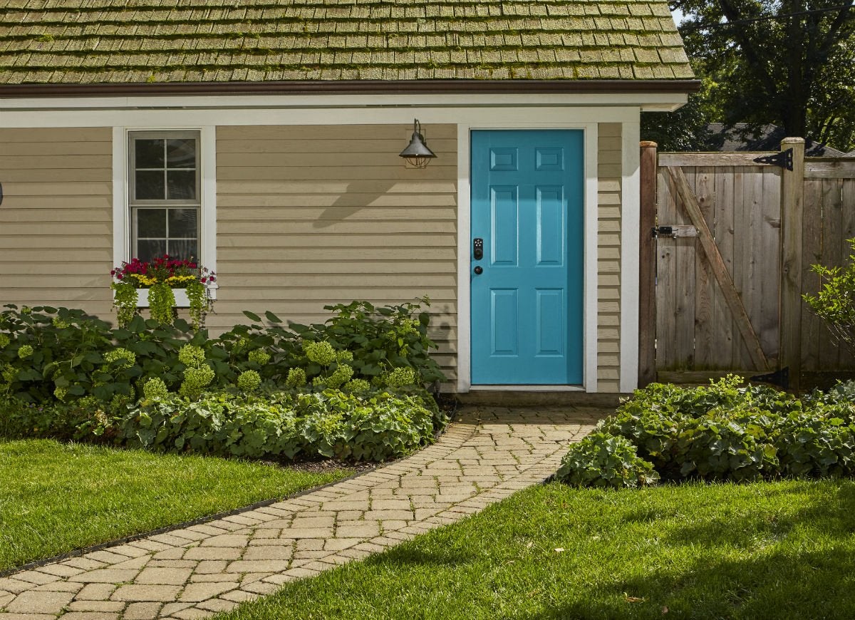
When fading trim calls for a touch-up, try this bright white, which is “perfect when freshening up a home and pairs nicely with neutral and bold shades,” says Kim. The Ultra White eaves and door and window trim at this picture-perfect property add definition to the exterior, while a Fragrant Bouquet door and Freshly Baked siding add a punch of bold blue and light brown, respectively, that sync nicely with the vivid green landscaping. For a cohesive look, use leftover Ultra White on your garage or shed.
Frostine (AF-5) from Benjamin Moore Regal Select Exterior
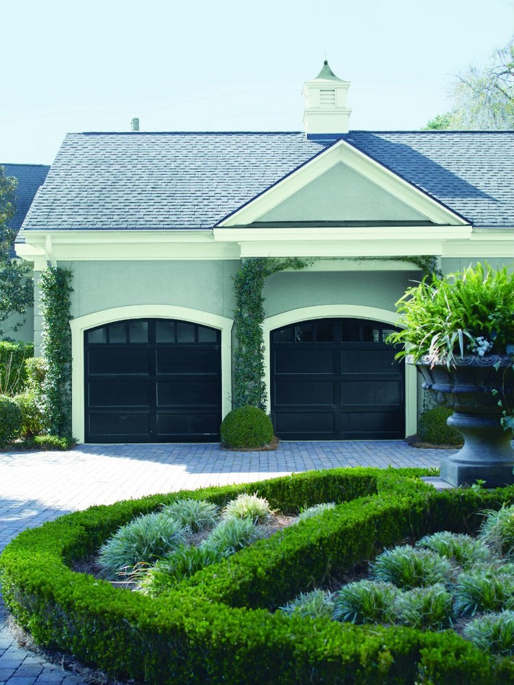
As icy and elegant as Frostine looks indoors, this chameleon white with blue-green undertones looks warm and exuberant outdoors. Here, Frostine roof trim in a soft-gloss sheen and a high-build finish that’s ideal for heavily textured exteriors is paired with the cooler colors of Coventry Gray on the siding and Wrought Iron on the garage doors to evoke both whimsy and drama.
Kindling (N200-6) from Behr
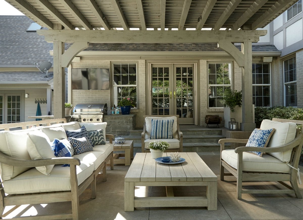
Picking a paint that’s meant to complement several unfinished wooden structures on the property? A rich taupe like Kindling looks right at home on exterior trim located just a stone’s throw from these weathered wood pergolas and patio sets.
RELATED: If This, Then That: Your Guide to Pairing Paint Colors
Swiss Coffee (12) by Behr
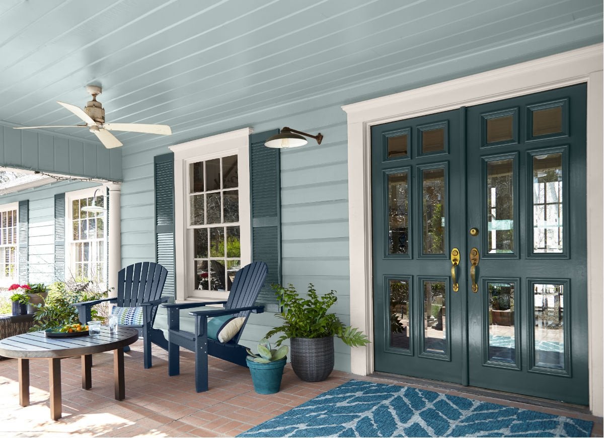
When in doubt, turn to nature to find an impactful and awe-inspiring color combination. Swiss Coffee, a creamy off-white that’s warm without a hint of yellow, pops like the foam on the crests of waves against the blue-ish robin egg and teal hues on the siding and shutters.
Black Magic (PPG1001-7) by PPG
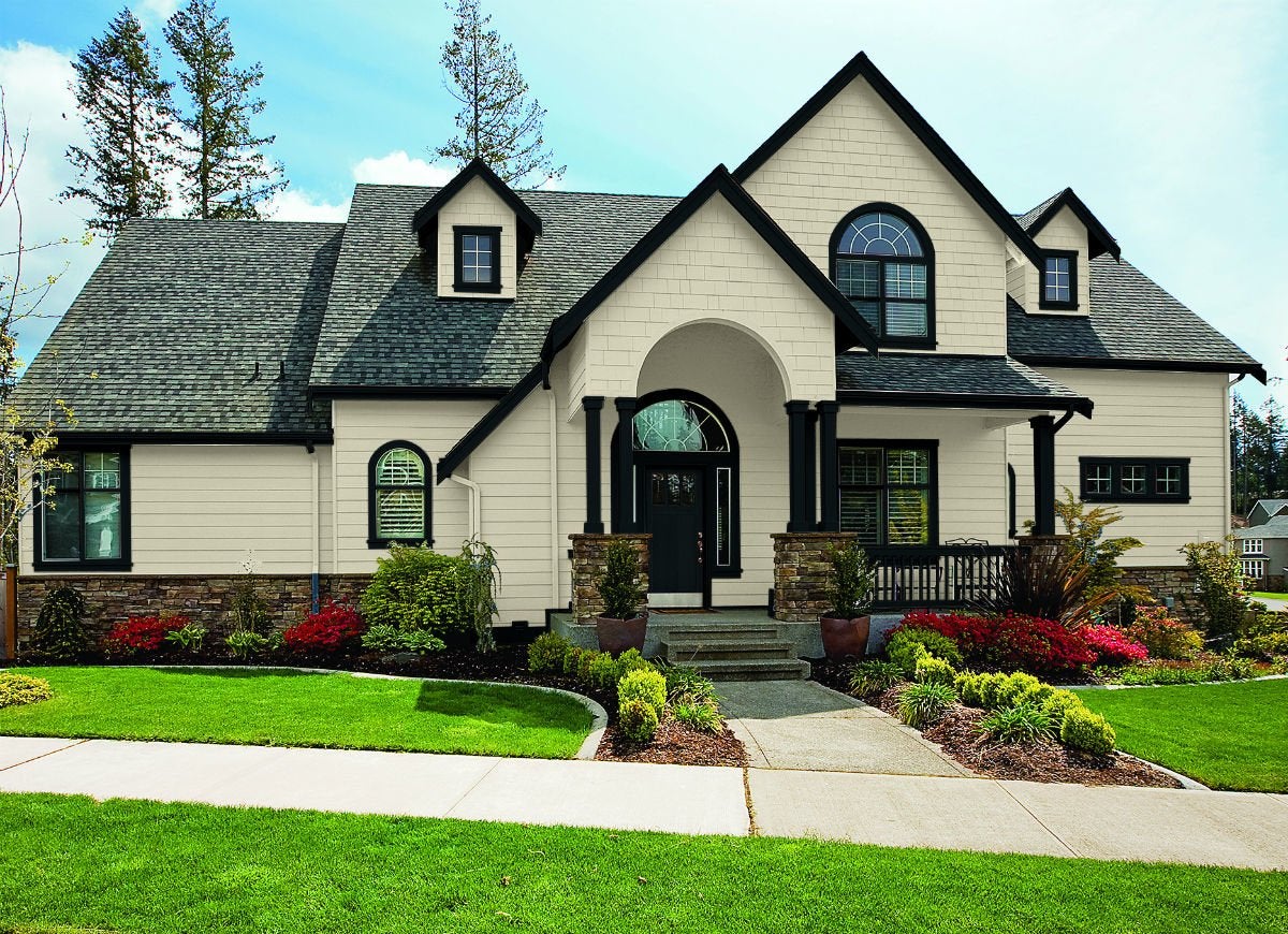
Just as charcoal and near-black trim colors create dramatic contrast to interior walls, they can also make any exterior color pop just as easily. Here, painting the chunky trim along the roofline with Black Magic not only draws the eye immediately to highlight its unique shape and rounded windows, but its warm undertones also tie the creamy beige siding to the speckled brown-black shingles.
RELATED: 12 Exterior Paint Colors That’ll Help Sell Your House
Night Watch (PPG1145-7) by PPG
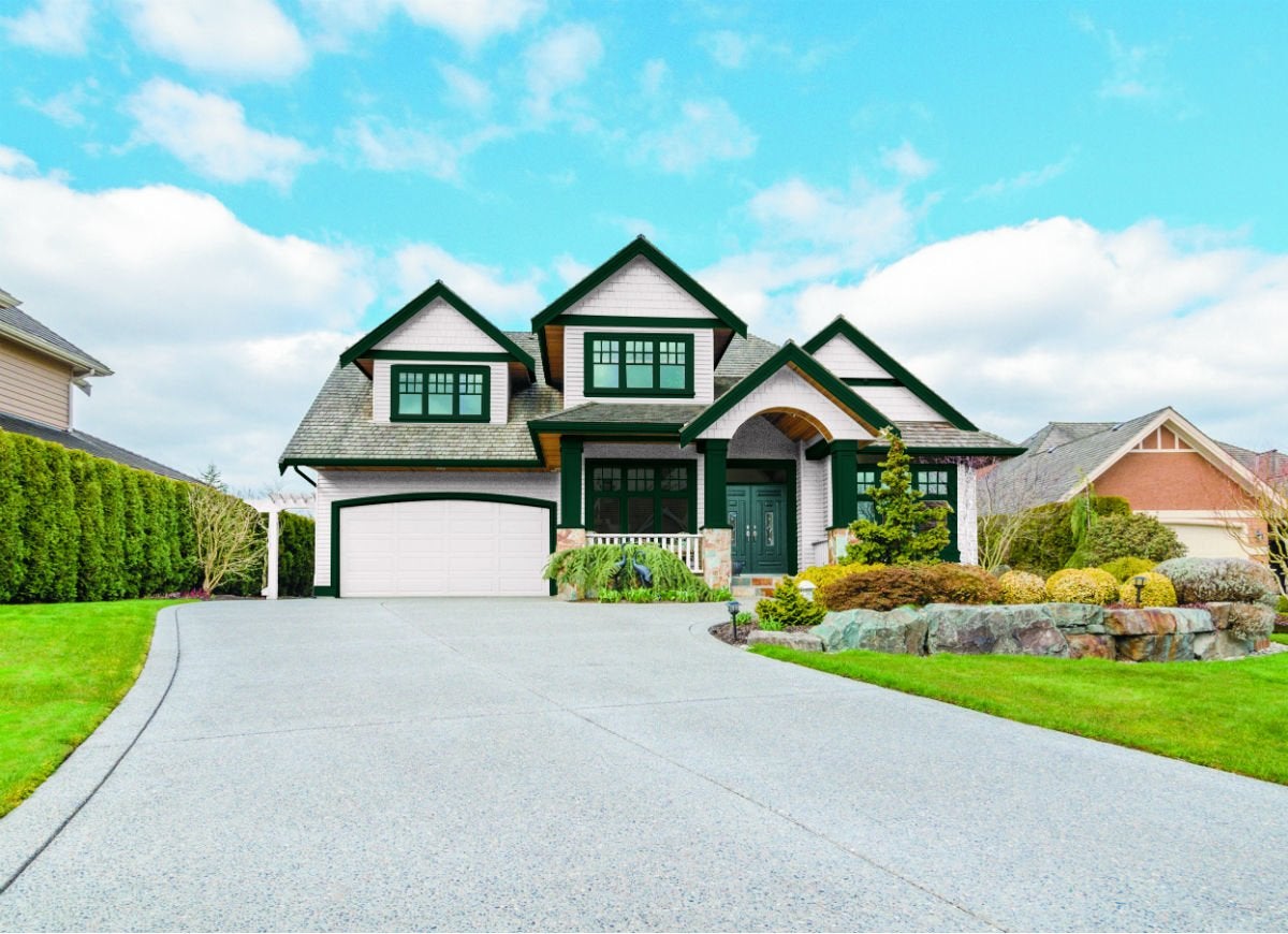
If you consider your landscaping to be the crown jewel of your curb appeal, try a jewel-toned color on your exterior trim and door. Night Watch, a dark jade, works on multiple levels as a not-so-boring neutral as well as a tie-in to the fruits of your green thumb planted beneath windows and around the side of the house.
Delicate White (PPG1001-1) by PPG

Crisp and classic, Delicate White plays nice with practically any color that graces your siding, shutters, or entrance. Here, the winter white balances warm and cool pastels.

This Is the Year for a Kitchen Renovation
Whether you’re selling or staying, everyone can get something out of a kitchen update. Learn why we consider this renovation the Most Valuable Project of 2025 and how to stay on budget.