We may earn revenue from the products available on this page and participate in affiliate programs. Learn More ›
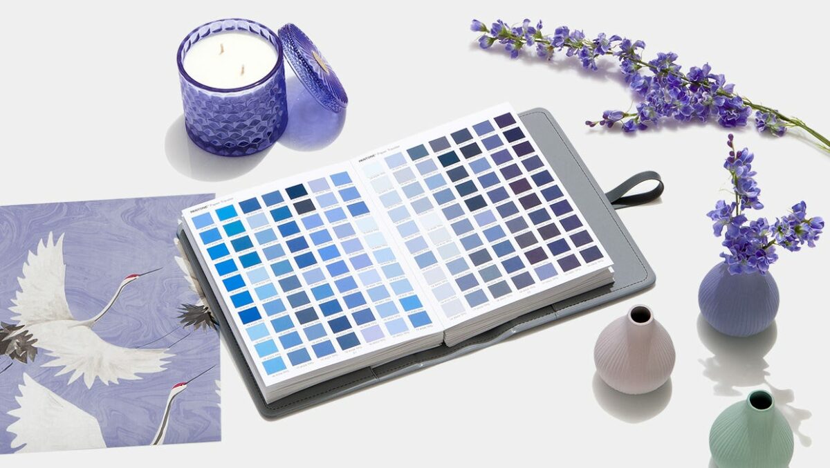
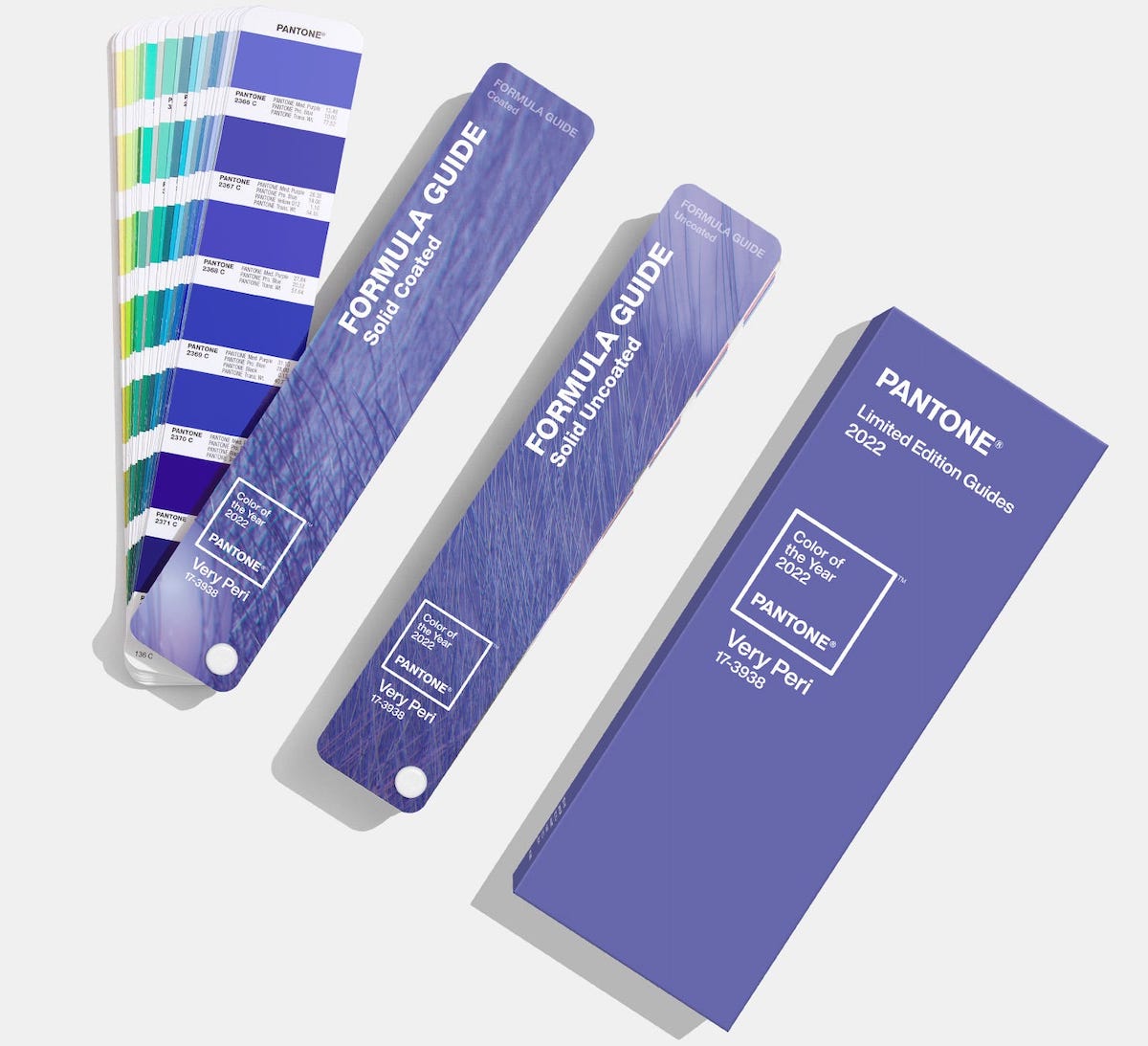
Pantone, the global color-matching authority and developer of the Pantone Matching System used extensively by interior designers, painters, and artists, has announced its choice for the 2022 color of the year. This time around, the honor goes to Very Peri, a gorgeous shade that marries blue with violet-red undertones to create a dynamic color that turns heads and demands attention. According to Pantone, Very Peri exhibits “a carefree confidence and a daring curiosity.”
Chock-full of Attitude
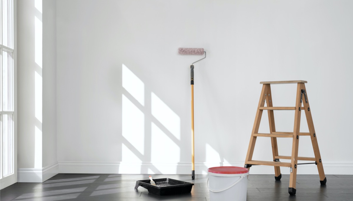
In the wake of two profoundly challenging years, Very Peri is a refreshingly bright pop of color. Admittedly, it’s not suitable for coating the entire house—a little goes a long way—but it’s the perfect pick-me-up shade for striking a lighthearted tone.
To learn some creative ways for readers to work Very Peri into their home décor, we consulted a variety of designers. Try some of the below design tips to reinvigorate your home with this eye-catching color of the year.
Find an Anchor Pattern
Mark Cutler and Nichole Schulze, founders of CutlerSchulze, a design firm located in Los Angeles, California, have definite ideas for putting Very Peri to good use. They suggest starting with an “anchor pattern,” either fabric or wallpaper, that incorporates a bit of Very Peri. After establishing the anchor pattern, consider adding Very Peri more generally to the room in the form of “some pillows or even wall treatments.” Cutler and Schulze also note that the color would “totally fit within a jewel-tone scheme,” particularly in “a library or a den,” where the level of color saturation would be appropriate.
Consider a South-Facing Room
Bright colors like Very Peri “look best in south-facing rooms,” according to Lily Wili, founder and designer at Ever Wallpaper, a boutique retailer of wallpaper and murals located in the United Kingdom. South-facing rooms are often flooded with sunlight, which can show bright colors to their best advantage. Wili also suggests pairing the color with “subtle gray and white” or “muted tones.” To make the room look cozy without feeling cluttered, “try adding self-print pillowcases and throws on the bed or couch.”
Brighten a Basement
For those with an adventurous spirit, Kyle Richards, co-founder of Best Overland Park Painters, in Overland Park, Kansas, suggests painting a basement wall with Very Peri. “Just because it’s the lowermost part of the house doesn’t mean it has to look like a gloomy cave,” Richards says. Very Peri’s blue base color carries a touch of warmth, and with its reddish undertone, it’s “sure to make for a unique basement atmosphere,” he adds.
Related: 7 Nostalgic Paint Colors That Are Making a Comeback
Accent a Gray Background
Christiaan Huynen, graphic designer, CEO, and founder of Ireland-based design firm DesignBro, suggests pairing accents of Very Peri with shades of gray for a “sophisticated and modern look without being overwhelming.” He reminds readers that the color will be “in” for just one year, so it may be best used as an accent rather than a significant focal point like a wall. Huynen says to think of Very Peri as a touch of “eye-candy for your home.”

Keep It Soft
Designer Andrea Schumacher of Andrea Schumacher Interiors, which has offices in Denver, Colorado, and Santa Barbara, California, proposes incorporating Very Peri into soft furnishings instead of using the lively hue on walls. These soft accents could include “drapery fabric, a punchy sofa, bedding, or even an area rug.” Schumacher also notes that pairing Very Peri with other blue tones could “create a dreamy atmosphere perfect for a bedroom or powder room.”