We may earn revenue from the products available on this page and participate in affiliate programs. Learn More ›
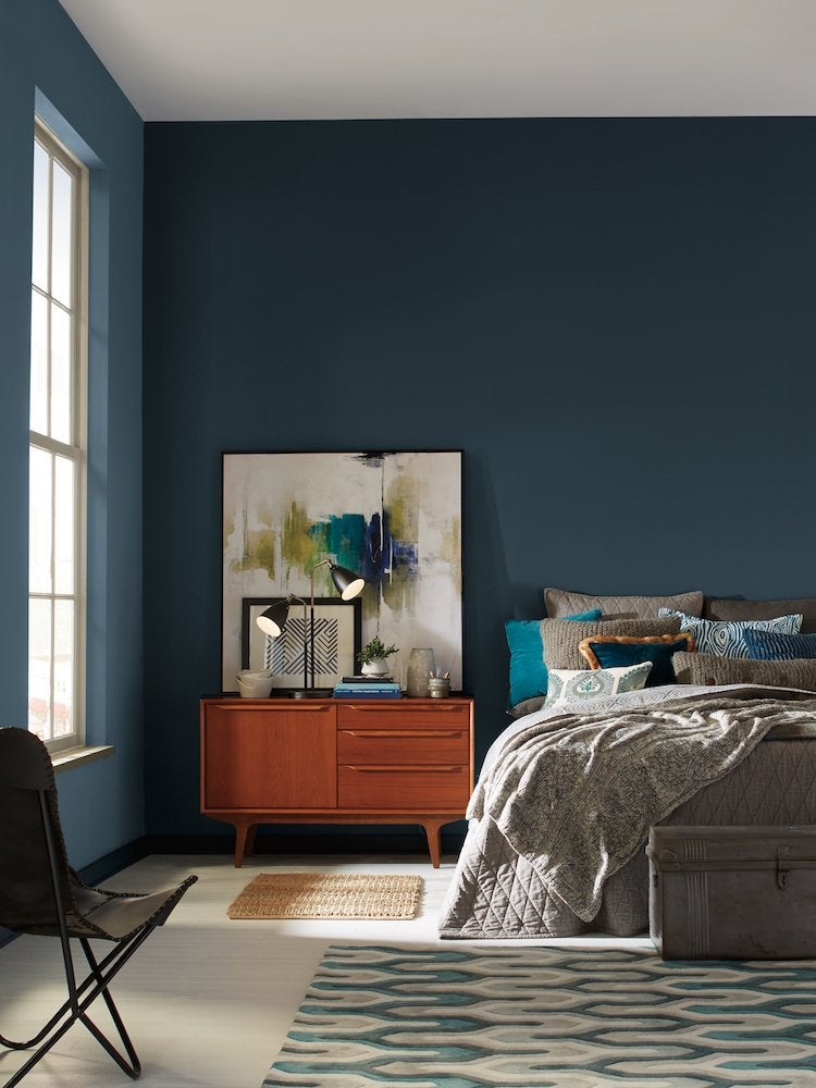
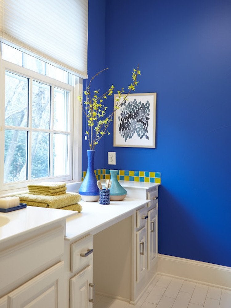
Oceanside—Sherwin-Williams SW 6496
Sherwin-Williams
Chosen as Sherwin-Williams color of the year for 2018, Oceanside is an opulent peacock blue. “Deep green-blues like Oceanside respond to changes in light, which creates intense dimension,” says Sue Wadden. A tremendously versatile color, Oceanside pairs well with bright yellows as well as more subdued navy, and is also an ideal companion for corals and copper metallic tones.
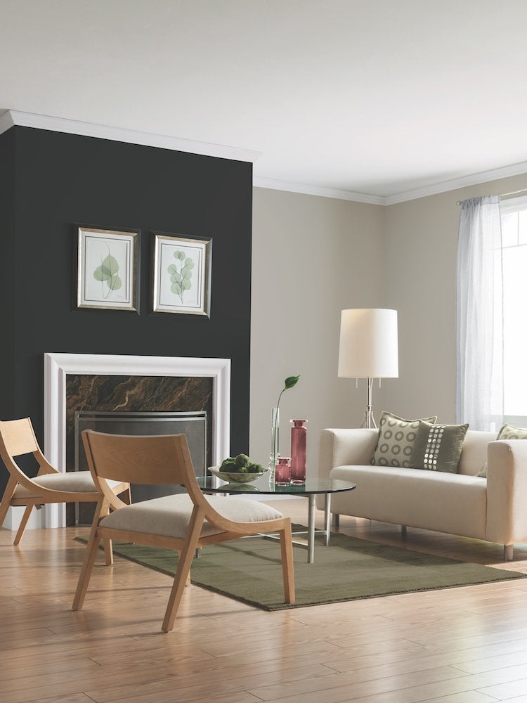
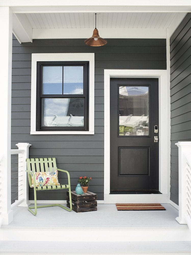
Black Flame—PPG 1043-7
PPG Paints
Classic black infused with indigo undertones distinguishes Black Flame, PPG’s color of the year for 2018. “Black creates the silence we crave in an information-heavy world, while the indigo offers a deep hopefulness,” says Dee Schlotter, PPG’s senior color marketing manager. Try the color on an accent wall, a ceiling, or to add a modern vibe alongside whites, blush pinks, or soft pastels.
Caliente—Benjamin Moore AF-290
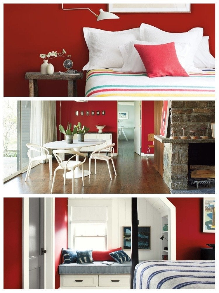
Benjamin Moore
“Strong, radiant, and full of energy!” That’s how Ellen O’Neill, Benjamin Moore’s director of strategic design, describes Caliente—the company’s color of the year for 2018. If you’ve ever dreamed of using red in your home, this is the shade to try: on an accent wall in a modern room, on cabinets in a country kitchen, or balanced with white wainscoting in an elegant dining room, bedroom, or bath.
Deep Onyx—Glidden 00NN 07/000
Glidden Paint
Embrace black as a neutral, advises Misty Yeomans, color marketing manager for Glidden Paints. “Using black paint like Deep Onyx, our color of the year for 2018, can seem intimidating at first,” Yeomans admits, “but it’s actually easier than you think.” Black pairs well with many colors from primary reds and blues, to earthy browns, to crisp white. Try it as an alternative to white paint on doors, trim, and cabinets.
Bahia Grass—Kelly-Moore KM4782
Kelly-Moore
Bahia Grass, a subtle green that evokes wild grasses swaying in the breeze, has been named Kelly-Moore’s color of the year for 2018. “Bahia Grass is the epitome of a modern neutral,” observes Mary Lawlor, Kelly-Moore’s manager of color marketing. Serene when mixed with white and cream, “it’s also the perfect companion to the 1970s-inspired palette that’s become influential today.”
Heron—Pratt & Lambert 27-18
Pratt & Lambert
Create elegant, restful rooms with Pratt & Lambert’s 2018 color of the year, Heron. “Heron promotes tranquility, inspiring homeowners to declutter, unplug, and reconnect with family and friends,” says Ashley Banbury, senior designer for Pratt & Lambert. To emphasize a relaxed atmosphere, pair Heron with crisp white or soft gray, or layer natural materials such as wood, metal, and terra cotta.
In the Moment—Behr T18-15
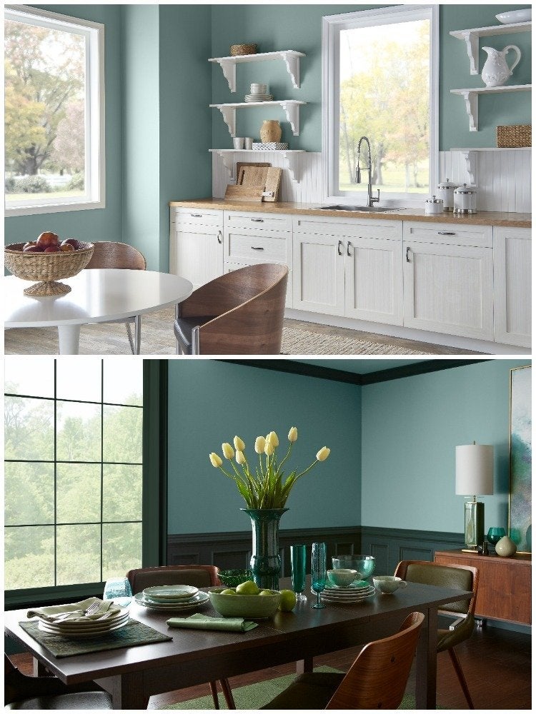
Behr
Combining elements of spruce blue, soft gray, and lush green, In The Moment represents Behr Paints’ first-ever color of the year. “This restorative blue-green is a grounding neutral that evokes a sense of sanctuary in our always-on lives,” says Erika Woelfel, Vice President of Creative Services for Behr. Invigorate the color with spice-red accents or pair with a warm gray to create a more tranquil atmosphere.
Black Magic—Olympic OL116
Olympic Paints & Stains
With so many shades of black on the radar for 2018—like Olympic’s color of the year, Black Magic—dare to use the dramatic hue throughout the house. “Black perfectly juxtaposes trending grays, blush pinks, and warm whites,” says Olympic’s Dee Schlotter. “It’s also a flawless complement to distressed wood elements and works especially well in a dining room with a bold light fixture.”
Metal .05—Colorhouse
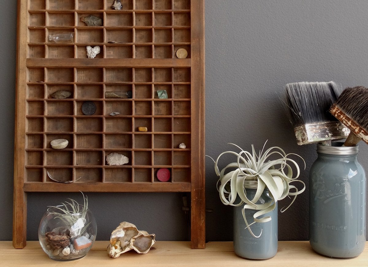
Colorhouse
Known for its commitment to eco-friendly paint mixtures and recycled packaging, Colorhouse is equally passionate about its carefully curated palette for the home. For 2018, the company has chosen four hues to represent the coming trends. Among them is Metal .05, a strong graphite gray that looks equally stunning as an accent or on all four walls, and is an ideal backdrop for warm wood tones.
Air .07—Colorhouse
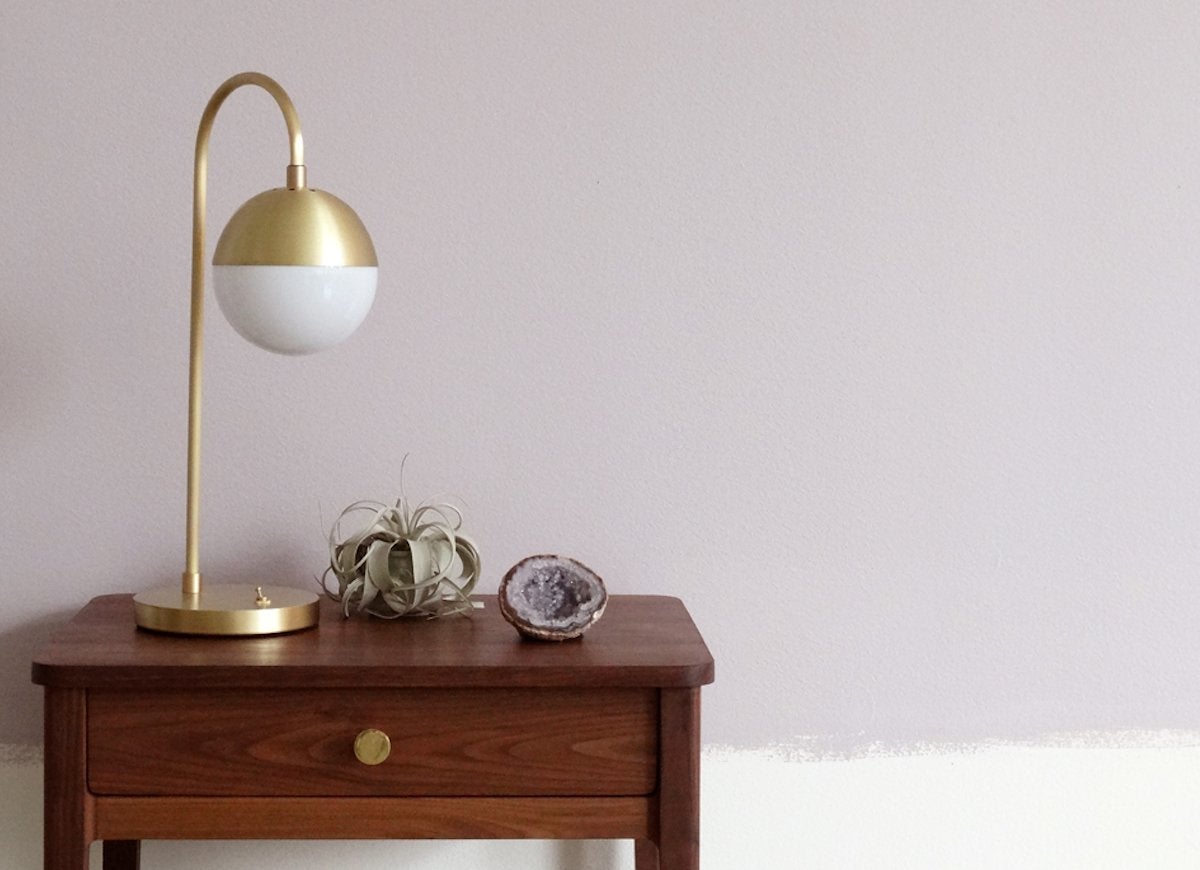
Colorhouse
Inspired by the earthiness of lavender fields, Air .07 is another of Colorhouse’s 2018 selections. This delicate purple defies classification in one style, looking just as fresh and current in an urban living room as in a country kitchen. Using lavender as a neutral lets homeowners play with the other colors in a room, from calming white and cream to a bolder mix of sky blue or apple green.
Wide Sky—Behr T18-17
Behr
Part of Behr’s 2018 color trends palette, Wide Sky is a vibrant blue that promises to wake up any space it’s in. “We want to encourage homeowners to use color to enhance the energy of a space,” Erika Woelfel points out. Wide Sky fits the bill, pairing perfectly with a strong yellow to evoke a classic French country look, or facilitating a fun twist on Americana with white, chambray blue, and faded reds.
Incense Stick—Benjamin Moore 2115-20
Benjamin Moore
Deep browns have become a go-to neutral in the home, and that trend is on course to connote in the New Year. Part of Benjamin Moore’s color trends 2018 palette, Incense Stick provides a strong backdrop onto which homeowners can play with patterns and textures. Try mixing in graphic black-and-white prints, warm yellows, or honey toned wood finishes.
Ibis White—Sherwin-Williams SW 7000
Sherwin-Williams
Part of Sherwin-Williams Colormix Forecast for 2018, calming Ibis White brings classic neutrals to a new generation. “Our colors are inspired by youth culture,” says Sue Wadden. “A modern, playful way to approach neutrals is to balance them with watery tones of blue.” In this room, Ibis White walls are paired with Billowy Breeze (SW 9055) on the crown molding and ceiling.
Water .06—Colorhouse
Colorhouse
“The world is more fun in color,” says Colorhouse president Puji Sherer, who believes in paint’s ability to inspire creativity in the home. Water .06 is a shade that is sure to spark countless ideas. Combining hints of blue, green and gray, Water .06 would be a classic choice for a bedroom and or bath, but imagine it in a home office or craft room as a backdrop to colorful paints, papers, and fabrics!
Bisque .02—Colorhouse
Colorhouse
Not so long ago, creams and beiges had fallen out of favor as an everyday neutral, but they’re coming back strong as homeowners rediscover their ability to add warmth and beauty to any room. Colorhouse’s Bisque .02 is an ideal choice for anyone looking for a cool white that’s not cold. This wax-paper hue perfectly balances earth tones and would ground bolder hues like red, navy, or pumpkin.
Pearl Gray—Sherwin-Williams SW 0052
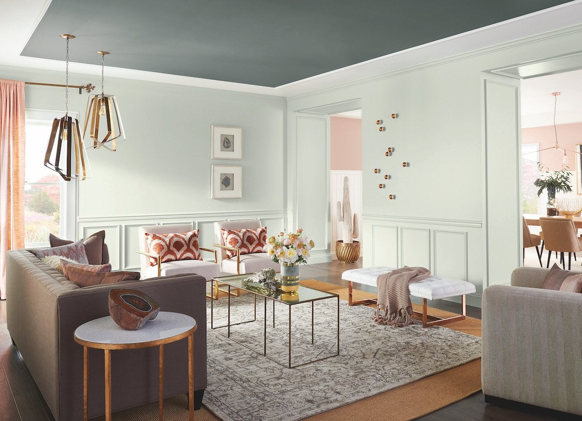
Sherwin-Williams
Botanically-inspired hues can be found throughout Sherwin-Williams’ 2018 Colormix Forecast, like the barely-there green of Pearl Gray. “Hushed tones, complex grays, and hazy botanicals blend together fluidly to create a peaceful space,” says Sue Wadden. In this airy living room, Pearl Gray walls are punctuated by a ceiling painted in Homburg Gray (SW 7622), another Colormix selection.
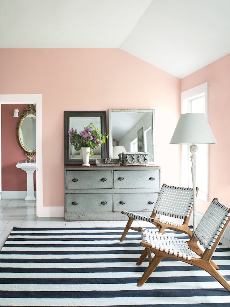
Pleasant Pink—Benjamin Moore 2094-60
Benjamin Moore
Proving once and for all that pale pink isn’t just for kids anymore, Benjamin Moore has added Pleasant Pink to its 2018 color trends palette. The inviting, seashell shade acts as an ideal neutral backdrop for any decorating style. Layer on graphic black-and-white prints for a modern look, position weathered wood furnishings for a more country feeling, or combine influences for a lively mix.
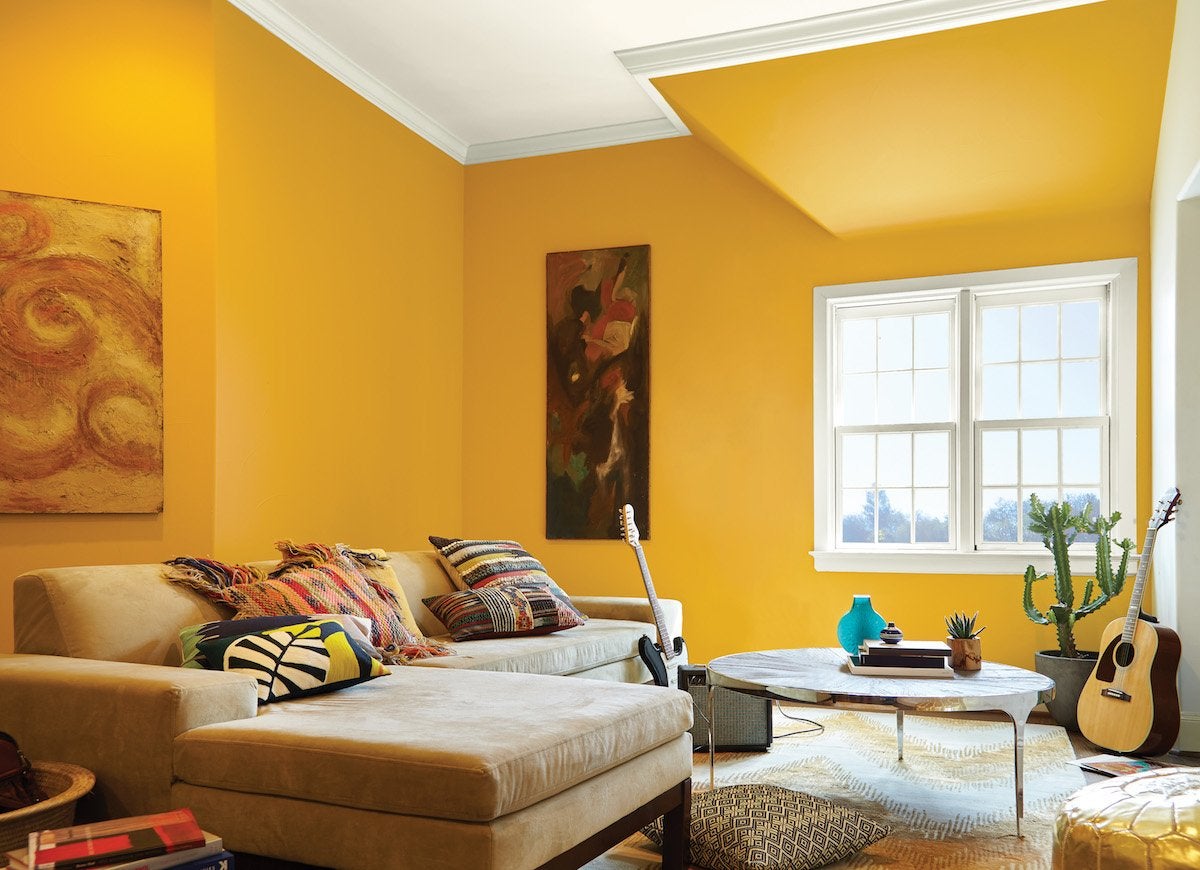
Life is Good—Behr T18-05
Behr
Cheerful yellow is turned up to full volume for Life is Good, part of Behr’s 2018 color trends palette—a collection of colors chosen to “rejuvenate the spirit, inspire joy, and restore balance to our lives,” says Erika Woelfel. The bold color invites playful mixtures of texture and pattern, from throw pillows to carpets to curtains, reflecting the international influence so prevalent in home design today.
Prep for Paint
Inspired to repaint your space? Then you’ll want to do the job right. Check our guide to the best paint tools you never knew you needed or take note of these painting tricks that’ll make the process of painting your home mess- and effort-free.