We may earn revenue from the products available on this page and participate in affiliate programs. Learn More ›
When a space lacks natural light, choosing a paint color for the walls is challenging. Colors that are too muted or too cool can make sun-deprived interiors feel uninviting. Instead, play up the light from lamps and overhead fixtures with lighter, warmer shades to visually expand dark spaces and create a welcoming atmosphere for you and your guests.
In our pursuit of the best paint colors for low-light rooms, we consulted professional paint color expert Amy Krane of New York-based Amy Krane Color. “I advise my clients to test, test, test, no matter the type of natural light in the room,” Krane says. “Paint a test swatch on the wall at least 2 feet square, two coats, in areas of direct light and in shade, then observe the colors during all times of day, all weather, and with and without your light fixtures on.” The eye-catching hues below can rescue any dark corner in your home, making it feel much brighter and oh-so-cozy.
1. Dorset Gold by Benjamin Moore
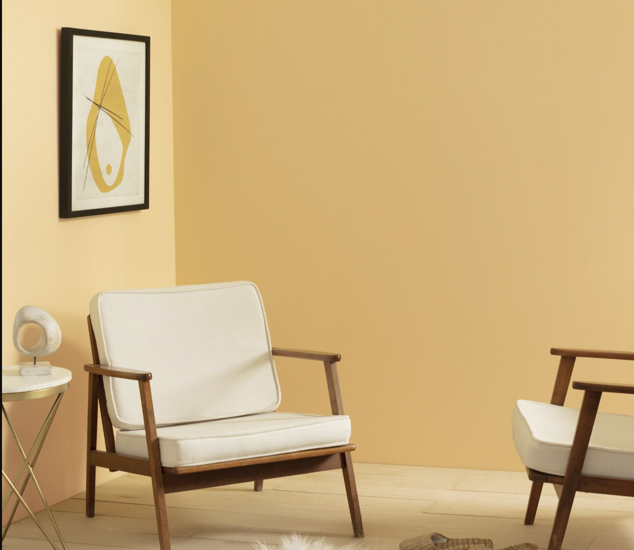
Dorset Gold by Benjamin Moore earns a top spot on Krane’s list of paint colors for low-light rooms. “Choose a warm color that is known to reflect light,” Krane says. “This means yellow, all shades and tints of it. From canary to ocher, a yellow will add some brightness and warmth to the room.” So whether you choose an ocher reminiscent of a wheat field or one closer to gold, like Dorset Gold (HC-8), the color should work wonders for dim rooms as it features a natural warmth that reflects available light.
Gold works most often in traditional settings, highlighted by white mantels, molding, and trim, but it’s perfect for bringing a touch of luminosity to a space as well. Shine any woodwork with a semi- or high-gloss paint to add a bit of dazzle.
2. Wallflower by Sherwin-Williams

Lavender is a good choice for low-light spaces because a subtle purple hue reflects available light to create the illusion of brightness. Sherwin-Williams’ Wallflower (SW 6281) has subtle and soft undertones that create a luminous effect. For a more grown-up interpretation, pair lavender with gray, black, and white; when coordinated with bold purples and blues, it turns playful.
RELATED: 29 Best Paint Colors for a Kitchen You’ll Never Want to Leave
3. Miami Parasol by Backdrop
What better way to mimic natural light in a room than with sunny yellow walls? The light, buttery hues of Backdrop’s Miami Parasol reflect artificial light without the risk of overpowering the space, as a bolder shade might.
“Opt for warm and light shades like soft yellows, creamy whites, light grays, or warm beiges, says Stacy Dackson, associate designer at New York Interior Design Inc. “These colors can make a room feel more inviting and less gloomy in low-light conditions.” Enhance the classic look of yellow interiors with white woodwork and warm wood tones.
4. Hearthstone Brown by Benjamin Moore
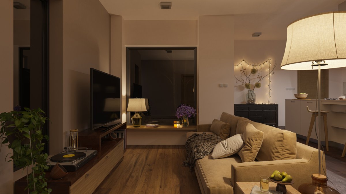
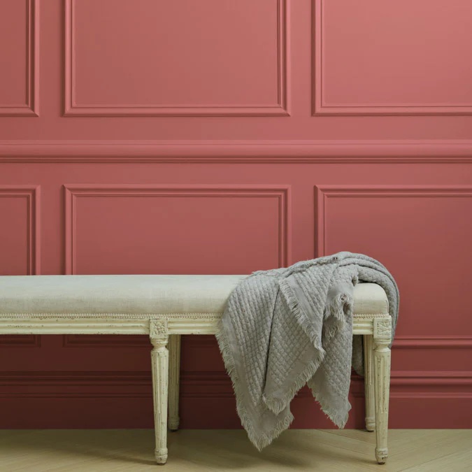
“Embrace the dark! Go for a dramatic, deep, cozy color,” says Krane. This creates a mood that distracts from the lack of light “by virtue of its beauty and moodiness,” she says. While most dark paints make a low-light room feel smaller and more confining, the chocolate brown that is Hearthstone Brown by Benjamin Moore (2109-20) is a warm, inviting shade fit for a space you’d want to curl up in. Balance this strong color with light accents, such as white woodwork, pale carpeting, or patterned fabrics to keep the look from feeling too heavy.
RELATED: 10 Things to Know Before Painting Your Walls a Dark Color
5. Sleepy Blue by Sherwin-Williams
Sleepy Blue by Sherwin Williams (SW 6225) is an ideal choice for low-light rooms because it has cool undertones that can brighten even the darkest corner of the home. It’s well suited to traditional interiors if you pair it with crisp white details and dark wood furnishings. It can also skew retro—think midcentury atomic art—if you add cherry red or lime green to the mix.
6. Accessible Beige by Sherwin-Williams
The warmth of Sherwin-Williams’ Accessible Beige (SW 7036) helps counteract cool tones that often are present in low-light rooms. The color features a subtle combination of gray and beige and creates a soft and inviting atmosphere. You’ll notice that this color helps bounce light around the room and minimizes any shadows in the space.
7. Party Peach by Benjamin Moore
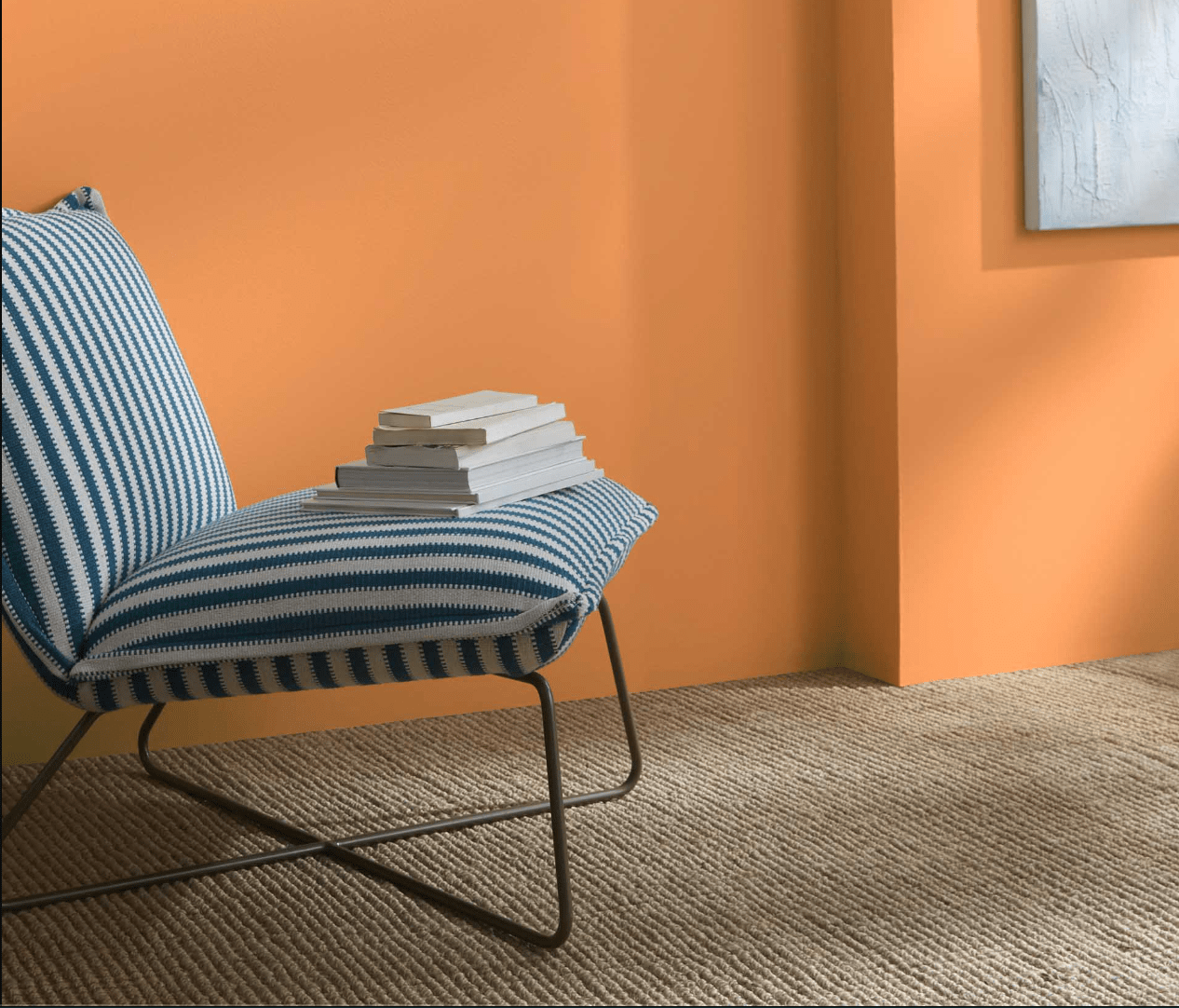
Apricot, pumpkin, tangerine: All of these shades of orange can transform an interior that gets little light into a gathering place that exudes warmth. Benjamin Moore’s Party Peach (139) certainly brings joy to any room as its soft peach hue glows radiantly when lit by lamps, candlelight, or even sunlight from a small window.
8. Purbeck Stone by Farrow & Ball
Elegant gray has become the new neutral in interior design. One reason for its popularity is that it works equally well in both sun-bathed and light-deprived spaces. Purbeck Stone by Farrow & Ball (No. 275) is a mid-gray with an “extraordinary response to light,” according to the company’s website, which counterbalances low-light areas.
When shopping for paints for darker rooms, “look for colors with higher LRV (light reflectance value), as they reflect more light and can help brighten a room,” Dackson says. Choosing a light shade like this one for the walls and incorporating bright accents into the room through woodwork, fabrics, and accessories, can really liven up a dim room.
RELATED: The Best Greige Paint Colors for a Warm, Welcoming Home
9. Pink Sky by Clare
Pink is a natural choice for rooms where sunlight is limited. Pale rose and seashell can brighten all four walls, but bolder hues like watermelon and fuchsia will overwhelm a dimly lit space—save those for an accent wall. The coral-like Pink Sky by Clare makes a great wall color for low-light rooms. Its soft peachy undertones create a subtle luminosity for an inviting environment. “Pay attention to the undertones of the paint colors,” Dackson says. “Some neutrals might have warm or cool undertones. Cool undertones (like blue or green) might amplify the feeling of coolness in a low-light room, while warm undertones (like yellow or peach) can add warmth and coziness.”
10. Silver Drop by Behr
Another favorite among interior designers, Behr’s Silver Drop (790C-2) is a light gray with a hint of warmth and adds a clean, airy feeling to spaces that lack light. Like the other pale grays mentioned above, Silver Drop reflects and diffuses any available light, minimizing shadows and creating a serene space.
11. Lime Green by Benjamin Moore
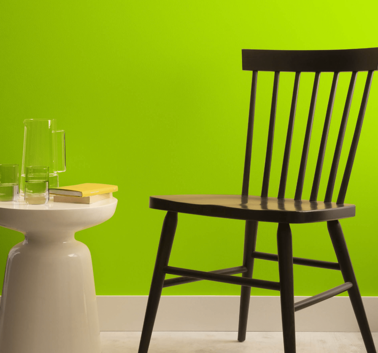
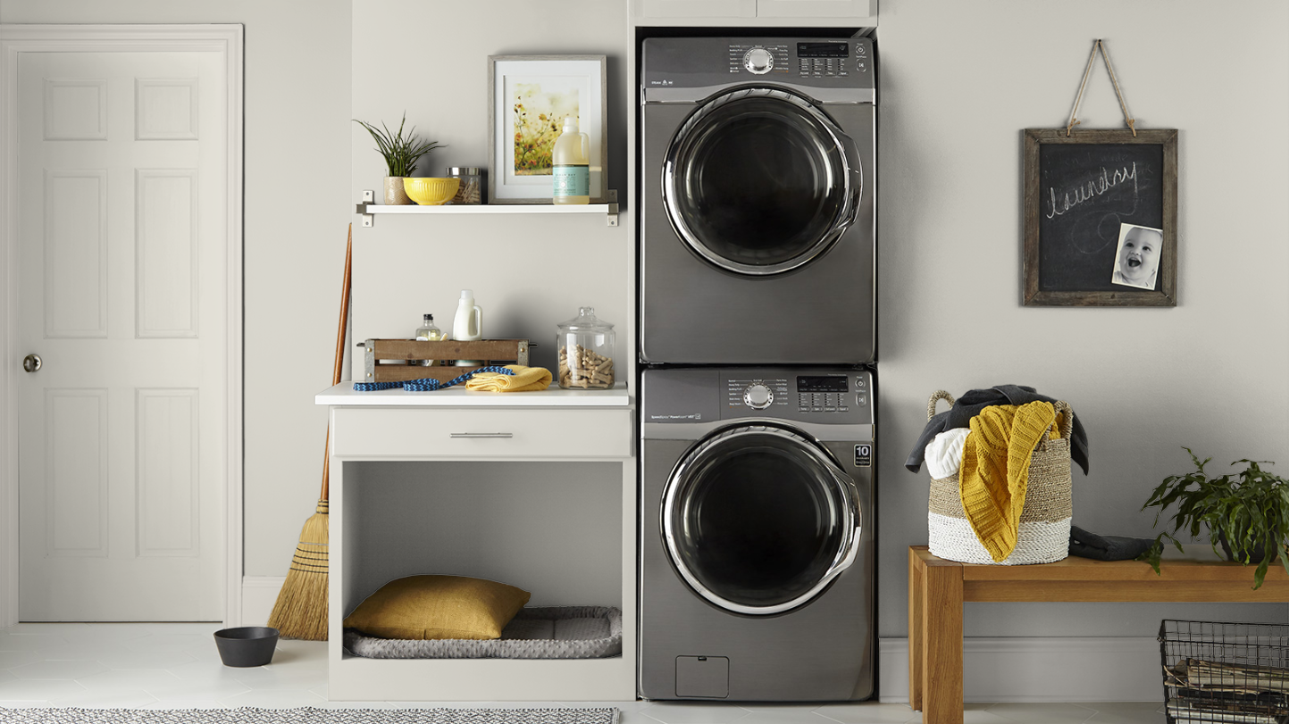
Lime green energizes interiors both large and small, especially in a poorly lit room. Though many homeowners only use it on an accent wall, braver souls have successfully used it on all four walls—or even the ceiling. Lime Green by Benjamin Moore (2026-10) can instantly perk up otherwise dark and dowdy bedrooms and baths, or out-of-the-way spots like laundry rooms and under-stair spaces.
RELATED: The 15 Best Paint Brands
12. Decorator’s White by Benjamin Moore
This versatile, soft white reflects light well without feeling stark, according to Dackson. Decorator’s White by Benjamin Moore (CC-20) makes a great color for dim spaces; its crisp and clean hue helps counteract the darkness. Interior designers often favor white and cream tones as they have the power to visually transform and expand a space, too.
13. Pale Oak by Benjamin Moore
Pale Oak by Benjamin Moore (OC-20) is another one of Dackson’s go-to hues for low-light rooms. Unlike stark whites or similar colors that can appear bleak in dim lighting, the soft, warm gray Pale Oak strikes the perfect balance, providing hints of brightness without overwhelming the space.
Where to Buy the Paint Mentioned in this Article
Buy Backdrop at backdrophome.com
Buy Behr paint at The Home Depot
Buy Benjamin Moore paint at Ace HardwareBuy Clare paint at Clare Paints
Buy Farrow & Ball paint at your local stockist
Buy HGTV by Sherwin-Williams paint at Lowe’s
Buy PPG paint at The Home Depot