
We may earn revenue from the products available on this page and participate in affiliate programs. Learn More ›
An accent wall provides a visual focal point in any room and is a great way to add color and personality to a home. It can make a huge difference in a small space by drawing attention to the art on display, or providing a bold backdrop for decorative accessories. An accent wall doesn’t have to be large—sometimes just painting one section of a wall can make a considerable impact on your space. Whether you’re looking for vibrant colors or neutrals, here are 16 of the best paint colors for your accent wall.
1. Burnt Sienna by Benjamin Moore

Warm terracotta hues have been everywhere in recent years, from clothing to graphic design to home decor. Benjamin Moore’s Burnt Sienna is the perfect example, and will bring an earthy, grounding effect to any room in which it’s used. The hue adds warmth to a room with dark wood furniture or dark floors but can also be utilized in a more sparse, modern space to add a splash of color among otherwise neutral hues.
2. October Mist by Benjamin Moore

Benjamin Moore’s 2022 Color of the Year is October Mist, a sage paint color that’s at once fresh and calming. The brand describes the color as “evocative of the stem of a flower, this gently shaded sage anchors and uplifts.” It’s a great choice for rooms that would benefit from some color, but where a bold or dark hue would be unwelcome. A green accent wall in a bedroom or nursery is a particularly good choice.
3. Incarnadine by Farrow & Ball
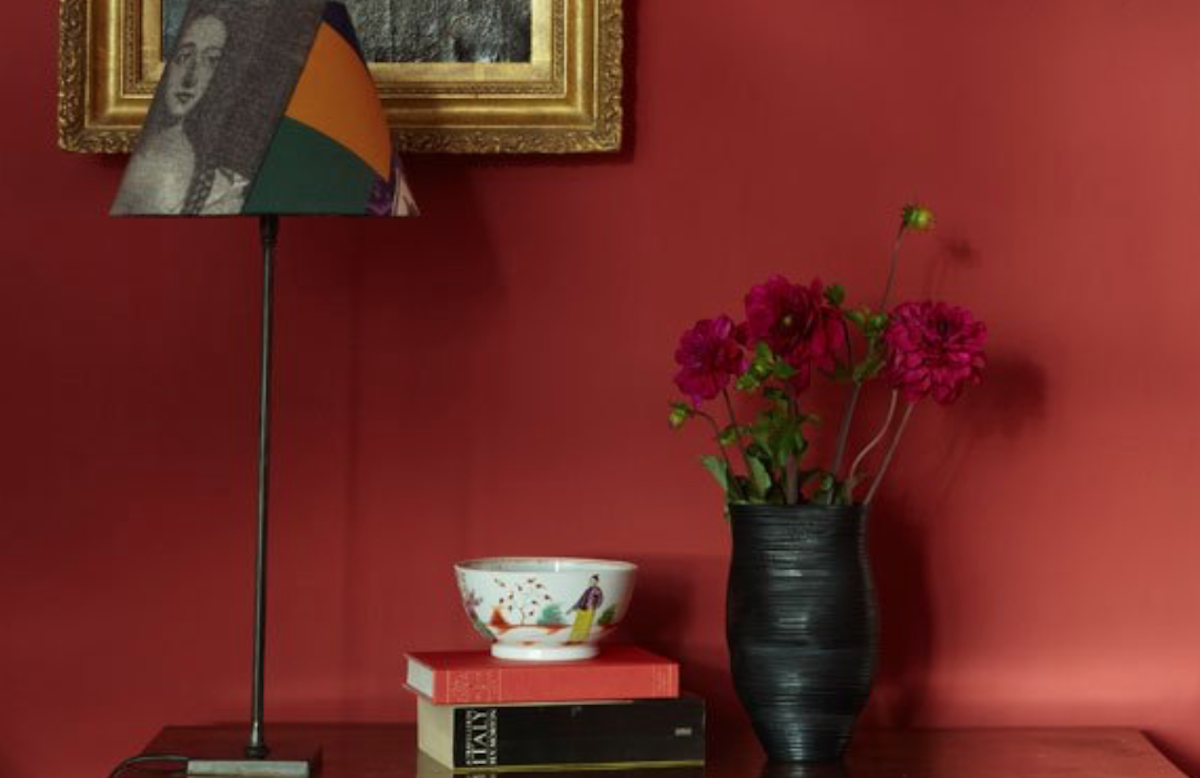
Those looking to add a bold visual statement to any room should consider a deep crimson like Incarnadine by Farrow & Ball. It would make a striking addition to a dining room or a living room filled with vintage treasures. In fact, it was inspired by the work of David Hicks at Barons Court in the 1970s. It’s a particularly excellent choice as a backdrop for art.
4. Violet Petal by Benjamin Moore
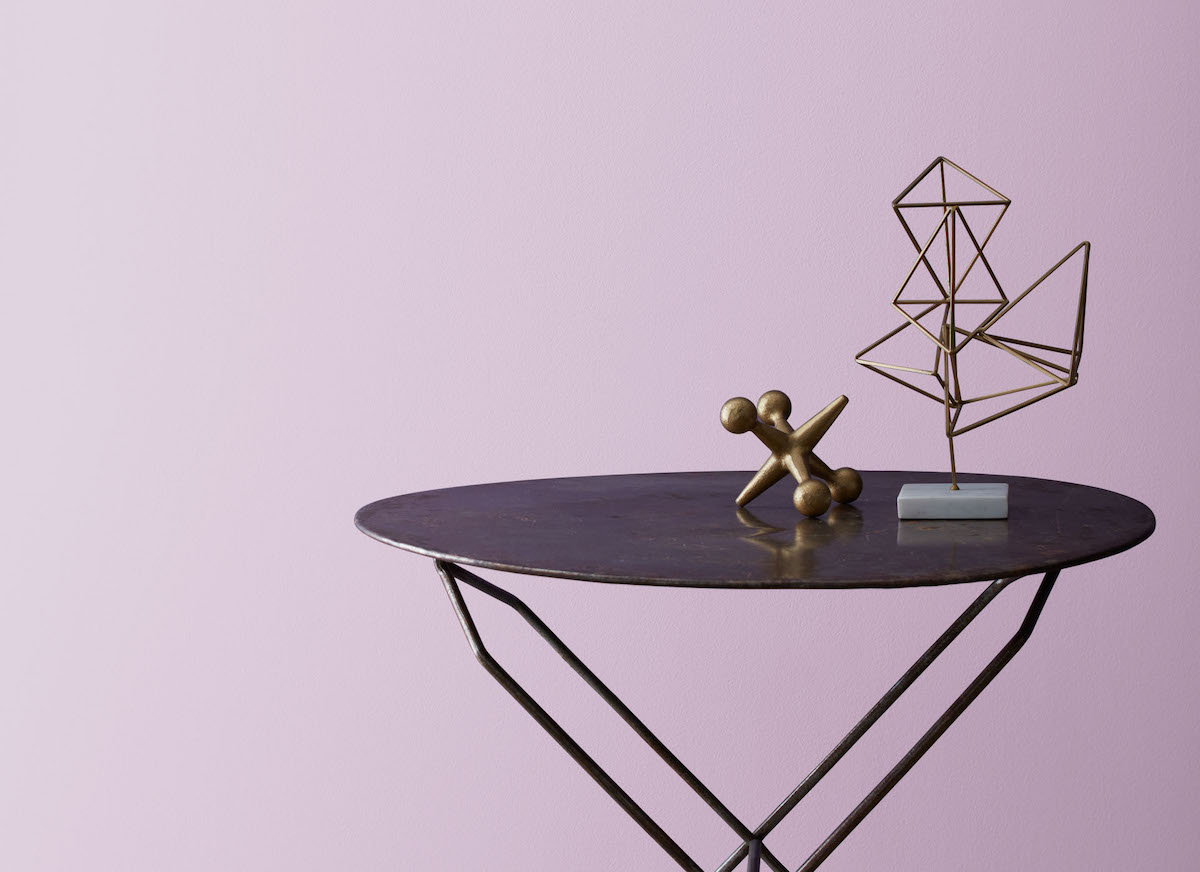
Violet is known to be an uplifting color that inspires creativity and imagination. The warm undertones of pale violet make it ideal for spaces where you want to relax after work or school, like the bedroom or living room. Violet Petal by Benjamin Moore is a strong enough color to use for an accent wall but isn’t such a bright color that it feels childish.
5. Railings by Farrow & Ball
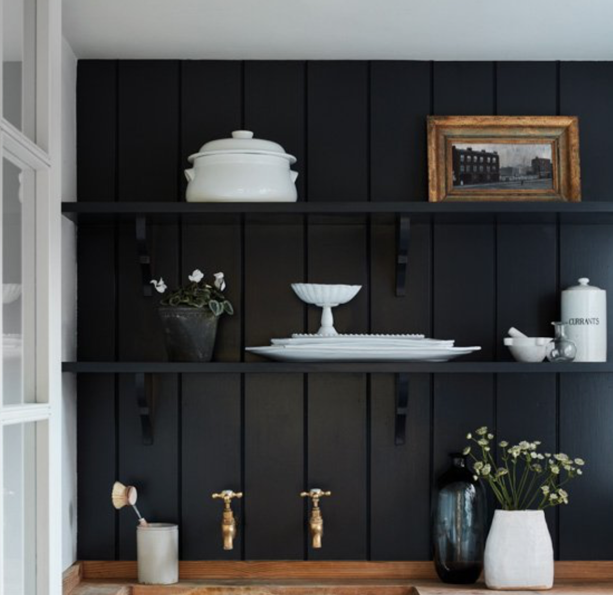
Black is a perennially popular choice for accent walls because it’s timeless and provides a major impact. Black paint on an accent wall gives off an illusion of depth because it contrasts so sharply with lighter elements in the room. It does, however, tend to absorb light rather than reflect it like lighter colors do, so it’s best used in spaces that have plenty of natural light. Railings by Farrow & Ball is described by the brand as a “soft black” that’s “more blue than black.” It’s inspired by the color of ironwork and makes for a dramatic yet classic addition to any interior space.
6. Corn Stalk by Behr

Yellow is one of those colors that can bring warmth and energy to any space, but it will also help make a room appear brighter and more open. Corn Stalk by Behr is a great choice for those who don’t necessarily want to make a huge statement but rather subtly bring yellow into a room. It’s a mid-tone buttery yellow that would look great in a kitchen.
7. Art and Craft by Dunn-Edwards
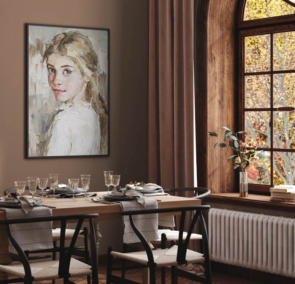
Choosing a neutral color for an accent wall may not seem like an obvious choice, but opting for a neutral in a slightly darker tone can make a major impact without introducing any bright hues. Warm browns are subtle and inviting—they don’t draw attention to themselves but instead add warmth to the overall feeling of a room. Art and Craft by Dunn-Edwards looks great with other warm-toned shades like cream and blush.
8. Frank Blue by Sherwin-Williams
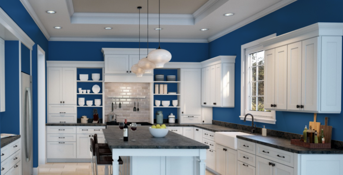
Blue is known for being a soothing color, but a bright blue like this one by Sherwin-Williams adds plenty of energy to a space. The best part about a bright blue accent wall is that it works well with almost any decorating style, from contemporary to traditional. Frank Blue coordinates well with other cool neutrals like gray, making it a perfect choice as an accent wall in a room that already has light gray walls.
9. Evergreen Fog by Sherwin-Williams

Sherwin-Williams chose Evergreen Fog as their 2022 Color of the Year, so it will probably be a popular choice in the months to come. The brand describes the color as “a versatile and calming hue, a chameleon color of gorgeous green-meets-gray, with just a bit of blue.” They go on to say, “It’s a simple but sophisticated wash of beautiful, organic color for spaces that crave a subtle yet stunning statement shade.”
10. Mink Violet by Benjamin Moore

Looking to add some color without introducing a rainbow hue? Consider a neutral-toned purple like Mink Violet by Benjamin Moore. It’s described as a “moody violet with warm, dusted red undertones” that could act as a bolder alternative to something like mid-toned gray. It can coordinate with either warm or cool-toned colors, including blue, yellow, and cream.
11. Studio Green by Farrow & Ball

A dark green accent wall evokes evergreen forests and English hunting lodges, bringing both a sense of nature and history to any space. It’s sophisticated, luxurious, and yet feels practically like a neutral. Studio Green by Farrow & Ball is chameleon-like, appearing nearly black in rooms with dim lighting and brighter green in well-lit spaces.
12. Sunwashed Brick by Behr
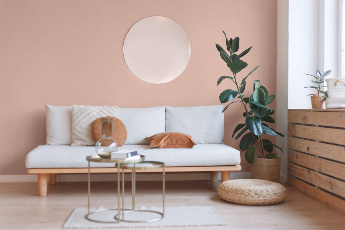
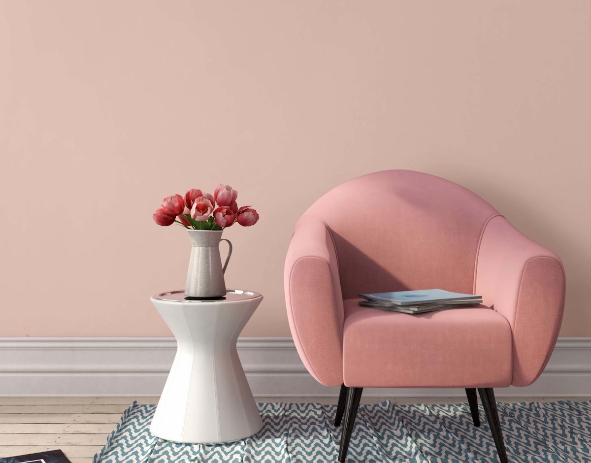
Blush hues have been everywhere for the last few years, and it doesn’t look like the trend is abating. While pink tones have typically been considered feminine, they’re evolving to have a reputation as an on-trend neutral. Choosing the right tone, however, is paramount to avoid a space looking like a child’s nursery. Behr’s Sunwashed Brick is soft and sophisticated, and would make a punchy accent to a living room or bedroom.
13. Breathe by Graham & Brown
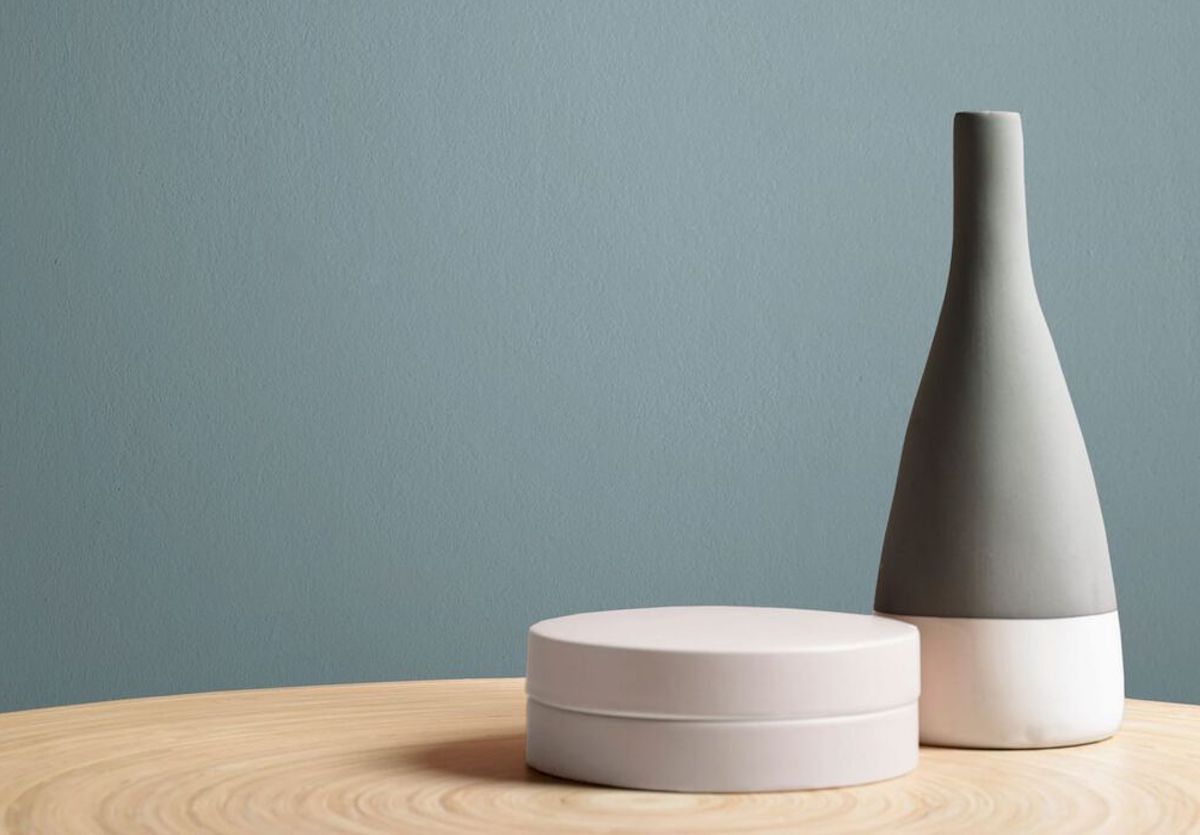
Choosing a pale color for an accent wall adds contrast and visual interest without becoming the focal point of the space. It’s also a perfect choice for those who aren’t ready to commit to painting a full room. Pale blue, like Breathe by Graham & Brown, is not only soothing and calming but it’s also very versatile, working in nearly any room of the house.
14. Babouche by Farrow & Ball
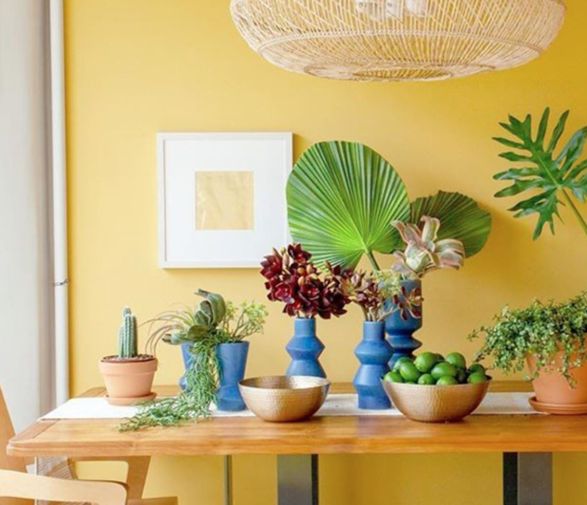
When used as an accent color, bright yellow can be incredibly effective. Yellow is great for adding warmth to a room and it’s also a great complementary color for green tones. It’s bright and sunny, but it can also be too intense for some spaces. Babouche by Farrow & Ball is inspired by the yellow shoes worn by Moroccan men and makes a major statement if used in the right space.
15. Peppercorn by Sherwin Williams
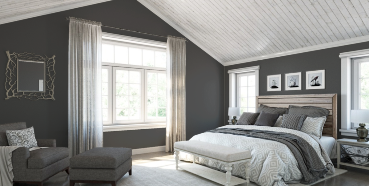
Dark gray has long been a popular choice for accent walls but can look completely different depending on the tone and color temperature. Sherwin-Williams’ Peppercorn is a crisp, cool gray that looks beautiful in rooms with white trim and crown molding. It also works well on kitchen cabinets, adding a moody accent to any kitchen.
16. Hague Blue by Farrow & Ball
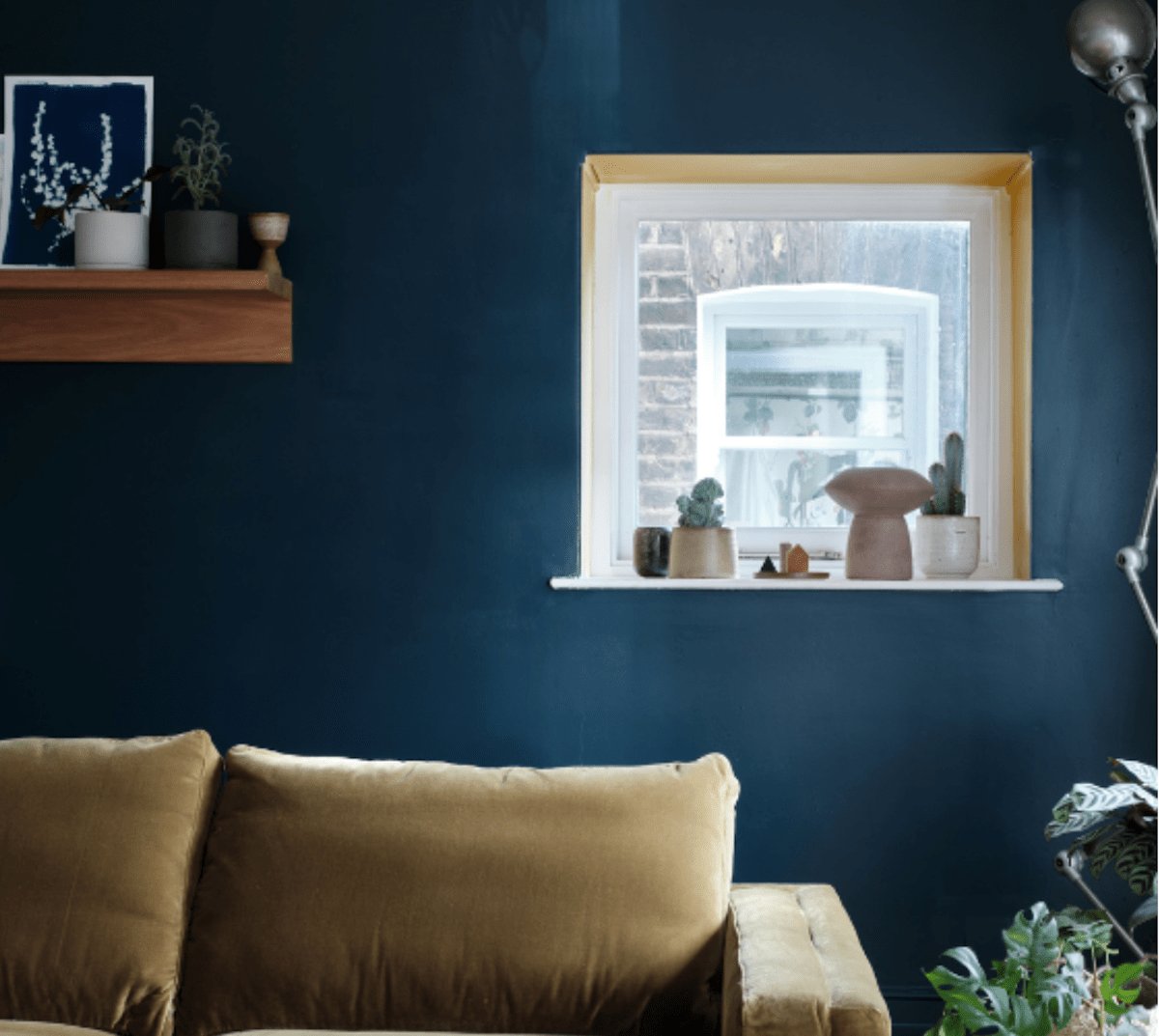
The impact of a dark blue accent wall on a room can be dramatic because this color is often associated with power, elegance, and wealth. Farrow & Ball’s Hague Blue has been popular for years because it evokes a classic European atmosphere that never goes out of style. It was inspired by painted Dutch woodwork and is named for The Hague. A dark teal accent wall in a color like this one is the perfect choice for an accent in living and dining rooms.
