

We may earn revenue from the products available on this page and participate in affiliate programs. Learn More ›
Q: What is a 60-30-10 color palette, and how can I incorporate it into my home’s interior decor scheme?
A: The 60-30-10 rule is a concept that provides simple guidelines for developing cohesive color palettes for interior design, and it’s a method for decorating with color. It divides the colors of a space into three sections: the dominant color, secondary color, and accent color.
The first number, 60, represents the percentage of the room devoted to the dominant color. The second number, 30, is the percentage of space displaying the secondary color, and the third number indicates how much space—10 percent—is devoted to an accent color.
RELATED: 12 Exterior Paint Colors That’ll Help Sell Your House
The 60-30-10 rule is a classic decorating concept for crafting a color palette.
This rule has been used by interior designers for decades to create cohesive, sophisticated spaces. One of the reasons it’s so commonly cited is because it helps remind us that we don’t have to go overboard with our color choices—just three colors are usually enough to create a dynamic look in most any space. While the percentages don’t need to be adhered to exactly, they do provide a rough guideline for how much of each color should be used in a space.
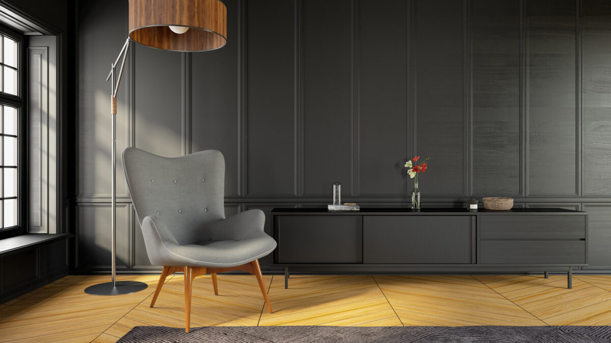
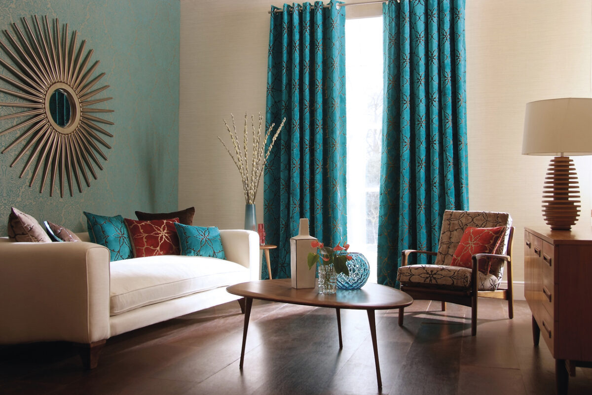
The dominant color is used for about 60 percent of the room’s surfaces—this typically includes the color of the walls and could also include large rugs and furniture. The secondary color is often incorporated into window treatments, furniture upholstery, artwork, and accent walls. Its primary purpose is to provide contrast against the dominant color. Lastly, an accent color is used sparingly on smaller objects like lamps and throw pillows. This final touch provides visual interest and depth through its contrast with the rest of the colors in a space.
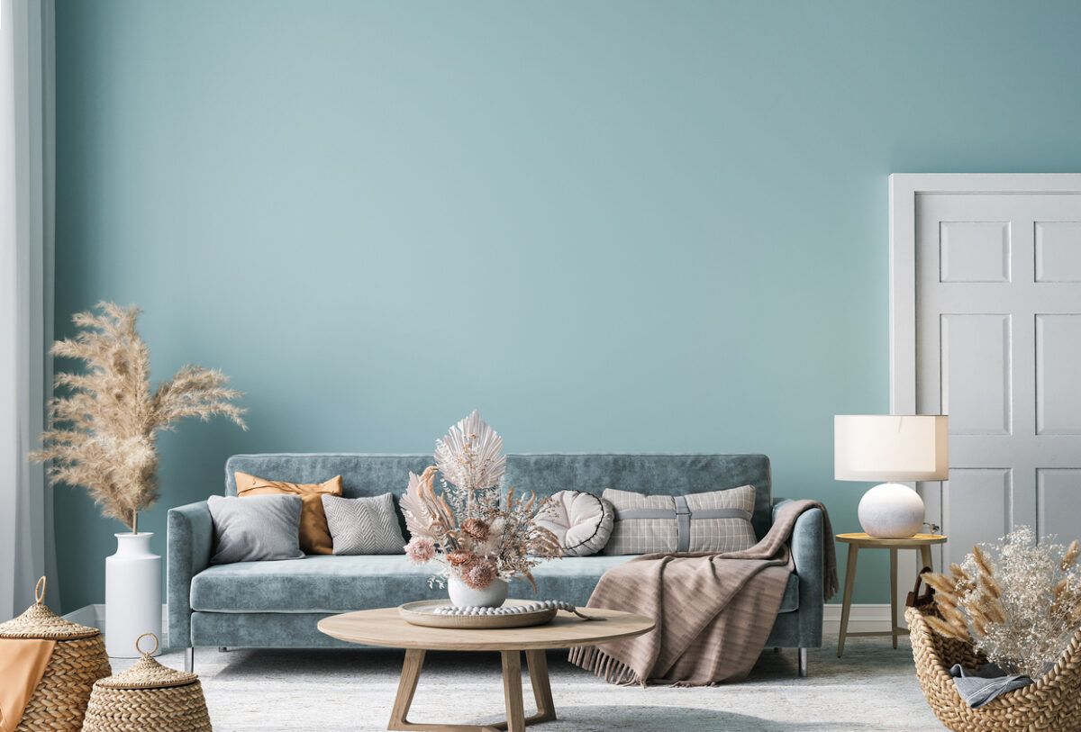
Choose a dominant color for a room’s walls, rugs, and other larger elements.
The first step is to choose the dominant color that is typically used for walls, flooring, and other large pieces. Look at photos of rooms that inspire you and take note of their color scheme. When choosing a room’s dominant color, consider the mood that you’d like to evoke. If you want to create a relaxing atmosphere, opt for colors that evoke feelings of tranquility. For example, greens and blues are considered to be calming colors. Grays and whites can also create a peaceful atmosphere. To give off a cozy vibe, choose browns or soft oranges and yellows.
Also, consider the depth of the color. A more relaxing room may call for pale neutral tones like cream or beige. On the other hand, a room can feel more intimate and cozy when decorated with richer colors.
RELATED: How to Select a Paint Color
Use a secondary color for window treatments, furniture, or an accent wall.
Once you’ve chosen your dominant color, it’s time to pick a secondary color that provides contrast with the dominant color. Secondary colors are often incorporated through upholstery, accent walls, and furniture pieces.
If you’ve opted for a pale hue—like white—for your dominant color, then a warm umber or dark gray could make a great secondary color. Another option is to use a wood hue as the secondary color, which is also picked up in fabric patterns and other design elements.
Feel free to vary the tone in order to make the room even more dynamic. For example, both lighter and darker shades of blue can be used within the umbrella of the secondary color.
Select a third color for art, throw pillows, and other small decor pieces.
Choosing the third color is an opportunity for a little fun. If your dominant and secondary colors are both relatively neutral shades, consider adding pops of bright hues as an accent. Alternatively, in a room that has brightly-colored walls, white may act as the accent color. Accents can also be metallics like gold, silver, brass, or bronze, which can be provided by lamps, furniture hardware, and other fixtures.
Since the accent color only makes up 10 percent of the room, it can also be swapped out easily. So while it might make sense to choose safe, timeless hues for the dominant and secondary colors, you can opt for something a bit more trendy as an accent color.
Refer to the color wheel to choose the three colors.
Not sure how to choose the three colors? Think back to elementary school days and recall the color wheel. Color wheels display the primary, secondary, and tertiary colors in the visible color spectrum. Hues that are placed opposite from one another on the wheel are known as complementary colors.
While the color wheel is made up of bright hues, the same colors can also be used for the undertones of more neutral hues. For example, a room with blue-toned gray walls can benefit from orange accents, and a space that’s predominantly made up of creamy yellow hues would be complemented by pops of purple.
Don’t be afraid to break the 60-30-10 rule.
Like other interior design rules, the 60-30-10 color rule is just a guideline, and it’s meant to be broken. While it provides an excellent base for creating universally appealing color palettes, it may not work for maximalists and those who prefer a more eclectic or bohemian aesthetic with several colors in a room’s scheme.
One way to personalize the rule is by twisting the rule to make the secondary “color” a broad category instead of a single color. For example, pastels could be your secondary “color,” allowing for pale hues of blue, green, pink, and yellow. Instead of an accent color, opt for an accent pattern. Use floral prints, animal prints, stripes, or polka dots to add an extra layer of visual interest.
RELATED: 7 No-Fail Exterior Paint Colors