We may earn revenue from the products available on this page and participate in affiliate programs. Learn More ›
Soothing Shades for Your Home
With life more stressful than ever, many of us are eager to fashion our homes as restful, relaxing sanctuaries. Thoughtful color selection is an effective way to achieve serenity. To find a shade that soothes, Sue Wadden, director of color marketing for Sherwin-Williams, recommends painting large swatches of your two or three favorite shades so you can observe how the colors shift as the natural light changes and how they look under artificial lighting. “Once you’ve spent time with each color, you’ll better understand what creates a calming mood in a room and be able to make your final choice,” says Wadden.
Click through for paint colors that radiate a sense of calm, helping you regroup, recharge, and face each day with renewed energy.
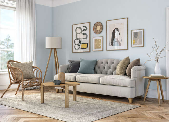
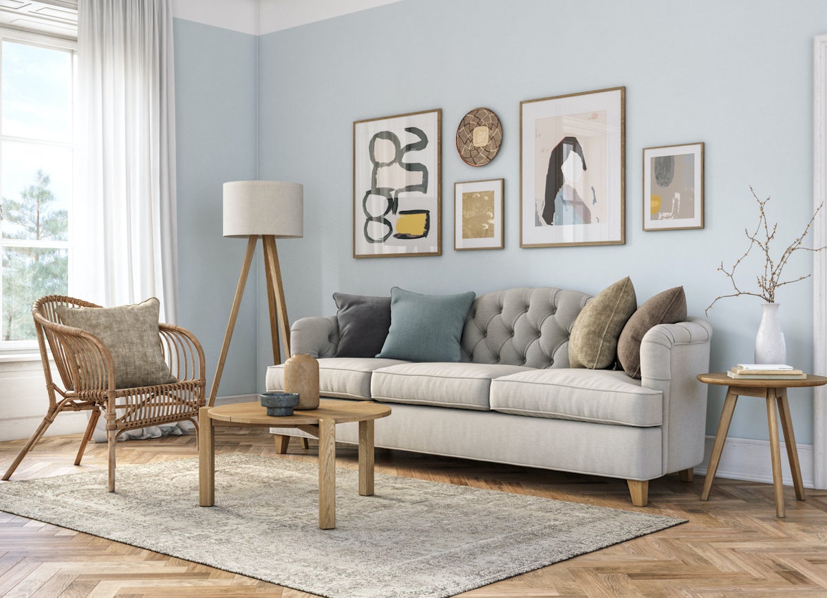
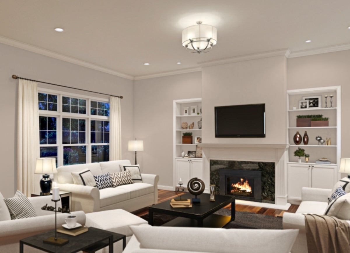
Seize the Gray by Clare
A light gray is the perfect base for a calm room. The subtle shade softens a room without making it too dim, and the room can be decorated any way you wish. Clare’s Seize the Gray is a perfect choice for a calm gray. Since it doesn’t have undertones, it is versatile for any style room and can adapt to various lighting types.
Truly Taupe by Valspar
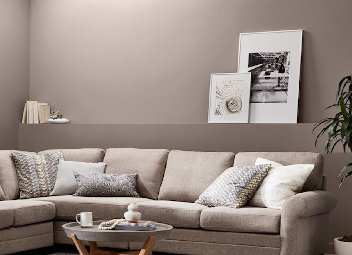
Taupe is a mix of brown and gray, but don’t confuse it for beige. This shade is typically richer and darker, with warm undertones. Wadden recommends the “cocoon feeling” that a taupe paint can convey. Truly Taupe is warm and easy to coordinate with neutral-colored furniture and Valspar’s Alabaster or Nice White.
Euphoric Lilac by Valspar
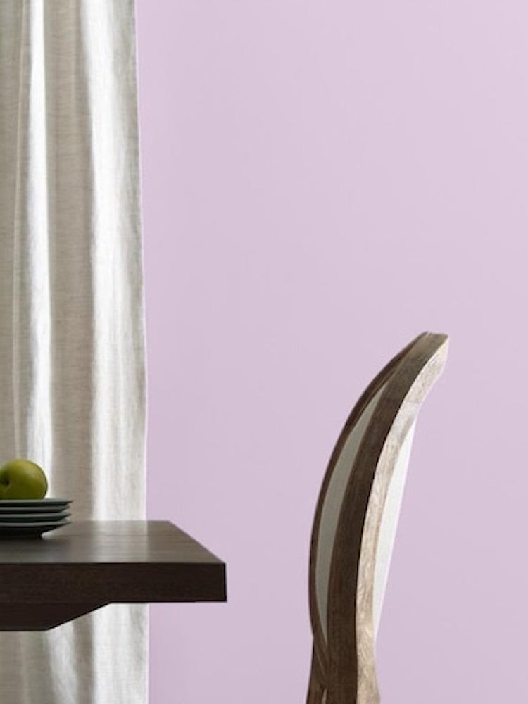
Pale purple, such as lavender or lilac, is a great option if you want to break away from neutral colors. A shade like Euphoric Lilac by Valspar soothes while still offering a pop of color and a happy vibe. Paint this satin finish on your bedroom or sitting room walls for a calming retreat.
Pure White by Sherwin-Williams
White paint provides the blank slate you need to relax. A natural white, like Pure White by Sherwin-Williams, brightens a room and helps you stay focused.
Make Waves by Clare
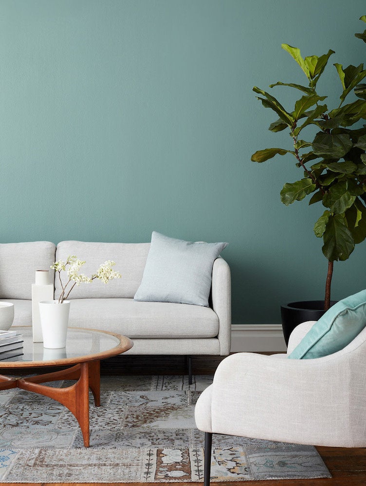
You might not be able to live at the beach or see waves from your house, but that doesn’t mean you can’t bring that breezy vibe to your home. Clare’s Make Waves is a cool green blue that, like ocean waves, ebbs and flows with your house’s natural lighting.
Bona Fide Beige by Sherwin-Williams
Pick beige for a light, peaceful neutral that lets your furniture and decor take center stage. With yellow undertones, a beige paint such as Bona Fide Beige by Sherwin-Williams is a softer, cozy alternative to white.
Petunia Pink by Benjamin Moore
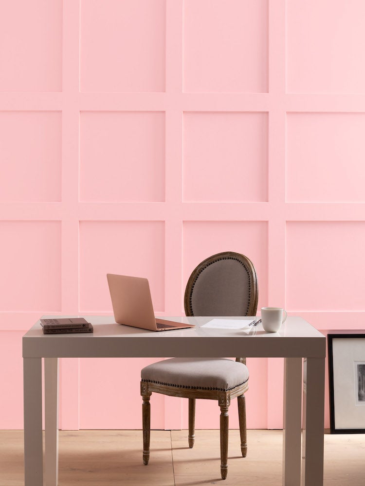
Pink isn’t just for little girls’ bedrooms anymore. From millennial pink to dusty rose, these subdued shades rejuvenate a space without being shocking. Consider Petunia Pink by Benjamin Moore for a muted pink pastel that dances around the edge of plum.
Morning Sunshine by Benjamin Moore
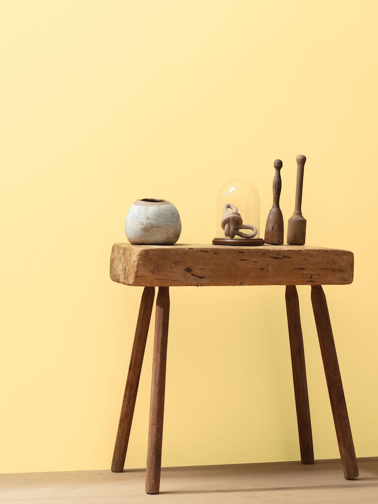
Bring the peace and serenity of daybreak indoors with Morning Sunshine by Benjamin Moore. A cheerful color that adds brightness while banishing the blahs, Morning Sunshine is not, however, so loud that it disrupts the calm. Richer than a banana peel, more muted than a child’s rain slicker, this lovely shade is the Goldilocks of yellows: just right.
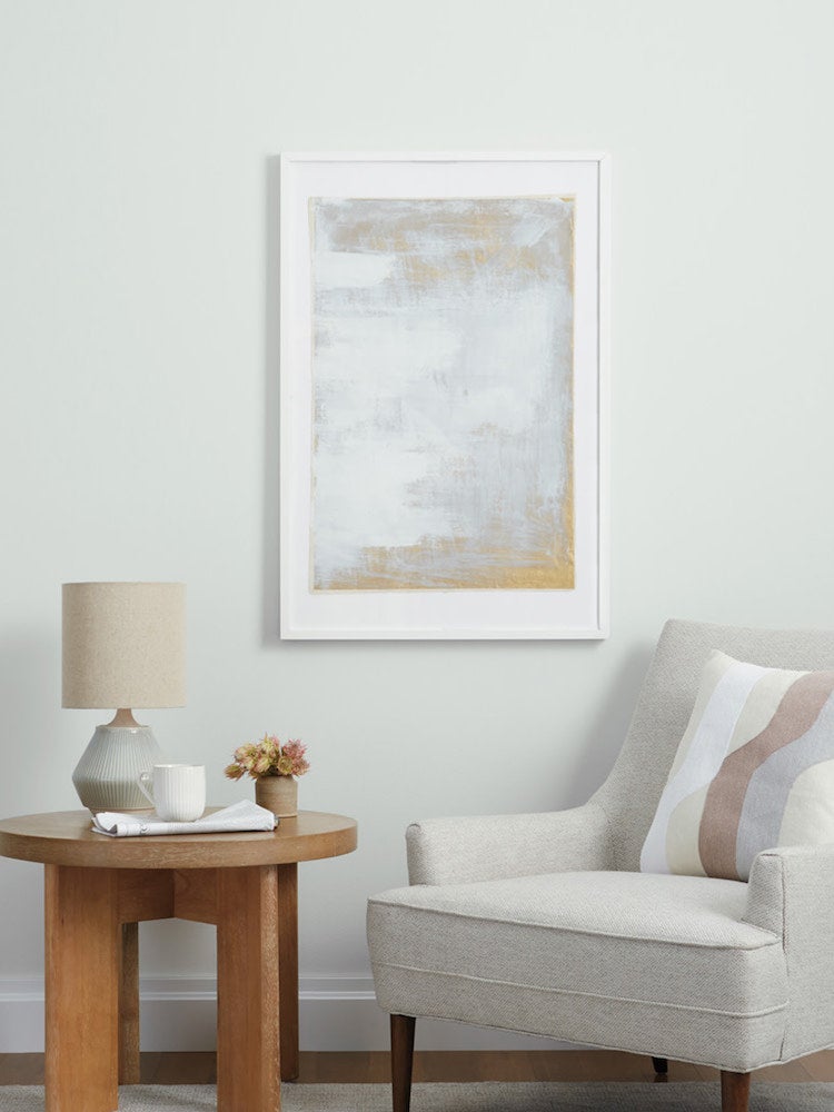
Intricate Ivory by HGTV Home by Sherwin-Williams
A whisper of color in the warmest of tones cannot help but contribute to a sense of serenity. A lovely, neutral backdrop for cherished furnishings and art, Intricate Ivory from HGTV Home by Sherwin Williams ensures that tranquility reigns in a home that feels like, well, home. This comforting cream welcomes accessories in a similar palette or accents in bursts of contrast for just a bit of excitement.
Pale Tidepool by Valspar
For those seeking a verdant vibe, perhaps something minty and mossy is the answer. Consider Valspar Pale Tidepool, a smooth and modern hue that offers a placid perspective for dwellers seeking a serene setting. Refreshing and leaning toward cool, Pale Tidepool conjures early spring days at the shore, waffle cones replete with pistachio ice cream in hand.