We may earn revenue from the products available on this page and participate in affiliate programs. Learn More ›
What's Old Is New Again
Remember those avocado kitchens of the 1970s and ’80s? Maybe you’re too young, or maybe you lived through it all and have worked hard to block out the memories. But either way, don’t be so quick to judge. As you’ll soon see, it’s possible to reinvent vintage hues (yes, even avocado) for today’s homes. We’ve interviewed color experts at top paint brands and asked them to reveal which vintage colors are new again.
Mustard
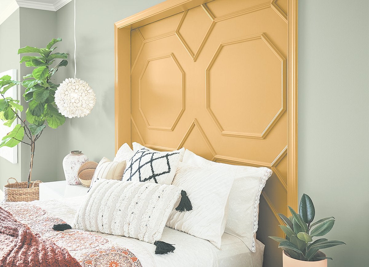
Thomas Jefferson painted his dining room at Monticello a bold, bright yellow back in the 1700s, and mustard was again all the rage in 1970s. Major paint brands are seeing a renewed interest in yellows and golds, including Cellini Gold from Behr and Tassel from Sherwin-Williams. “People want more warmth and personality in their homes,” explains Sue Wadden, director of color marketing at Sherwin-Williams. Erika Woelfel, Behr’s VP of color marketing, recommends pairing mustard paint with gray, pink, or slate blue.
Mauve
The mere mention of the word “mauve” conjures up visions of 1980s power suits and pastel bedrooms. Fortunately, this muted shade of purple is getting a remix. Check out Pratt & Lambert’s Sweet Breeze, for instance. As Ashley Banbury, senior color designer for the brand, notes, “Wood tones have shifted to cooler shades, and when combined with a beautiful mauve, [it’s] a fresh and new take on a familiar color.”
Forest Green
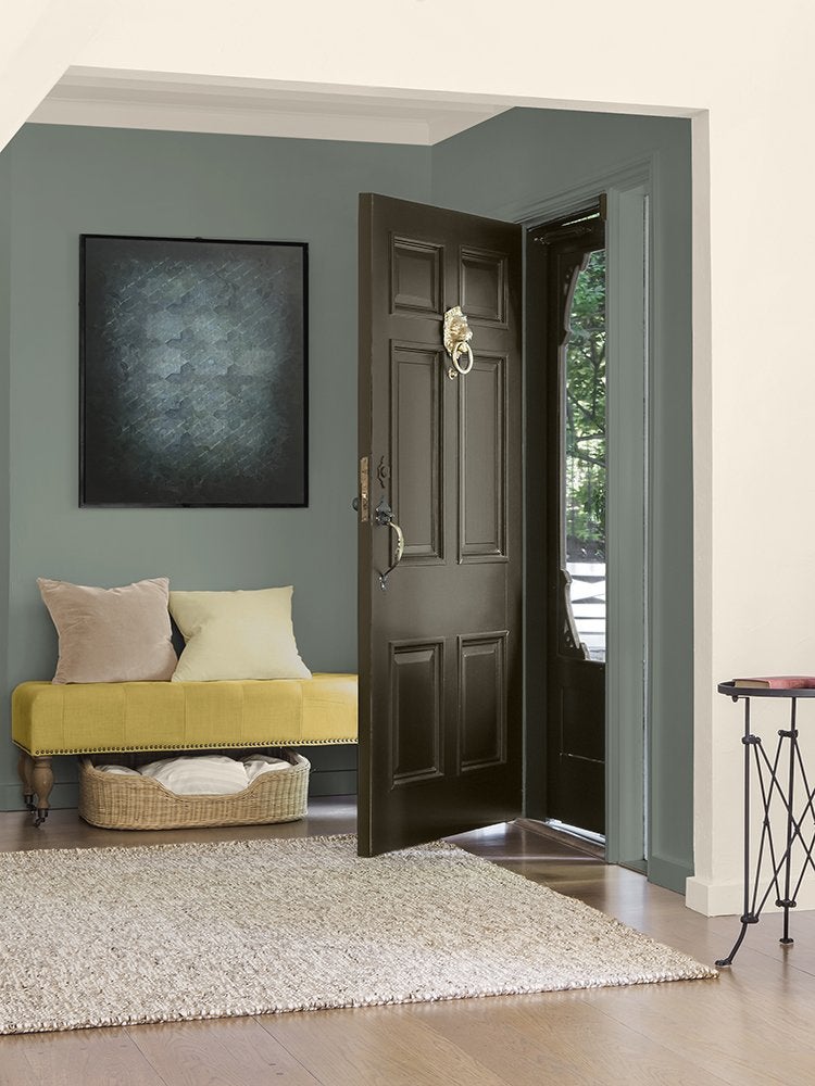
Today’s color designers are giving that 1970s avocado green a 2020 spin. “We’ve noticed green shooting up everywhere, from kitchen cabinets to front doors and walls,” observes Shannon Kaye, color marketing manager at Kelly-Moore Paints. To prevent your green from looking muddy, she recommends fresh, cooler hues like Jasper Park and Camping Trip.
Teal
The ’90s was the decade of teal. But this refreshing color is ripe for a comeback, especially with the right trim and accessories. Shannon Kaye of Kelly-Moore recommends pairing blue-green hues with “clean architectural lines, new appliances, lush tropical landscaping, and simple neutral furnishings.” Her choice is Theatre Dress, a rich, dark teal.
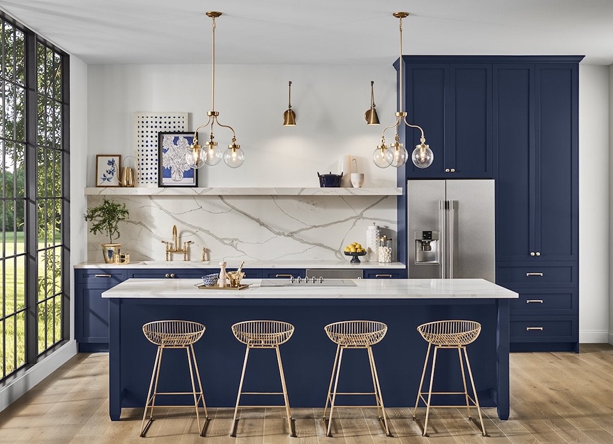
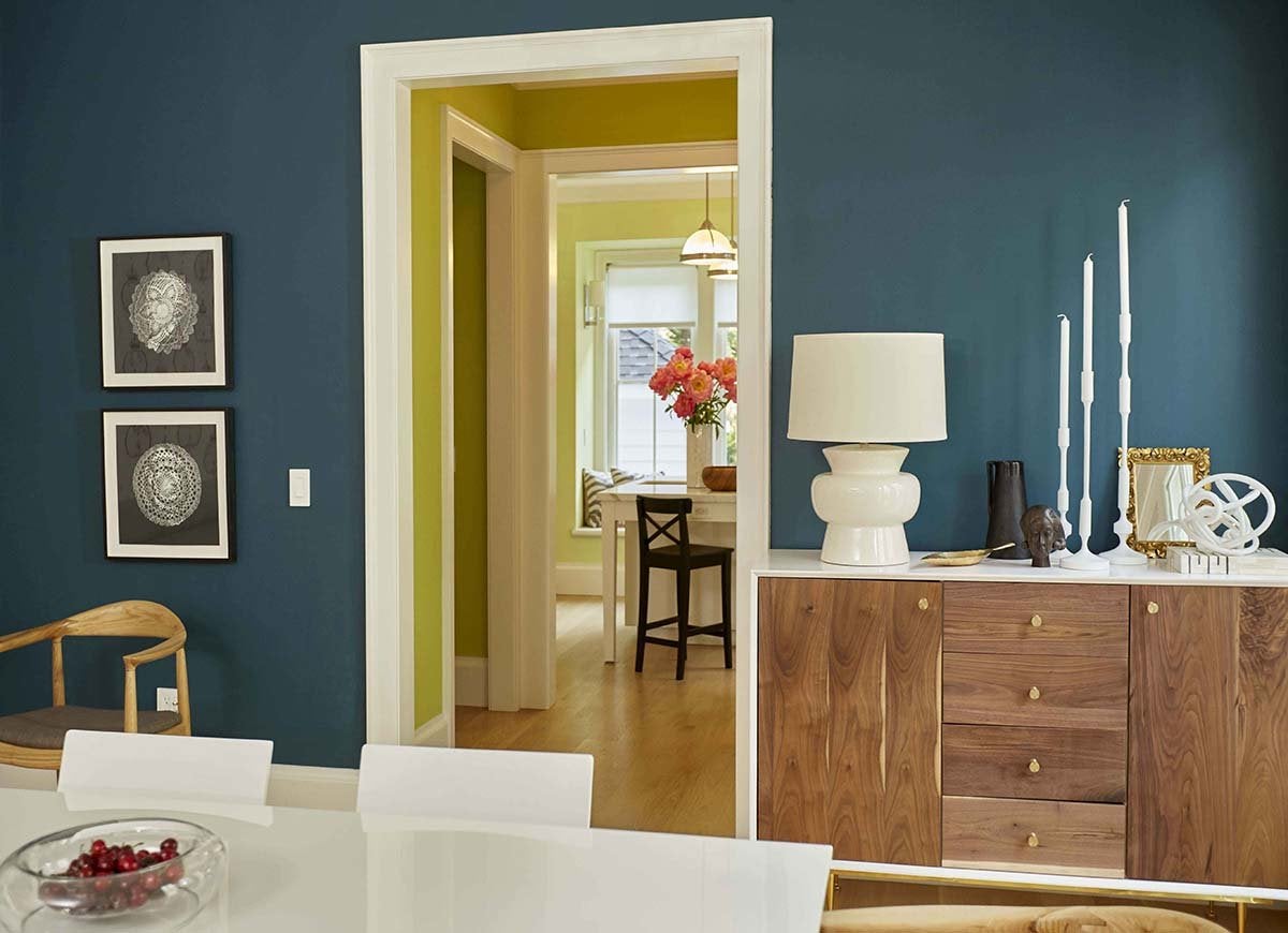
Navy
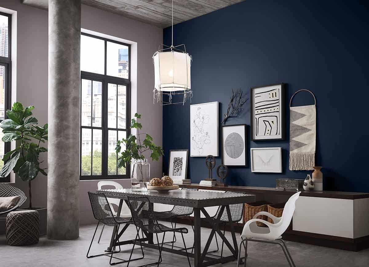
Take a tip from the Roaring ’20s: Dark colors like navy blue can add drama and luxury to your interior space. Naval from Sherwin-Williams “can act as a nostalgic pop of color, but also as a calming neutral backdrop,” says Sue Wadden, director of color marketing. Complete the look with “bold decor, streamlined silhouettes, exquisite craftsmanship, and luxurious finishes, including marble, inlaid wood, and mixed metallics,” she suggests.
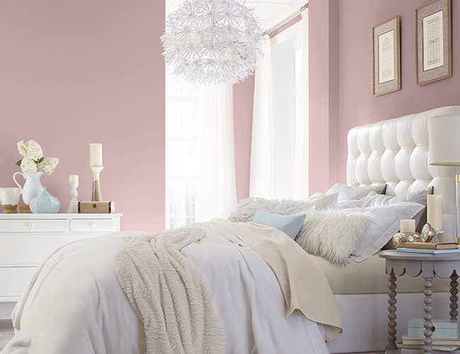
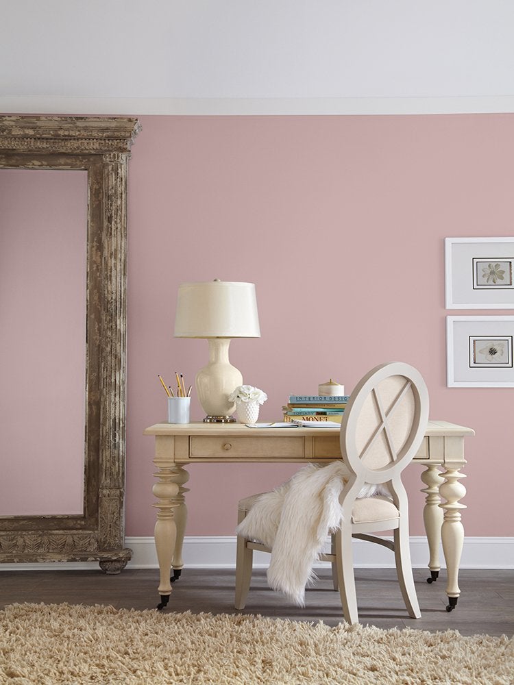
Pink
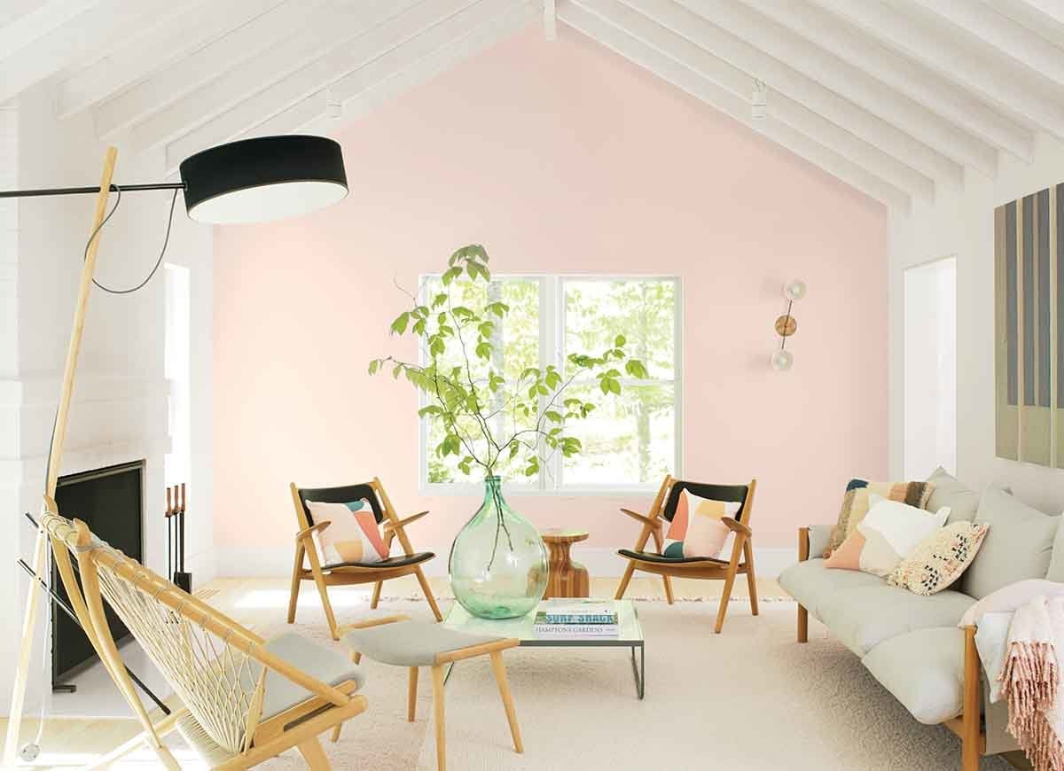
You can bring that rosy dawn light right into your home. “An upgrade to the ’50s pink bathroom tiles, pink in 2020 is soft, sophisticated, and surprisingly versatile. It’s no coincidence that First Light 2107-70 has been named Benjamin Moore’s Color of the Year,” shares Hannah Yeo, the company’s manager of color marketing and development. A cooler pink than in the past, “this flattering shade instantly puts you in a good mood.”
Pale Yellow
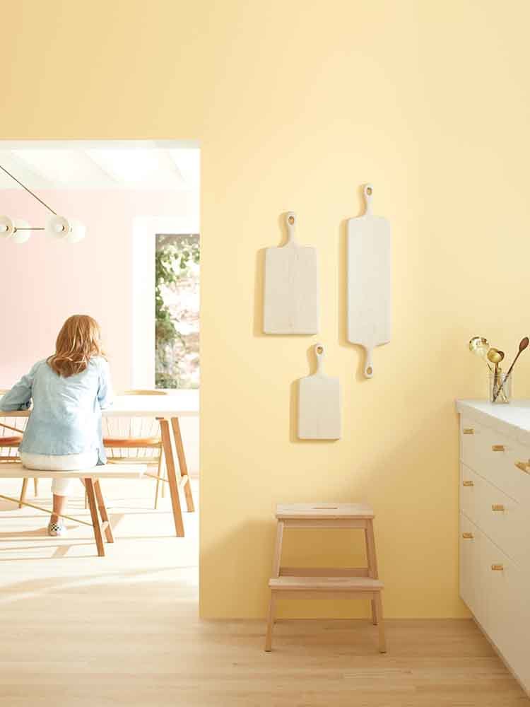
A sunny yellow kitchen never goes out of style. But to make it look up-to-the-minute instead of ho-hum, you need to choose the right shade. Hannah Yeo of Benjamin Moore likes Golden Straw, which adds light and warmth without veering too bright or sickly. This pale yellow is popular for its photogenic quality, which means it’s perfect “for creating an eye-catching space” on your Instagram or Pinterest profile.