We may earn revenue from the products available on this page and participate in affiliate programs. Learn More ›
America's Favorite Colors
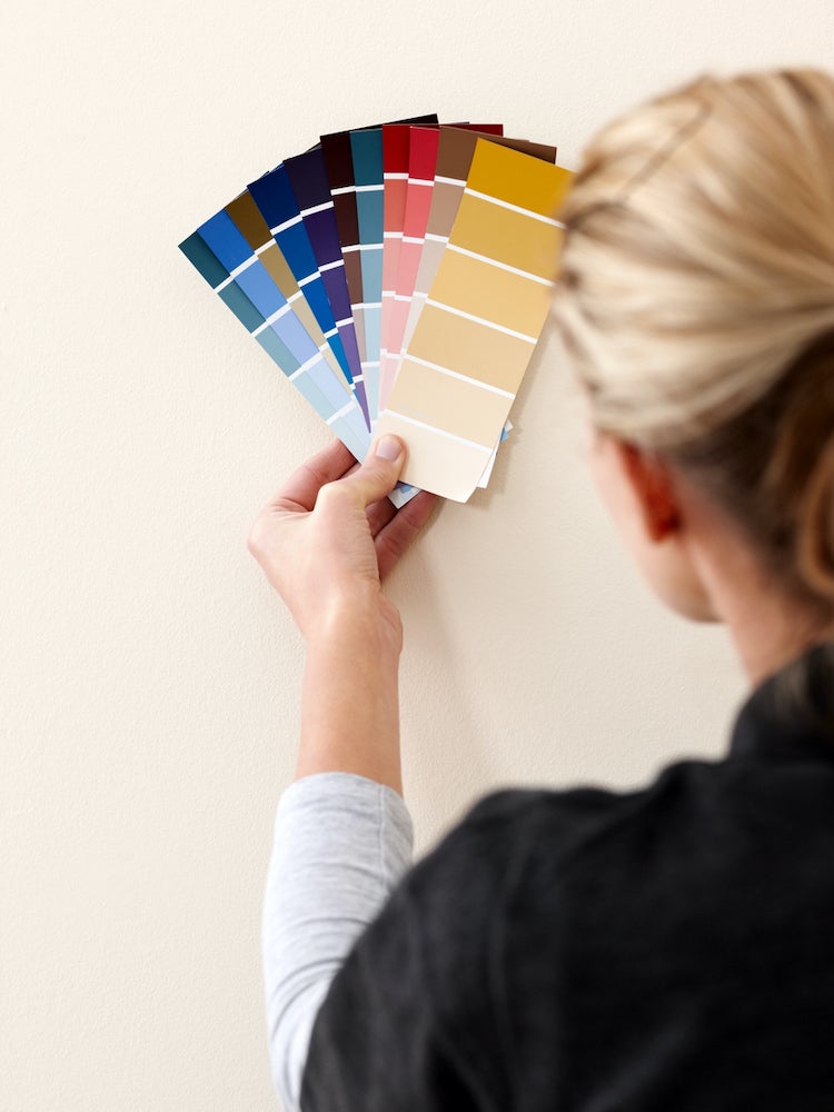
For many people, choosing new paint colors for the home is an exciting—yet often daunting—prospect. Just standing in front of those rows and rows of swatches can be enough to raise your stress level. It may surprise you to discover, however, that even with the seemingly limitless options available, a handful of hues perform far and away better than others. We spoke with paint industry experts to uncover their best sellers. Here, the top interior paint colors in America today.
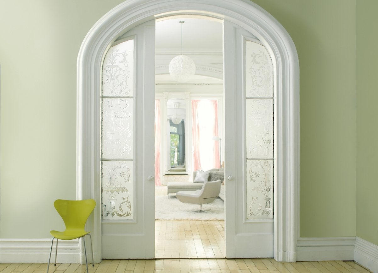
Bright White
White is an enduring favorite with homeowners, and it’s not hard to see why. “Whites can do a tremendous amount to lighten up a room, make a small space feel larger, or provide a blank canvas for any design style,” explains Erika Woelfel, VP of color at Behr Paints. Behr’s crisp Polar Bear is consistently a top seller.
Related: 18 Paint Colors You’re Going to See Everywhere in 2018
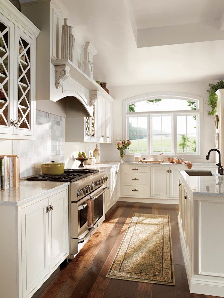
Antique White
A softer, warmer take on pure white, versatile antique whites call to mind parchment paper and frothy cafe au lait. Kelly-Moore’s Antique White is a wonderful, and aptly-named, example. “It’s the perfect backdrop for both colorful and neutral room accents and art displays,” says Mary Lawlor, manager of color marketing for Kelly-Moore.
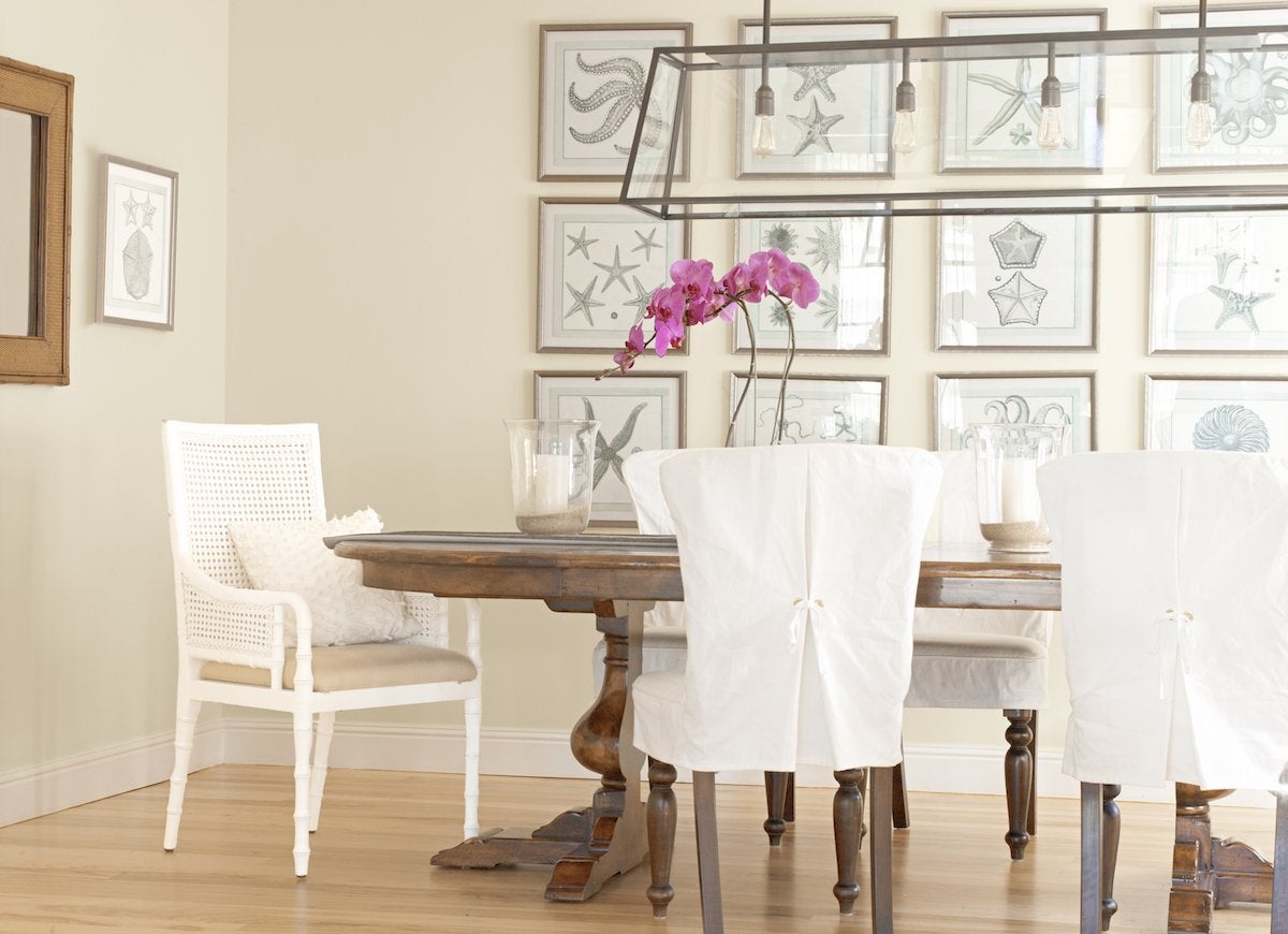
Beige
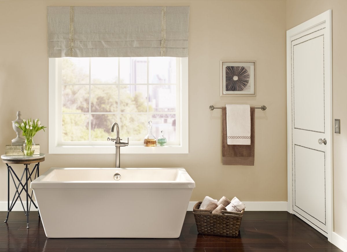
One step further down in the spectrum of white paint, classic beige is a warm shade with yellow undertones—like Behr’s popular Navajo White. Beige pops when trimmed with bright white, and is a natural choice to combine with browns, rust reds, and blues. “Timeless neutrals like Navajo White are consistently among our best sellers,” Erika Woelfel confirms.
Related: 9 Paint Color Rules Worth Breaking
Blue
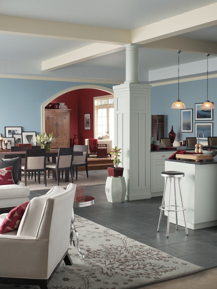
The calming quality of blue in the home is undeniable, as is the popularity of shades like Aleutian from Sherwin-Williams. “Aleutian is a dusky gray-blue that evokes a misty morning rain,” observes Sue Wadden, director of color marketing for Sherwin-Williams. Versatile blue works in cozy bedrooms, spacious living rooms, and everywhere in between.
Related: 11 Problems You Can Solve with Paint
Pale Gray
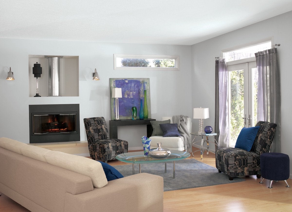
In recent years, pale gray has become a go-to neutral in many homes and it’s easy to see why—gray lets a room’s decor shine, while the color itself makes a style statement all its own. “Our most popular color overall in 2017 was Gray Screen,” reports Sherwin-Williams’ Sue Wadden. “It’s a modern color with a refreshing, cool vibe.”
Charcoal Gray
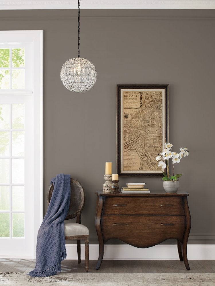
As our affinity for gray paint has increased, Americans have been turning up the volume—and deepening the shades they choose to charcoals that sometimes border on black. One of Pratt & Lambert’s best sellers is Rubidoux, “a warm, sophisticated gray that works as a backdrop or a stand-alone accent,” says Ashley Banbury, Senior Designer for Pratt & Lambert.
Green
The popularity of green interior paint is rooted in the color’s association with the natural world. Not surprisingly, one of Benjamin Moore’s best selling paints is a soft garden-green, Guilford Green. “It’s one of our best-selling colors and complements a range of materials, fabrics and furnishings,” says Andrea Magno, of Benjamin Moore’s color and design team.
Related: 9 Shortcuts to Picking a Paint Color
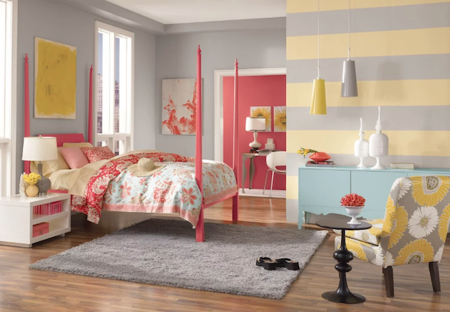
Yellow
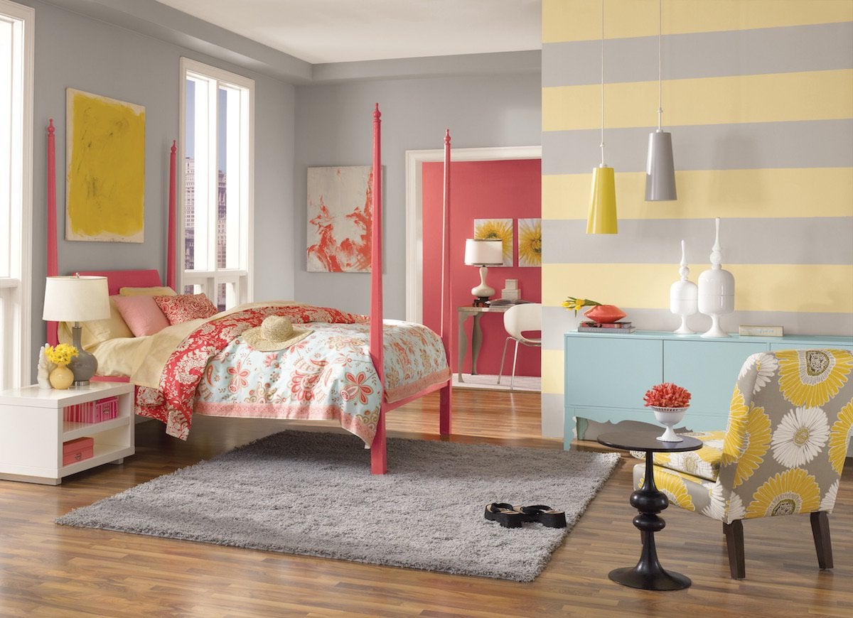
It’s the swatch we reach for when we’re looking to elevate the mood of a room or when we want to create a playful, happy atmosphere in our home. Just ask Sue Wadden of Sherwin-Williams about her company’s best-selling Friendly Yellow. “It’s a muted, pale yellow that brightens up any space with its cheery, welcoming tone,” she says.
Related: If This, Then That: Your Guide to Pairing Paint Colors
Picking a Palette
Feeling overwhelmed by the rainbow of paint chips in the hardware store? Consider the space you’re painting, from the interior style to the purpose of the room. These guidelines will help you narrow your choices. Of course, just because some design rules say one thing, in the end it’s your space and it’s about what you want!